The building of a brand icon
“When Andy Warhol wanted a shape to represent mass culture, he drew the [Coca Cola] bottle and when Volkswagen wanted to celebrate the shape of the Beatle, they compared the car to the bottle.” Excerpt from the Coca Cola Journey™: Celebrating 100 years of the Coca-Cola bottle.
How has the little glass Coke bottle transcended continents, cultures, languages and timelines to remain as firmly rooted in our experience today as when it first appeared 100 years ago? How did it get to be a brand icon? Which begs the question …
How does your packaging stack up to that kind of history? Are you a brand icon in the making?
When you check the retail shelf are you already blowing the dust off that packaging redesign you did last year? Every day we’re exposed to great brands with clever packaging. Some of it is truly inspired, but brand icon? That’s the kind of drawing power only a handful of brands command.
This blog was inspired by 3H Senior Designer Lindsay Sleightholm: “I love Coca-Cola branding. I was drawn to it even before I studied to become a graphic designer. Actually, it might have had a little bit to do with my career decision.”
That’s a big statement, but I’d hazard a guess that like Lindsay, each of us has been touched in some way by the allure of the little glass bottle.
Good Design Takes Things Personally
Lindsay: “For me, it started with a Coca-Cola pub mirror that my parents had hanging on a wall in our house when I was young. The copy read: “5¢, Delicious, Coca-Cola Relieves Fatigue, The Most Refreshing Drink in The World,” with a vintage photo of a young girl from the Edwardian era holding a glass of fountain Coke. No one could get away with those claims anymore (let alone the imagery). But back then I was sold. Not in the messaging so much, but in the feelings it evoked.
Today, I have a collection of Coca-Cola memorabilia: bottles, cans, signs, print ads, even an old cooler, and I still have that mirror. As far as antiques go, I don’t think the mirror holds much monetary value. For me, the value is sentimental.”
A brand moves from great to iconic by tapping into feelings and sentiments that are universal. Coca Cola’s advertising holds up a world mirror, reflecting the good times we’ve experienced with a bottle of Coke in hand, and it promises more good times to come, with a Coke in hand.
Good Design Shakes Things Up
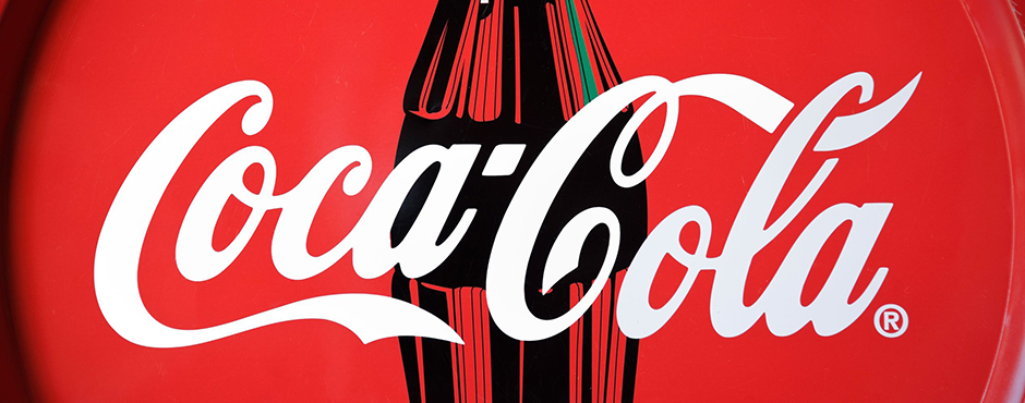
Lindsay: “As with anything in branding and package design, it boils down to being unique. Coca-Cola learned this early on. It wasn’t enough to have a great tasting product because competitors could mimic the formula. What they needed was a way to stand apart from their competition. They accomplished this in 1915 with the contour bottle design — an abrupt departure from every other bottle design at the time. The mandate was for a bottle ‘that could be recognized when broken on the ground or by touch in the dark.‘ The design was originally patented and later trademarked. It’s a design that is ergonomic, iconic and as synonymous with the brand as the logo. You only need to see a silhouette of the bottle to know what the product is.”
Timeline: The Evolution of the Coca-Cola bottle.
See what the competition’s doing and then do it differently. Shake things up.
Good Design Walks the Talk Over Time
Lindsay: “The design of the Coke bottle is timeless because essentially it’s remained the same for 100 years and yet it’s still 100% relevant. There have been modifications over the years to allow the bottle to adapt to changing styles and trends in packaging – not so much the shape of the bottle, although that has evolved — but in the materials used to manufacture it. It was originally glass, then plastic, then aluminum, and now with certain skus there’s a return to glass. The bottle design is a perfect example of adapting to changing market demands while remaining true to a clear vision for the brand. Not to mention, ‘everything old is new again.’ Which in the case of the Coke bottle took 100 years.
Coca-Cola hasn’t drifted too far from the original design, so in essence we’ve all grown up with it. The bottle brings a sense of familiarity and nostalgia to people when they see it. Even if you don’t like the product you can’t help relating to it on some level.”
So what’s the message in the bottle?
So what’s the message in the bottle? Clarify your vision and remain true to it. When you find a design that works don’t mess (too much) with it. Coke says it best, recalling the universal backlash to a formula change in 1985: “The fabled secret formula for Coca-Cola was changed, adopting a formula preferred in taste tests of nearly 200,000 consumers. What these tests didn’t show, of course, was the bond consumers felt with their Coca-Cola — something they didn’t want anyone, including The Coca-Cola Company, tampering with.”
The coke bottle is a beautiful design and it remains relevant. But that’s not always the case. As Miriam, Chief Creative Officer at 3H, blogged, “you have to design within the framework of the culture. Even though it hurts to let a beautiful design go, if it doesn’t perform it will be let go eventually and the costs associated will be significant.”
Thank you Coca-Cola for 100 years of keeping it real and building a true brand icon. You’re an inspiration to all of us. If you haven’t seen Coca-Cola’s Celebrating 100 years of the Coca-Cola bottle, check it out, it’s a fascinating look at the life of a fascinating brand.
Want a few tips on how to get your brand’s message in a bottle, bag, box, or whatever shape you think your packaging will take? Download our free re:design e-book.