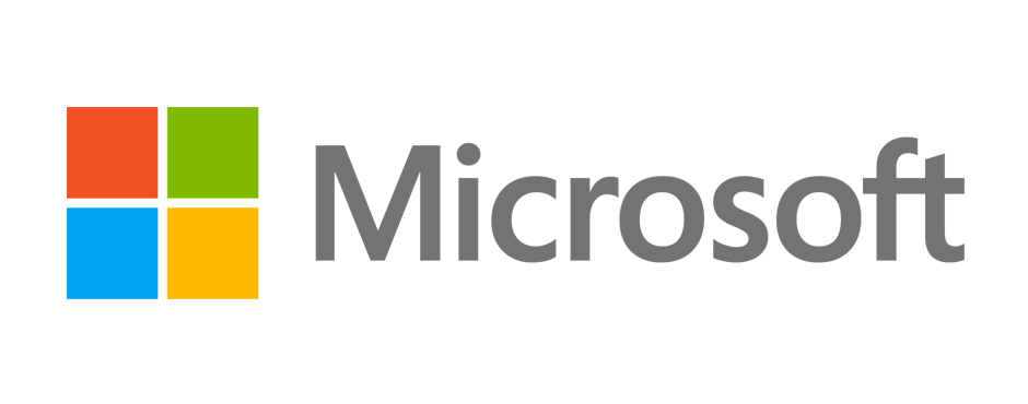
On August 23, 2012 a monumental change took place at one of the world’s largest technological companies; Microsoft unveiled a new logo, the first new logo since 1987.
This marks a significant change in the direction the company is taking. On the same day the logo was reveled, Microsoft stated in a press release that they wanted to revamp their image in time for the launch of Windows 8, which happens in late October. Windows 8 is the first software from Microsoft that can be used on both PCs and personal tablets, changing the way in which consumers interact with their various technological devices.
By creating a new logo Microsoft is not only trying to build interest and buzz around the product launch, but also show its target market that they have changed their way of thinking product development in response to how people currently use technology. Windows 8 is not just another “pretty” update and neither is the logo. It’s a new logo for a new Microsoft… with a new attitude.
Before
After
So how is that new business attitude reflected in the new logo? The first change is the font. Gone are the italics in favour of a new, straight font, which connects the F and T. They also altered the colour by lightening it and simplifying the use of colour removing dimension and shadows.
Secondly, the four coloured squares, which were previously curved and used to represent a window, have been straightened out and flattened to make a square. This was done to represent how applications will appear as mosaic tiles that will work on both touch tablets and PCs.
The changes are pretty minimal, so what has the response been? Pretty minimal as well. While it’s not being hailed as horrible, there’s no real praise for it either. It seems that it has failed to make an impression one way or another.
For a new logo that is supposed to be ushering in “one of the most significant waves of product launches in Microsoft’s history,” I personally think they could have done much better.
But like I said, they didn’t do a horrible job. Many components used are what go into a good logo. As Lance Ulanoff, Editor in Chief at Mashable.com, points out it’s simple and timeless. The design is clean and modern and void of stylistic trends that will easily look dated in a few years time. It also doesn’t deviate too far from the past logos. The logo is appropriate for the direction the brand is heading in. The tiles act as representation of the product the Microsoft is offering.
So where does it fail? Where it fails is the fact that it’s not memorable. Microsoft wanted the logo to be “humble, yet confident,” but humble is the wrong route to take if the brand is trying to play up the notion of significant innovation.
The lightened colour comes off as dull and weak. The adjustment of the coloured tiles is very minor. What the logo should say is “Microsoft is a leader in technology that offers innovative products to customers for their changing need.” Instead it says “Microsoft made a few changes here and there that might go unnoticed with customers.”
Simplicity is key in logo design…can anyone say Apple? The new Microsoft logo can be described as simple… but unlike Apple, it’s not clever and it’s not iconic. It’s bad business practice to try to follow in the footsteps of a competitor who has done it so well. Microsoft would have been better served striking off on its own… creating something original to set its brand apart.
While a logo a brand does not make, it is important to put thought and care into it, especially when evolving it.
Do you feel, given the goals and intended messaging, that Microsoft created a new logo that connects with consumers?


