Pantone. What a beautiful word. It just rolls off the tongue.
As any designer knows, Pantone provides a collection of numbered spot colours that cannot be reproduced in CMYK. It is device independent, thus ensuring solid, accurate colour reproduction every time. Basically, it means “I want this colour – I get this colour.”
Pantone guides are now a staple of the graphic design industry. In fact, most designers can easily name their favourite swatch; mine’s 485.
Humble beginnings
It’s hard to believe Pantone has only been around for 50 years. The organization started out as a small print company in New Jersey, and was propelled forward with the help of a then temporary employee, Lawrence Herbert.
Herbert was hired fresh out of university and had originally planned on going back to school to study medicine. His plans changed, and in 1962 he bought them out. A year later he introduced PMS (Pantone Matching System) and, in doing so, revolutionized the business of colour.
Today, Pantone is known as the global colour authority, with millions of brands banking on Pantone ink to ensure consistent identity colour.
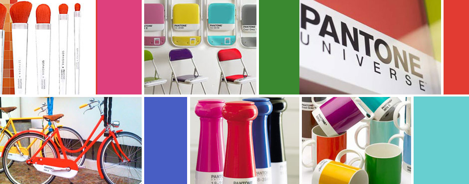
Drool-worthy
As with any successful brand, the company expanded – and somewhere along the way came the swag.
I remember when I received my first Pantone mug as a gift. I was thrilled and, of course, wanted more. With a heads-up from a colleague, I visited my local Chapters store and was overjoyed to find a colourful pyramid display of bright, shiny Pantone mugs. It was like a little piece of designer heaven against a backdrop of lattes and magazines.
While I was standing in line to purchase the second piece in what would surely become an abundant and drool-worthy Pantone collection, the question occurred to me: “Pantone in Chapters? Has Pantone gone… mainstream?”
The Pantone Universe
Today, what was once reserved only for designers, creatives and the print industry has now indeed become part of the mainstream. Perhaps even more quickly than the introduction of additional colours, Pantone is now churning out consumer products.
It’s become much more than a standardized colour system, and enveloped a market far greater-reaching than it initially intended. In fact, anyone with an appreciation for colour and branding can get their hands on scads of Pantone-inspired items courtesy of the fast-growing “Pantone Universe“.
The universe expands
The Pantone Universe – as one would expect by the name – is a full-fledged cosmos comprised of products from the Pantone brand.
In addition to clothing, accessories, electronics and housewares, the Pantone Universe also includes the Pantone Hotel, which is as brand-infused as you’d imagine. (Incidentally, if you happen to be headed to Brussels and book far enough in advance, you can stay the night for under 100 Euro.)
Then, of course there’s Pantone’s newly introduced line of cosmetics. Partnering with Sephora, the Pantone Universe is banking on the lure of its booming brand – as well as its colour of the year, Tangerine Tango – to entice cosmetics buyers to open their wallets.
Zero to hero
I don’t know about Tangerine Tango, but I’m okay with just my Pantone mugs for now. I don’t really need a whole universe.
But my thoughts are mixed about whether or not it’s a good thing that this universe even exists. In one respect, it’s amazing to the see the complete transformation of a brand from zero to hero. In another, I do hope it keeps its roots intact and holds strong to the goals on which it began.
Either way, no one knows how far the universe reaches. But as long as the Pantone entity remains true and authentic, the sky’s the limit.