
As Visual Identity ambassadors, we examine the marketing data we collect through every filter imaginable; we look at trends and we anticipate shifts. We sort and analyze the information to death and it’s important that we do. What we’re doing is looking for truths, looking for what’s real and what resonates with consumers. But as we’ve said before, if the end result — the product and the packaging — don’t reflect those truths, if our efforts don’t come across as real, then we’re wasting our time and our money.
[dt_sc_pullquote type=”pullquote6″ icon=”no” align=”center”]Good graphic designers know good design when they see it. And they know exactly why it’s good.[/dt_sc_pullquote]
I asked the graphic gurus at 3H to choose their favourite packaging design and speak to why they think it’s great. After all, they spend their days working on visual identity for clients and a big part of that is packaging design. We showcase our work on the 3H website, but sometimes it’s nice to step out and give credit to our colleagues in the great big marketing and advertising pond we’re all swimming in. My point? Good graphic designers know good design when they see it. And they know exactly why it’s good. The rest of us non-designers can learn from this…
Today’s blog is courtesy of Kyle McGuire, Senior Digital Designer at 3H.
[dt_sc_title type=”H3″ border=”Yes” align=”Left”]Kyle’s favourite packaging …[/dt_sc_title]
[dt_sc_two_third first]
Analyzing Visual Identity
Featured Brand: Toronto’s Steam Whistle Pilsner
A Toronto microbrewery started by three “fired guys,” who upon being let go from another Canadian microbrewery opened their own because they wanted to “make a Pilsner that would compete with the best in the world.”
Why Kyle likes it?
Intelligently Simple Creative with a Retro Feel
“It’s a very retro, yet clean logo. It’s a visual identity that stands out from the crowd.
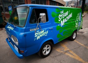
The creative is intelligently simple and always graphically on track with the other pieces in the product line via its clean lines, bold colours, and the consistent retro look. It’s a fun, light-hearted brand and the packaging reflects this, whether we’re talking about the company’s retro van, a 1967 Ford Econoline Heavy Duty that along with an entire fleet of vintage vehicles delivers beer and travels to events around the country, or the clean action of the steam trails in the company logo.
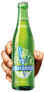
The retro look makes this brand easily identifiable on the shelf, in particular the bright green base colour that is used on everything, including the green bottle, rather than the industry-standard brown bottle. The green bottle is a great retro element, based on vintage bottles from the 1940s and ‘50s.
Smart Packaging
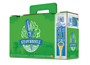
The company calls their packaging “overbuilt.” It is. Steam Whistle redesigned the 12-bottle carrying case; theirs is known as the “suitcase” 12 pack. It has a retractable handle and the top seals itself without the use of glue. It’s an ingenious innovation using die-cutting. The design is also forward thinking because for so long no one changed the format of the 12-pack of beer. It was always a 4 x 3 bottle arrangement with side holes for handles. The “suitcase” is a 2 x 6 pattern and the handle comes straight out of the center of the box so it’s an easy one-handed carry, not prone to tearing.
[/dt_sc_two_third]
[dt_sc_one_third last]
[/dt_sc_one_third]
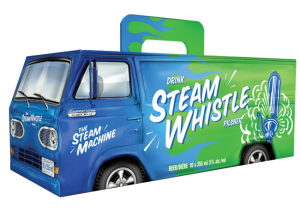
Packaging for the Can Van 10-pack box, inspired by the Steam Whistle Van, is fun, exciting and humorous; it instantly catches your eye on shelf, relying on that vintage look, but with modern packaging development. The perforated rear van doors on the Can Van box open just like the van doors on the back of the Steam Whistle van. This makes it easy to store in the fridge. The Can Van box also uses the same handle as the suitcase, so it’s also easy to carry with one hand without worrying about the handle breaking.
Forward Thinking
Steam Whistle has a very forward thinking approach to its visual identity, both in its package development and graphic design. In my eyes, this synergy makes them one of the most creative companies in package design and development. Their light-hearted, feel-good approach to design consistently comes over as real.
Want a few tips on design or redesign? Download our free re:design e-book.