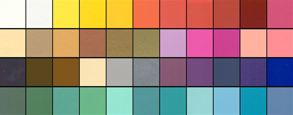
Our reaction to colour is subliminal. As consumers, we are generally unaware of the persuasive effects of colour. Psychological effect is instantaneous, stimulating the senses and power of suggestion. We see it in every level of communication: in corporate identification and logos, signage, advertising on tv, billboards, in print media and packaging, on the computer and in-store. As we zip down isles in our favourite stores, our eyes rest on a package for approximately .03 seconds. In that blinking-of-an-eyelash timing, the packaging/sign/logo must rivet the observers’ eyes, inform them of the product, and, more importantly, appeal to their psyches.
I doubt I am saying anything new here. However, last week, we went to visit a client at their office and what happened there, prompted me to take note about colour and how we identify with it. We hadn’t been to Dentsply Canada’s office in a little over six months. As we walked through the door, the receptionist glanced up and said “…from 3H?”. Wow, that completely floored me. We make a point of always wearing purple when we see clients, because purple is the dominent 3H brand colour. This was enough for the receptionist to remember our visit from 6 months ago. We, at 3H, are strong believers in Brand Recognition!
We practice what we preach. While we clearly know and acknowledge that it takes much more than colour to build a brand… what you do with a “brand” colour clearly enables and facilitates brand recognition. Colours are so intimately associated with a brand that just the suggestion of a colour is enough to bring a brand to mind. That’s isn’t simply amazing… it’s awesome in building equity.
Think about this…
When you think of Home Depot, what colour comes to mind?
Which bank is “blue”, which one is “orange”, and which one is ‘green”? Close your eyes and picture the Google logo. The McDonald’s logo? And for my Canadian readers… what is meant by the “Windsor” blue.
Our reaction to color is instantaneous and this lens is a quick look at general responses based on research, historical significance of color and word association studies. Let’s take this one step further… picture the Home Depot logo, but with different words in the same font in the orange box… would you still recognize it? Would you see the logo as a whole, as one image, and recognize it instantly, associating it with Home Depot.
So when developing a brand and beginning with the basics of creating a logo… choose a colour that would represent your brand identity effectively for now and the future…And repeat after me….
Repetition, repetition, repetition… consistency… everywhere… all the time. Exposure over time ensures success….. but that’s a different point of discussion! Colour makes a brand stand out and command attention and make sure that the Logo colour matches your brand mission and message to create the brand identity you want.
So what do colours mean anyway? Here’s a brief overview.
Green occupies more space in the spectrum visible to the human eye than most colours. Green is the pervasive color in the natural world, making it an ideal backdrop in interior design because we are so used to seeing it everywhere. Green is considered the colour of peace and ecology.
Purple embodies the balance of red’s stimulation and blue’s calm. This dichotomy can cause unrest or uneasiness unless the undertone is clearly defined, at which point the purple takes on the characteristics of its undertone.
Blue is seen as trustworthy, dependable, and committed. As the collective colour of the spirit, it invokes rest and is calming.
Yellow shines with optimism, enlightenment, and happiness. Shades of golden yellow carry the promise of a positive future. Yellow will advance from surrounding colors and instill optimism and energy, as well as spark creative thoughts.
Pinks are youthful, fun, and exciting, while vibrant pinks have the same high energy as red; they are sensual and passionate without being too aggressive. Pink is the color of happiness and is sometimes seen as lighthearted.
Orange sparks more controversy than any other hue. There is usually strong positive or negative association to orange and true orange generally elicits a stronger “love it” or “hate it” response than other colours. Fun and flamboyant orange radiates warmth and energy.
Understanding colour and what they represent is important in establishing a brand persona. In today’s world of fast communication and overload of visual stimuli, it is more than vital that brand expresses its identity at the blink of an eye.
If you had to define your personality as a brand colour, what would it be?


