by Miriam Hara | Aug 8, 2025 | Advertising, Agency, Business Success, Creative, Design
Unmistakably Purple
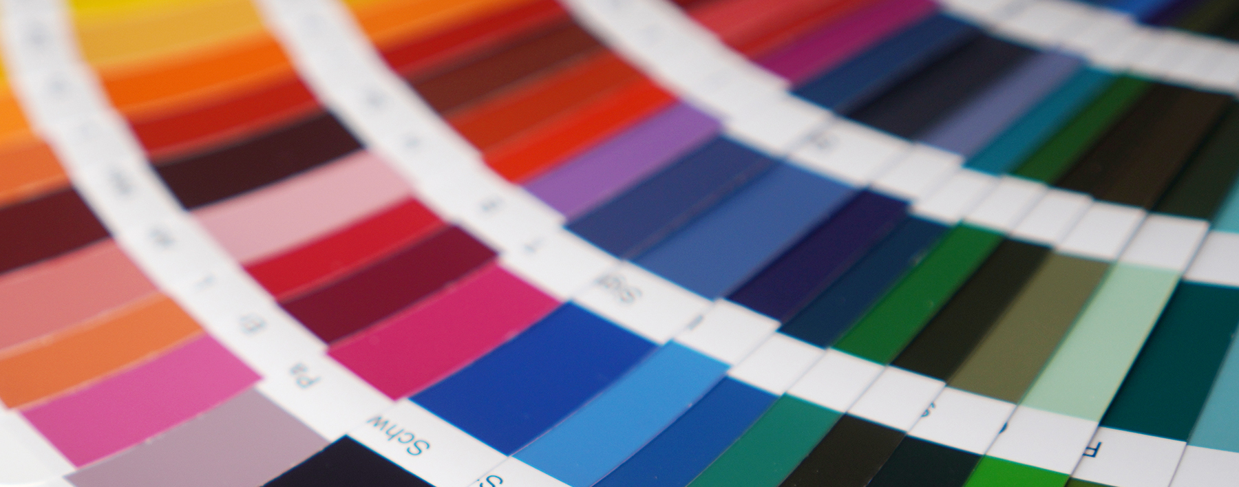
If voice shapes how a brand sounds and represents, its visual identity is how it’s remembered. In a world crowded with choices, visuals are strategy, personality, and first impression all at once. For my business... my brand, that unforgettable visual identity begins with one unexpected colour: purple.
The Layering Approach
An unforgettable visual identity is never just about what looks good on a page. It’s about crafting patterns, moments, and details that make an impression before you’ve said a word. It embodies and propels forward the brand's logo while carrying the momentum to social media communications, and advertising.
When I considered what would signal my business to the world, I started with the simplicity of a my business' visual identity. I started with a colour that was unexpected 37 years ago. It was a colour that was rarely seen or utilized in the business world yet oddly traditional. It was a bold move in the seas of grey, blue and burgundy. Additionally, I wanted a colour that sparked curiosity, commanded attention, and reflected the kind of creative courage I bring to every project.
Why Purple?
Purple wasn’t chosen by accident. It’s the signature of my brand for a reason. Throughout history, purple has signalled creativity, originality, and even a little bit of rebellion. It’s confident, distinctive, and unapologetic just like the brands I love to build. And let's not forget...purple is often associated with courageousness...with braveness.
Albeit, purple is also personal for me. It reflects imagination, a bias toward bold ideas, and a commitment to standing for something unique, not just what’s expected. It’s the heartbeat of every piece of creative, every campaign, and every brand moment we deliver.
Consistency Creates Confidence
Of course, visual identity is about more than just one shade. It’s the patterns, rhythms, and small details that turn colour into memory. Purple is the visual thread that runs through our brand. It appears in the logo, the website, event booths, even the energy of the team.Consistency is a competitive advantage. I want people to feel the brand before they even know it’s us.
Purple invites a double take. It stands out in a sea of sameness and, in our world, that matters. Clients and potential clients alike, take note of our brand colour. Unbeknownst to them, from the very first hello, we are already having a brand conversation. One that enables us to really show what we can accomplish for their brands. The use of purple is very intentional.
Visuals That Speak Volumes For My Clients, Too
Many of the brands I work with are navigating complex, crowded spaces; health, innovation, food, lifestyle, and legacy industries that can feel overwhelming and even feel a little sterile. For them, standing out isn’t just a luxury; it’s survival.
When I and my team are given to develop an unforgettable visual identity... it isn't only about colour. It's about being unexpected...and whatever that form takes. We aim to make their message impossible to ignore and giving their brand sense of confidence and cohesion that transcends vehicle. Confidence in their communications, advertising and of course, confidence for their sales force to articulate what needs to be. The visual identity is the springboard for which all brand communications (digital, print, sales) take flight. Clients have told me that our creative choices, especially the signature visual elements, help their brands claim space, spark conversations, and signal that they’re not afraid to lead.
When someone is exposed to one of my businesses' campaigns or walks into our office, I want them to feel that spark. Purple makes sure they do. It’s a colour that opens doors, starts conversations, and makes the brand unforgettable not just for me, but for every client I have the privilege to work with.
by Miriam Hara | May 27, 2025 | Advertising, Creative, Design, Marketing

Defining Design Strategy
After over 36 years at the helm of 3H Communications, there are certain truths in our profession that have endured the test of time. Creative concepts aren’t pretty pictures… and design isn’t decoration. When design lacks intention, it will be sure to miss the mark. Every curve, every hue, every seemingly simple design choice happens by the exercise of expertise and free will.
Whether it’s making the bold choice of a deep indigo, the placement of a logo, a typography selection or the subtle curve of a package corner, every decision carries weight and purpose.
Behind every great design there is a rationale. A thought process that bridges creativity with strategy.
Marketing of Design.
Design strategy articulates what must be visually contextualize. What are we trying to achieve? Who are we speaking to? How will this design help us get there? It sets to align the visual elements of a brand with its mission, values, and goals. It takes abstract ideas and transforms them into visual articulations that are compelling, working together cohesively to tell a story and drive action.
Without strategy, design risks becoming a disconnected series of aesthetic decisions. Ultimately nice to look at, missing the mark in becoming a powerful tool for communication, differentiation, and long-term brand equity.
Ask ‘Why’ Always.
Think like a 3 year old and continuously ask Why? Why this shape? Why this texture? Why this spacing? Every answer must add to the bigger picture, whether it’s solving a problem, evoking an emotion, or influencing behaviour.
A curve on a package may very well be visually appealing, but it just might be about making it easier to hold or subtly creating an organic flow that aligns with a natural product promise. A colour isn’t just a shade, it’s a signal. It can calm, energize, or provoke.
Design Driven by Intention.
When intention leads design, it shows. It feels cohesive. It feels confident. It simply works well. At 3H, design intention is simply our process.It’s not just about how something looks. It’s about why it looks that way. Brands that endure do so because their design foundations are executed properly. Design strategy catapulted by intention ensures that even as trends shift, the core brand message remains intact.
Why It Matters.
We already live in an over-saturated world where consumers are bombarded with visual stimuli every day. Design without intention is noise. But design with intention? That’s where magic happens.
At 3H, our philosophy is simple: design is a strategic tool. Every project, no matter how big or small, starts with intention and is guided by rationale. We design with purpose. And in a world that’s always looking for the next big thing, that makes all the difference.
by Miriam Hara | May 27, 2025 | Design, Marketing
by Miriam Hara | Apr 16, 2025 | Agency, Creative, Design
 Constructive Criticism… ugh! That’s all I have to say. In the world of marketing creative the use of the term constructive criticism is as prevalent as the air we breathe! Whether designing a campaign, writing a headline, or capturing the perfect shot, everyone has a say on that creative component. It’s part of the creative process and it is integral in crafting and improving the creative asset. But let’s not sugarcoat it: feedback can sting.
Creativity is personal
Despite me telling my team that feedback, “Is not personal” , I do understand that, innately, it is. It’s difficult not for it to feel personal when you’ve taken the germ of an idea and spent hours perfecting it before you even present it. And then someone comes along, squints at your masterpiece, and says, “Hmm… it’s not quite there.”How can it not feel personal?
But when constructive criticism is given, that is the defining moment. Feedback isn’t just about hearing what needs to change, it’s about how you respond to it.
To my way of thinking, constructive criticism is the way any professional can up their game. Become really, really good at their profession. Seriously good!
Understanding the why behind the what.
Giving feedback is an art. It should, by it’s very nature, be directionally but not specific. Alas, too often that is what feedback looks like….Make this bigger. Change this colour. Tweak that headline.
Turning that feedback into being constructive you need to decode the feedback. It’s not about just doing what is requested, it’s about understanding why the change is being requested.
- Why did they ask for more space?
- What’s the real concern behind this change?
- What outcome are we trying to achieve here?
Start thinking this way, you will become a true professional, a collaborator.
Personal or not? Understanding the distinction.
Feedback isn’t a reflection of you. It’s a reflection of the work. And that distinction makes all the difference. When feedback is given, and the understanding of the feedback gets crystallized, the outcome is something everyone will get behind. Feedback isn’t an attack, it’s a way to make a creative stronger…better. If a creative concept or asset cannot handle the modifications, perhaps there’s a bigger issue about the creative.
Constructive Criticism: It’s a mindset.
Feedback is the thing that tells you where to focus, where to sharpen your edge, and where to let go of what isn’t working. If you are truly listening. It’s part of the process that continuously stokes the fire of passion… and refines natural.
Here are my key takeaways on turning feedback into an opportunity to grow and become better (yes, even after 40 years!)
- Listen to understand, not to respond.
- Ask smart questions. “What’s not landing here?” or “What’s the bigger goal we’re aiming for?”
- Pause. Take a walk, sleep on it, let your thoughts settle.
- Look for patterns. If you’re hearing the same note over and over, it’s not a coincidence, it’s an indication that you’re not learning from the feedback… but just doing!
The true professional creatives are the ones who know how to use the feedback to make what they’ve initially created, even better.
Don’t just do.
At the end of the day, addressing feedback isn’t about getting the job out the door. It’s always an opportunity for growth. Evolving your craft, sharpening your skills, and building a resilience will serve you long after the project wraps up.
Consider that every critique is; a chance to become better. An opportunity to think deeper, create smarter, and deliver something that doesn’t just work, it wows.
How you handle feedback will determine your professional trajectory… and subsequently your professional opportunities. Contrary to the very iconic Nike slogan, Don’t just do it, learn from it!
by Miriam Hara | Nov 19, 2024 | Branding, Creative, Design, Marketing
Embracing Bold Moves: When and How to Rebrand a Legacy Brand’s Packaging Without Losing Heritage
Legacy brands carry a rich history, often evoking nostalgia and trust among loyal consumers. However, as consumer tastes evolve, even iconic brands must refresh their image to remain relevant. Rebranding packaging is a delicate process, especially for brands with a deep heritage, where there’s a fine balance between staying true to tradition and embracing modernity. Here’s how to revamp your brand’s packaging while honoring its legacy and maintaining loyal customers.
1. Recognizing the Need for a Packaging Refresh
For legacy brands, the decision to refresh packaging often comes from shifting market trends or consumer demands. The key here is to understand that a brand’s packaging speaks volumes about its identity. Is your current design feeling outdated in today’s sleek, minimalist world? Are competitors’ modern designs outshining yours on the shelves? A refresh doesn’t mean losing your brand’s heritage, but rather making sure it stays relevant.
Example: Look at how Coca-Cola has kept its iconic red and white colour scheme but continuously evolves its packaging. The subtle tweaks ensure the brand looks fresh without losing its instantly recognizable identity.
2. Stay True to Key Elements
Just like Dunkin’ retained its vibrant colours and recognizable font during its rebrand, legacy brands should maintain the visual elements that make them iconic. Think about the core aspects of your packaging design—colours, logos, fonts, or symbols that have emotional resonance with consumers. These elements anchor your brand’s identity.
Example: When Guinness refreshed its packaging, they kept the familiar harp symbol but modernized its design to appeal to a younger audience while retaining the essence of their heritage.
3. Balance Tradition with Modern Design
The challenge of rebranding a legacy brand’s packaging lies in walking the line between tradition and innovation. Your packaging must evolve to meet current market demands but also pay homage to the rich history your brand embodies. Modern design trends such as minimalism, flat design, or even eco-friendly packaging can be introduced in ways that highlight your brand’s authenticity rather than overshadow it.
Tip: Consider simplifying your design while keeping classic elements like colour schemes and logos. Streamlining the package can communicate modernity without diminishing the brand’s heritage.
4. Communicate the Story Behind the Refresh
One of the most effective ways to ensure a successful rebrand for a legacy brand is to communicate the why behind the change. Share the journey of the brand, explain the significance of the updated design, and ensure that consumers understand this is not a departure from tradition, but rather a step forward. Tell a compelling story that bridges the old with the new, creating an emotional connection.
Example: When luxury chocolate brand Godiva updated its packaging, they told the story of the craftsmanship and passion that still go into each box. The new design felt luxurious yet modern, without forgetting its Belgian roots.
5. Test and Involve Your Audience
A legacy brand’s audience often feels a strong attachment to its existing packaging. Testing potential designs with a group of loyal customers can provide valuable insights and help you fine-tune the refresh without straying too far from what they love. Involving them in the process makes them feel like stakeholders in the brand’s future.
Tip: A/B testing or focus groups can help gauge reactions before the full-scale rollout, ensuring you don’t alienate your core audience.
6. Ensure a Gradual Rollout
Just as Dunkin’ gradually transitioned its branding from “Dunkin Donuts” to “Dunkin,” a legacy brand’s packaging refresh should be rolled out in phases. A sudden overhaul can alienate loyal customers, while a gradual transition helps them adjust to the changes. During the transition, it’s vital to reinforce your brand’s legacy by highlighting the heritage elements that have been retained.
7. Prepare for Pushback—and Address It Gracefully
Change, especially for legacy brands, can often lead to pushback from die-hard fans. Prepare for this with clear messaging. Be transparent about why the refresh was necessary and how it benefits the brand and its consumers. Respond to concerns respectfully, reassuring customers that the brand they love is still very much intact.
Example: Burberry faced backlash when they updated their iconic logo. However, they handled it by explaining the need to modernize while staying true to their British roots, which helped ease the transition.
8. Celebrate the Brand’s Evolution
Finally, celebrate the evolution of your brand. Show consumers that the refresh is part of your brand’s journey and continued commitment to excellence. Use the opportunity to highlight the brand’s history while embracing its future. Special edition packaging or promotional campaigns that nod to the brand’s past can help reinforce the feeling that while the packaging may change, the core of the brand remains the same.
Stay True to your Roots
Refreshing the packaging of a legacy brand is a bold move but can be done without losing your heritage. By staying true to your roots, involving your audience, and embracing a modern, forward-thinking approach, you can ensure your brand continues to stand out on shelves while honouring its legacy. A successful rebrand isn’t about forgetting the past—it’s about respecting it while evolving to meet the future.
by Miriam Hara | Oct 1, 2024 | Agency, Creative, Design
Graphic Design: Making the Pieces Fit…And More
The need of graphic design may stem from making things look good, but that’s not what it’s all about. Professional graphic designers are strategic partners in communication. The need to design a visual message that does so much more than fill a space is paramount. With the decentralization of brand communication ownership, where many different graphic design agencies/freelancers/consultants are co-responsible for the managing and deploying of a single brand’s positioning and persona, the understanding of brand at a deeper level is a must. Professional graphic designers aren’t just making things look good—they are strategic partners in communication. The need to design a visual message that does so much more than fill a space is paramount.
Designers have become the essential link between a brand’s ideas and its audience, and that’s what truly elevates their role.
From Social Media to Video Editing….Technology Reigns
With the advent of technology and the acceleration of plentiful super duper software (yay!), all of these have merged into one, and then some (i.e.multi-media, etc). Along with this proliferation of software, design is accessible to all…and many call themselves visual designers and graphic designers. Mastering computer programs that all designers use may lead to the misconception that this is all graphic design is about. It may seem that all a graphic designers does is search for images and rearrange images and text on a screen, but that really isn’t what graphic design is all about.
Back in the day (and yes, I am dating myself), there were what we called commerical artists, production artist and graphic artists. Although these terms are still used…the term designer not artist is more often than not, the descriptor. Knowing that this next statement may meet with some outrage, I mean no disrespect. Knowing and mastering the likes of Canva, Procreate and Adobe Acrobat, does not make a graphic designer. All computer software does is facilitate the production of visual content that can be appealing and even riveting… but that does not make the producer of the visual content a graphic designer by profession.
Mastering Graphic Design: 5 Must-Do Practices
1. A designer’s role is to communicate with purpose, aligning visuals with business goals and audience needs. It’s no longer just about aesthetics (pretty pictures!)—it’s about creating connections.
2. At the core of every design is a message, and a designer’s job is to understand what that message is—and how to prioritize it. It’s not just slapping text onto a pretty picture. It’s digging deeper, understanding the goals behind the message, and ensuring that every design choice amplifies it.
3. Not every element in a design should have the same level of importance, and skilled professional graphic designers know how to highlight the most critical part. It’s about using hierarchy, contrast, and space in a way that draws the eye to the right spot, ensuring that the key message doesn’t get lost in the noise.
4. Graphic designers controls the flow of information. Whether it’s through colour, typography, or placement, they guide the viewer’s eye through a visual journey. It’s not just about where things are placed, but how they’re designed to be experienced.
5. The most difficult of challenges is for a graphic designers to take a lot of content and distill it into something clear and concise in very small space. It’s a constant battle and it’s a balancing act—communicating just enough to get the point across without overwhelming the audience.
In today’s design landscape, it’s clear that the graphic design profession is about far more than just creating layouts. It’s about strategic communication, prioritizing messages, and knowing how to lead the viewer through the visual experience.