by Joyce Turner-Gionet | Sep 9, 2015 | Agency, Branding, Business Success, Communications, Creative, Design, Interactive, Latest, Marketing, Social Media
Rah-Rah, Google! Give us an ‘E’ (but make it crooked!).
Gotta LOVE that crooked ‘e’ in the new Google logo. It’s so Google! Irrepressible, playful. I hear it’s annoying people. They want to straighten it. Personally, I think it’s perfect. Think about it. Leaving the ‘e’ crooked speaks volumes about Google’s personality.
Not everyone agrees with me, Twitter Users Think Google Copied Heineken with its new logo’s crooked ‘e’ (Google kind of admits it.)
All done in house, the rebranding is a composite of three elements: the word mark, a four-colour ‘G’ monogram and animated dots that represent the Google search engine in ‘thinking’ mode. For those who’ve been under a rock, or enjoying the last days of summer up at the cottage, here it is:
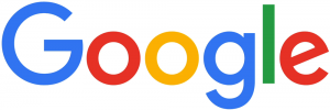
New Google Logo

New Google Dots

New Google Monogram
Here’s a reminder of the old Google logo:
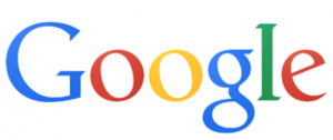
1999 – 2015
Here are some Google logo ideas that presumably didn’t make the cut
Here’s why Google did the rebranding …
Says Google … (from the official Google blog)
“So why are we doing this now? Once upon a time, Google was one destination that you reached from one device: a desktop PC. These days, people interact with Google products across many different platforms, apps and devices—sometimes all in a single day. You expect Google to help you whenever and wherever you need it, whether it’s on your mobile phone, TV, watch, the dashboard in your car, and yes, even a desktop!
Today we’re introducing a new logo and identity family that reflects this reality and shows you when the Google magic is working for you, even on the tiniest screens.
Read everything Google said …
Are we impressed?
I asked a few graphic gurus and marketing types across the industry for their opinion on the rebranding:

“Google, with an upper case G … it’s all grown up!”
“The lower case (previous) logo was approachable. With this new logo, Google has maintained its approachability, but made it more mature. More established. The colours and the playfulness with the dots has added to its “fun” nature … almost showcasing its “magic”. Turning questions into a found result. The use of an uncluttered, streamlined font adds to the contemporary nature … the G, unencumbered, is almost futuristic.
More importantly, I love the Alphabet name … the idea. It’s the basis of communications. With letters and building blocks, imaginations soar. What else can we develop? Where else can we go? It offers the ability of each letter to have its significant place in the sun!”
– Miriam H, Chief Creative Officer at 3H
“… suits their position as a search engine (wayfinding system)”
“Overall, it’s a thumbs up from me. The font they used is called Product Sans and was one they created specifically for the new logo and overall rebranding with the animated dots and icons. Similar to the new-ish Twitter icon, it was (mostly) created using only circles and semi-circles. I think it has a much more ‘current’ feel and suits their position as a search engine (wayfinding system).”
– Lindsay S, Senior Graphic Designer
“They’re still leading the way, now with their very own font.”
“It has retained its simple look and colour palette, while bringing a more accessible and contemporary feel. The font also has a uniqueness, a quirkiness, which demonstrates Google’s lighthearted, forward-thinking approach. They’re still leading the way, now with their very own font.”
– Jayne B, Integrated Marketing Manager
“fun and playful”
“I loved the way they presented it, the animation is fun and playful. I like the sans serif font more than the previous serif font. They’ve had the same logo for a long time. The previous logo was dated and the trend is towards sans serif fonts. Nice and chunky. It was a smart move since Google is now owned by Alphabet company. A new beginning for Google and the new logo is a great start.”
– Craig C, Senior Graphic Designer & Mixed Media Artist

“Just another logo”
“Just another logo. Cultural relevance? There’s a lot of talk about this, but I really don’t think it changes much.”
– Jason H, Photographer
“… reminiscent of the avant garde style of the TTC subway signs that came out in the 1950s”
“The new direction of the Google logo makes it easier to display on smaller devices, the switch from a serif to sans serif will make displaying on smaller screens much cleaner and simpler, it will also scale nicely. The thickness also lends itself to displaying more clearly on mobile screens. The change in the Google Icon, the New “G”, now reinforces the colour coding that Google has progressively moved towards, so now even the icon hints towards the growing suite of properties and product offerings. It seems to be a successful step in streamlining the branding of the complete picture of essential elements that Google is trying to put forward. I find it clean, modern and simple, reminiscent of the avant garde style of the TTC subway signs that came out in the 1950s and are still used for everything in the TTC Subway System. I like it.”
– Kyle M, Digital Designer
“Google’s big enough to be brave”
“Rebranding is never easy. You can’t please everyone and it always opens you up to negativity, particularly for a global giant like Google. Not everyone likes change but Google’s big enough to be brave. The clean, linear font ties in beautifully with the Alphabet name that came out of the overhaul of Google’s corporate structure. The company’s new url abc.xyz gave me a chuckle. Nice, clean, modern logo.”
– Mark A, Marketing, PR & Social Media Consultant
“It’s not a WOW logo, but …”
“It’s simple. The colours are very basic. It’s not a WOW logo, but I think that’s the way it should be for Google. Google is not just a company name, it’s a verb, it’s part of our culture. The logo doesn’t need to be beautiful, it needs to be recognizable and it still is. Just like ‘Google Doodles’, the logo gets changed in those but we always recognize it.”
– Yukari Y, Senior Designer
What do YOU think of the new Google logo? Does the crooked ‘e’ bug you? Let me know!
A HISTORY, FROM A TO … no Z, because Google is far from finished changing the world:
From Gizmodo … The Evolution of Google’s Iconic Logo
From Time Magazine … A History of Google Doodles
by Joyce Turner-Gionet | Sep 8, 2015 | Agency, Latest, Management
Labour Day: why?
We’ve all been celebrating the last hurrah of summer on the annual Canadian Labour Day Holiday Weekend. Officially (and sadly!) after this, summer holidays are over and it’s back to normal for Canadians. For Canucks, Labour Day is always the first Monday in September. But why do we call it Labour Day?
I did a bit of research because I honestly wasn’t sure! And it seems Labour Day isn’t just an official holiday for Canadians, eh!
It’s celebrated in the United States and in many other countries around the world, but often, on different dates. For some countries, it’s on May 1st, to coincide with International Workers’ Day. All over the world, it’s meant to celebrate the achievement of workers and it’s a history worth celebrating.
It came out of Britain’s Industrial Revolution, where the average work day could last a horrendous 16 hours, six days a week!
Labour Day came out of the Labour (Trade) Union Movement. As Wiki notes, it’s often referred to as the eight-hour-day movement, an incredibly important movement that we all benefit from today. Labour Day came out of Britain’s Industrial Revolution, where the average work day could last a horrendous 16 hours, six days a week. Child labour was rampant. Okay, we complain about an 8 hour day, five days a week. Most people actually work only 7-1/2 and we take lunch.
Eight hours’ labour, eight hours’ recreation, eight hours’ rest
1817: Robert Owen, Welsh Social Reformer pushed for eight hours’ labour, eight hours’ recreation, eight hours’ rest. And no child labour.
2015: A better world, one in which (particularly in our part of the world) we should count our blessings and thank those incredible forward-thinking social reformers who believed that down time was a necessity, not a luxury. It’s something to think about while we’re enjoying our ‘down time’ on future Labour Days.
We hope you enjoyed your Labour Day weekend!
Thanks to Wiki for the research!
by Joyce Turner-Gionet | Aug 24, 2015 | Business Success, Content, Interactive, Latest, Social Media
Chat slang is no longer just about the kids; it’s not even about the rest of us ‘getting down with the kids.’ It hasn’t been for quite a while!
Hard to believe, but texting has been around for 23 years
The first text message was sent in 1992 by a 22-year-old test engineer from his PC to the Vodaphone network in the US. Chat slang — the ubiquitous LOLs, TTYLs and JKs — now wraps its saucy paws around many of the 350 billion global text (SMS) messages we send monthly. According to the stats, more than 15% of those messages are in a business context.
When it comes to chat slang, we make it up as we go
Almost every text we send has the potential in it somewhere for abbreviation and/or acronym. My mum (in her eighties) has taken to chat slang like the proverbial duck to water. She signs her texts (even Christmas and birthday cards) YFM (Your Favourite Mother; not that I have another mother, LOL). She wanted a picture of my daughter, a nurse, in her hospital scrubs and sent her a text that said: “Can u take a selfie?” (aka a photograph of self).
My daughters rarely answer their phone, but they respond to text and pepper their responses with emojis. My old high school pal regularly texts just one word to me: “Chat?” She doesn’t mean shall we pick up the phone and have a conversation. She means is it a good time to have an extended catch-up session, via text? If I say: “sorry, not now,” she’ll reply: kk 2moro TTYL. A successful chartered accountant who runs her own company, she’s one smart cookie, but texting brings out her impish, casual side.
Whether — as many continue to despair — we’re killing the English language with chat slang, is a moot point. WCYD?
That’s what chat slang is: casual speak. And it is impish. Admit it! As grown ups, the impish aspect can be fun. The abbreviation of words and phrases and the use of acronyms saves time (some grammar sticklers maintain it’s a product of laziness); but necessity, as usual, is the mother of invention. Where’s the space to have a formal or in-depth conversation on a screen like that of the current iPhone, which measures 138 cm x 67 cm? This dictates pithiness in what we say. Whether — as many continue to despair — we’re killing the English language with chat slang, is a moot point. WCYD (What Can You Do)?
LOL originally meant laughing out loud, a text response to a joke. Nowadays, it’s more like the shoulder shrug in a face-to-face conversation, a sort of non sequitur. It should follow something funny. It often doesn’t. JK (Just kidding); 2 (to, or too); 4 (for); OMG (Oh my gosh or oh my god); c u soon (see you soon), are old hat. We’ve progressed. NetLingo’s list of chat acronyms and text shorthand is mind boggling.
Is chat slang good for business?
What about in a business context? Is chat slang the new business casual? I saw a professional newsletter recently that ended with: BYOD (bring your own device) to the convention. Bet a lot of those business folks had to read it twice, thinking: Is that a D or a B on the end? Should chat slang be used in formal business writing? Well, then it would no longer be formal writing. What about a business email or text?
You’re late for a meeting with a client, so you text: gtbl8. C u in 20 (going to be late, see you in twenty minutes). Is that acceptable business etiquette? Much depends on the nature of the relationship you have with your client. Mostly, it’s a common sense approach, but if you’re wondering, there are a slew of websites out there with advice on business texting etiquette (see below).
What about emojis?
We all love emojis (aka emoticons), the colourful icons that we reach for in both personal and business contexts: Want to say ‘I love you,’ then the googly eye icon, a red heart and a female sheep icon work well, whether you’re a mushy 8-year-old or a mushy 80-year-old. The sheer number of icons available for phones, tablets and computers is exploding. Obviously, someone’s seeing a need. What about in business? Seems we’re using them here too …
Emojis speak volumes in email and text. You’re angry about something: insert a mad face. Sad: insert a sad face. Embarrassed: insert the face with the bright red cheeks. Kidding about something and want your boss to know that you’re kidding (we all know from experience how easily texts and emails can be misinterpreted), insert a plain old happy face, or maybe two, for emphasis. Pleased with the job your client has done, you add a happy face in your thank you. Emojis often change the entire mood of an email.
Is proper grammar in hiding?
So where is chat slang taking us? Is proper grammar in hiding? Should we despair? Since when is OMG the appropriate response to a hangnail and the onset of a hurricane? When did my favourite mother start talking about selfies?
The experts seem to think that chat slang is simply a reflection of the more casual way we live today. Maybe we can start to worry when the president of the multinational we work for sends us a text before our presentation: DFTBA! (don’t forget to be awesome!) We should really worry when the government rejects the business expenses we reported on our tax return with an lmbo (laughing my butt off) or lshic (laughing so hard I’m crying).
Slang has always been proper grammar’s edgy cousin
Slang has always been proper grammar’s edgy cousin. Like jargon or colloquialism, slang hangs around language, a thorn in formality’s side. I can’t imagine reading an entire book or article where the content is exclusively acronyms and abbreviations. Is that even possible? (Argument enough for why we really don’t need to worry too much about where chat slang is going!) To be maddeningly esoteric: Chat slang is what it is. We no longer speak the language the way Shakespeare spoke it (the bard was a huge fan of slang). Language evolves, it changes with the times. Slang, jargon and colloquialism are always along for the ride. So, 4 now …
“2 b or not 2 b”: the future of chat slang is TBD.
What’s your opinion on chat slang? Should we use it or lose it? Does it belong in a business context? LMK (Let Me Know).
Read more …
7 Rules of Texting Etiquette Every Professional Needs to Know
Best Text Messaging Apps of 2015
Other side of the coin reading:
‘Crystal’ software: No chat slang or emojis here! A Gmail plug-in that gathers data on your personality then helps you compose formal emails in your own tone of voice: Can personality data change the way we communicate with each other?
by Joyce Turner-Gionet | Aug 21, 2015 | Business Success, Creative, Deadline, Design, Latest, Management, Problem Solving
Do you have a creative routine or ritual?
If you’re creative, work in the creative field, or simply find yourself a slave to routine or ritual, read this book: Daily Rituals. How Artists Work, by Mason Currey. You’ll feel better about it all — your procrastination, your late-night working habit, the note pad beside your bed on which you jot things down when you wake at 3 a.m., the odd, quirky things you do that help you get creative and the odd, quirky things you do when you’re just not feeling it!
“An encouraging read for creative types, and a delightful peek into that world for the rest of us.”
– NPR’s Morning Edition
A quirky little gem
My girls were shopping in Toronto not long ago and found this quirky little gem in a Queen Street bookstore. To me, it’s not a book you read once, then pass on to a friend; although I’ve recommended it to many people. It’s not a book I store on my bookshelf. I leave it out, so that I can pick it up whenever I need to remind myself that, just like anyone who earns a living in a creative field or as a freelance, some kind of schedule to your days is imperative, deadlines are (mostly) immutable and like the rest of us, even the great ones grappled (and still grapple) with the universal issues of time and productivity.
It’s not a book about how to be creative, it’s a book about how some of the most brilliant creative minds of the last 400 years found the time, energy and willpower to be creative on a (mostly) day-to-day basis, through their own routine or ritual.
Creative Routine or Ritual
As Currey conveys in his Introduction: This book is “about the circumstances of creative activity, not the product; it deals with manufacturing, rather than meaning. But it’s also, inevitably, personal … I wanted to show how grand creative visions translate to small daily increments; how one’s working habits influence the work itself, and vice versa … The book’s title is Daily Rituals, but my focus in writing it was really people’s routines.”
Igor Stravinsky only composed music when no one was around to listen. When creatively blocked, he had the routine of standing on his head!
A few teasers to tempt you to go out and buy (or borrow) this little gem …
According to Currey, Stephen King has the daily routine of setting himself a quota of 2,000 words to write. He writes every day of the year! Frank Lloyd Wright never made a single sketch until the entire project was completely worked out in his head. Andy Warhol kept “everything” that was sent or given to him in what he called his “time capsule,” a brown cardboard box. James Joyce kept to no schedule at all and often entertained people, including his tailor, from his bed. Playwright Henry Miller wrote all night long and then one day, discovered he was really a morning person. Thomas Wolfe stood up while writing, using the top of his refrigerator as a desk. Truman Capote did all his writing in bed and wouldn’t start or finish a project on a Friday. In the early days, Alice Munro kept her writing a secret from everyone but those closest to her. Glenn Gould ate one meal a day and on the days he was recording, ate nothing at all. His routine was to go to bed at an hour when most of us are just getting up.
Daily Rituals is a fascinating glimpse into the artists’ private lives, personal habits and unique routine preferences — some of them peculiar, others downright bizarre (I won’t spoil the read by telling you more here) — peppered with sometimes astonishing quotes from the artists, unearthed during Currey’s extensive research. The excesses — smoking, drinking, drugs, food, sexual proclivities — are revealed, as is the other side of routine excess, as in Joan Miró’s inflexible commitment to vigorous exercise and Woody Allen’s obsessive need to shower in order to invoke the creative muse.
Fresh and Fascinating
Perhaps the most delicious aspect of the book is that you don’t have to read it beginning to end, as you would a novel, because it’s not.
Currey’s book is series of vignettes, colourful snapshots of the artists if you will, written in a style that flows effortlessly to and fro. You can start at the beginning and read through to the end; read when you have a moment, one or two accounts at a time; start at the end and work backwards; or pick up anywhere in between. It’s that kind of book.
In some ways, this is a “How To” book, a ‘ ways to manage your time’ manual, written from a completely fresh and fascinating perspective that reveals how those famous “others” did it. It reminds us that, in the end, we’re all human and it’s often our idiosyncracies that make us interesting and unique. It’s part motivational, part inspirational, and all of it is a darned good read.
Daily Rituals. How Artists Work by Mason Currey.
Mason Currey Website
by Joyce Turner-Gionet | Aug 19, 2015 | Advertising, Business Success, Communications, Latest, Marketing
Most of us want more: more time, more fun, maybe more money, more apps and upgrades to help us do what we do faster and more efficiently, more stuff to help us minimize chores we hate doing. I believe in ‘more,’ I do. (I want to take more trips!) If something can help me do more in less time, measurably less time, and the time saved allows me to do other things, then it’s all good. If ‘more’ can help me deliver more value to my clients, then obviously, that’s good too. If ‘more’ is going to make me happier, for more than the time it takes for the novelty to wear off, then I’m more-ish! What got me thinking about the value of ‘more’ was a comment this week from my cell phone provider.
Do I need MORE?
“You’re eligible for an iPhone upgrade.” Granted, the upgrade isn’t free. No, I won’t get the latest model, unless I want to pay a LOT more; but I’d get a model that gives me more than the 2013 model I have now. I got excited. I’m an Apple fan from way way back. It was tempting. I’d get a bigger screen with greater pixel density, a more powerful processor, a battery that will last twice as long, a better camera — all good things, all stuff I’d like to have; but that’s not my point. Do I need more? Right now, my phone does what I want it to do, but …
MORE is so tempting…
My MacBook Pro’s getting old. I could do with a lighter, faster, more powerful model; okay, a sweeter one than the one I’ve got.
Apple’s advertising — as always — is smooth, intelligently simple and exciting. For the latest MacBook Pro, it’s particularly appealing: Hey, Joyce, with the new Force Touch trackpad “you don’t just see your content, you feel it.” Hey, Apple! I’m all for “feeling” my content, I’m a writer. The subhead reads: “Press a little deeper, do a lot more.” I’d be able to look up a word in the dictionary by simply pressing a little harder on the trackpad; it can distinguish between a hard touch and a softer one. Haptic feedback, aka kinesthetic communication, is a marvellous thing. (Haptic is from the Greek, relating to our sense of touch.) The new model would scan my retina, bypassing the need to enter my user name and password. Maybe that would prevent my daughter from ‘borrowing’ my 15˝ laptop to watch Netflix on a larger screen (hers is 13˝ and just not big enough for enjoying her shows, it seems). But since I’m not storing secrets that could rock the world on my laptop, do I need retinal security?
But will they allow me to do MORE?
“A groundbreaking retina display. A new force-sensing trackpad. All-flash architecture. Powerful dual-core and quad-core Intel processors. Together, these features take the notebook to a new level of performance. And they will do the same for you in everything you create,” says Apple.
Wow! All of that makes my laptop seem about as current as the era in which we hominids split with our ancestors, the chimps, to walk upright. I could have all of this really cool stuff and I’d love it. But will those features, as Apple’s copy suggests, take everything I create to a new level? Will they allow me to do ‘more’? Maybe!
How much MORE do we need? How much is MORE really going to give us?
I’ve had conversations with my geek pal about ‘more’; he gets excited about the near future and the far future and how much more we’ll be able to do. It’s an exciting world and yes, we need to anticipate, stay current, stay relevant and lean on technology to help us work smarter. Use it and yes, upgrade it, to enrich our lives and make things better in all of the ways that it can. But every once in a while (even if it’s just delaying the inevitability of those unrecyclable parts from my iPhone ending up as e-Waste) shouldn’t we question the value of more? How much more do we need? How much is ‘more’ really going to give us?
The job of advertising is to persuade
The smarter the advertising, the more persuasive. Apple can be very persuasive; but at the end of the day, it still falls to me to be persuaded.
In the near future, NO new phone; but I do see a laptop – if only to get me to the dictionary faster and put that retina scan to work cramping my daughter’s laptop-borrowing style! And it would be really nice to schlep around a lighter laptop. For this week, though, I’ll forego the enticing bells and whistles, stick with my old laptop and continue doing more, with less. I’m not quite ready to be persuaded.
For a futuristic perspective on ‘more’, here’s a peek at what more we might/can expect:
Tomorrow’s World: BBC’s Guide to the next 150 Years
BBC’s Timeline of the Far Future (a thousand years, a million, etc.)