by Joyce Turner-Gionet | Dec 9, 2015 | Branding, Creative, Design, Latest, Marketing
The building of a brand icon
“When Andy Warhol wanted a shape to represent mass culture, he drew the [Coca Cola] bottle and when Volkswagen wanted to celebrate the shape of the Beatle, they compared the car to the bottle.” Excerpt from the Coca Cola Journey™: Celebrating 100 years of the Coca-Cola bottle.
How has the little glass Coke bottle transcended continents, cultures, languages and timelines to remain as firmly rooted in our experience today as when it first appeared 100 years ago? How did it get to be a brand icon? Which begs the question …
How does your packaging stack up to that kind of history? Are you a brand icon in the making?
When you check the retail shelf are you already blowing the dust off that packaging redesign you did last year? Every day we’re exposed to great brands with clever packaging. Some of it is truly inspired, but brand icon? That’s the kind of drawing power only a handful of brands command.
This blog was inspired by 3H Senior Designer Lindsay Sleightholm: “I love Coca-Cola branding. I was drawn to it even before I studied to become a graphic designer. Actually, it might have had a little bit to do with my career decision.”
That’s a big statement, but I’d hazard a guess that like Lindsay, each of us has been touched in some way by the allure of the little glass bottle.
Good Design Takes Things Personally
Lindsay: “For me, it started with a Coca-Cola pub mirror that my parents had hanging on a wall in our house when I was young. The copy read: “5¢, Delicious, Coca-Cola Relieves Fatigue, The Most Refreshing Drink in The World,” with a vintage photo of a young girl from the Edwardian era holding a glass of fountain Coke. No one could get away with those claims anymore (let alone the imagery). But back then I was sold. Not in the messaging so much, but in the feelings it evoked.
Today, I have a collection of Coca-Cola memorabilia: bottles, cans, signs, print ads, even an old cooler, and I still have that mirror. As far as antiques go, I don’t think the mirror holds much monetary value. For me, the value is sentimental.”
A brand moves from great to iconic by tapping into feelings and sentiments that are universal. Coca Cola’s advertising holds up a world mirror, reflecting the good times we’ve experienced with a bottle of Coke in hand, and it promises more good times to come, with a Coke in hand.
Good Design Shakes Things Up
Lindsay: “As with anything in branding and package design, it boils down to being unique. Coca-Cola learned this early on. It wasn’t enough to have a great tasting product because competitors could mimic the formula. What they needed was a way to stand apart from their competition. They accomplished this in 1915 with the contour bottle design — an abrupt departure from every other bottle design at the time. The mandate was for a bottle ‘that could be recognized when broken on the ground or by touch in the dark.‘ The design was originally patented and later trademarked. It’s a design that is ergonomic, iconic and as synonymous with the brand as the logo. You only need to see a silhouette of the bottle to know what the product is.”
Timeline: The Evolution of the Coca-Cola bottle.
See what the competition’s doing and then do it differently. Shake things up.
Good Design Walks the Talk Over Time
Lindsay: “The design of the Coke bottle is timeless because essentially it’s remained the same for 100 years and yet it’s still 100% relevant. There have been modifications over the years to allow the bottle to adapt to changing styles and trends in packaging – not so much the shape of the bottle, although that has evolved — but in the materials used to manufacture it. It was originally glass, then plastic, then aluminum, and now with certain skus there’s a return to glass. The bottle design is a perfect example of adapting to changing market demands while remaining true to a clear vision for the brand. Not to mention, ‘everything old is new again.’ Which in the case of the Coke bottle took 100 years.
Coca-Cola hasn’t drifted too far from the original design, so in essence we’ve all grown up with it. The bottle brings a sense of familiarity and nostalgia to people when they see it. Even if you don’t like the product you can’t help relating to it on some level.”
So what’s the message in the bottle?
So what’s the message in the bottle? Clarify your vision and remain true to it. When you find a design that works don’t mess (too much) with it. Coke says it best, recalling the universal backlash to a formula change in 1985: “The fabled secret formula for Coca-Cola was changed, adopting a formula preferred in taste tests of nearly 200,000 consumers. What these tests didn’t show, of course, was the bond consumers felt with their Coca-Cola — something they didn’t want anyone, including The Coca-Cola Company, tampering with.”
The coke bottle is a beautiful design and it remains relevant. But that’s not always the case. As Miriam, Chief Creative Officer at 3H, blogged, “you have to design within the framework of the culture. Even though it hurts to let a beautiful design go, if it doesn’t perform it will be let go eventually and the costs associated will be significant.”
Thank you Coca-Cola for 100 years of keeping it real and building a true brand icon. You’re an inspiration to all of us. If you haven’t seen Coca-Cola’s Celebrating 100 years of the Coca-Cola bottle, check it out, it’s a fascinating look at the life of a fascinating brand.
Want a few tips on how to get your brand’s message in a bottle, bag, box, or whatever shape you think your packaging will take? Download our free re:design e-book.
by Joyce Turner-Gionet | Nov 20, 2015 | Branding, Creative, Design, Latest
As Visual Identity ambassadors, we examine the marketing data we collect through every filter imaginable; we look at trends and we anticipate shifts. We sort and analyze the information to death and it’s important that we do. What we’re doing is looking for truths, looking for what’s real and what resonates with consumers. But as we’ve said before, if the end result — the product and the packaging — don’t reflect those truths, if our efforts don’t come across as real, then we’re wasting our time and our money.
[dt_sc_pullquote type=”pullquote6″ icon=”no” align=”center”]Good graphic designers know good design when they see it. And they know exactly why it’s good.[/dt_sc_pullquote]
I asked the graphic gurus at 3H to choose their favourite packaging design and speak to why they think it’s great. After all, they spend their days working on visual identity for clients and a big part of that is packaging design. We showcase our work on the 3H website, but sometimes it’s nice to step out and give credit to our colleagues in the great big marketing and advertising pond we’re all swimming in. My point? Good graphic designers know good design when they see it. And they know exactly why it’s good. The rest of us non-designers can learn from this…
Today’s blog is courtesy of Kyle McGuire, Senior Digital Designer at 3H.
[dt_sc_title type=”H3″ border=”Yes” align=”Left”]Kyle’s favourite packaging …[/dt_sc_title]
[dt_sc_two_third first]
Analyzing Visual Identity
Featured Brand: Toronto’s Steam Whistle Pilsner
A Toronto microbrewery started by three “fired guys,” who upon being let go from another Canadian microbrewery opened their own because they wanted to “make a Pilsner that would compete with the best in the world.”
Why Kyle likes it?
Intelligently Simple Creative with a Retro Feel
“It’s a very retro, yet clean logo. It’s a visual identity that stands out from the crowd.
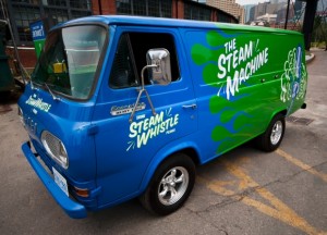
The creative is intelligently simple and always graphically on track with the other pieces in the product line via its clean lines, bold colours, and the consistent retro look. It’s a fun, light-hearted brand and the packaging reflects this, whether we’re talking about the company’s retro van, a 1967 Ford Econoline Heavy Duty that along with an entire fleet of vintage vehicles delivers beer and travels to events around the country, or the clean action of the steam trails in the company logo.
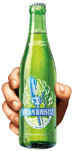
The retro look makes this brand easily identifiable on the shelf, in particular the bright green base colour that is used on everything, including the green bottle, rather than the industry-standard brown bottle. The green bottle is a great retro element, based on vintage bottles from the 1940s and ‘50s.
Smart Packaging
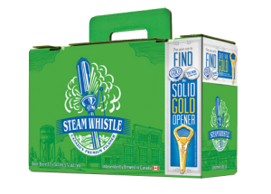
The company calls their packaging “overbuilt.” It is. Steam Whistle redesigned the 12-bottle carrying case; theirs is known as the “suitcase” 12 pack. It has a retractable handle and the top seals itself without the use of glue. It’s an ingenious innovation using die-cutting. The design is also forward thinking because for so long no one changed the format of the 12-pack of beer. It was always a 4 x 3 bottle arrangement with side holes for handles. The “suitcase” is a 2 x 6 pattern and the handle comes straight out of the center of the box so it’s an easy one-handed carry, not prone to tearing.
[/dt_sc_two_third]
[dt_sc_one_third last]
[/dt_sc_one_third]
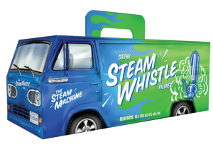
Packaging for the Can Van 10-pack box, inspired by the Steam Whistle Van, is fun, exciting and humorous; it instantly catches your eye on shelf, relying on that vintage look, but with modern packaging development. The perforated rear van doors on the Can Van box open just like the van doors on the back of the Steam Whistle van. This makes it easy to store in the fridge. The Can Van box also uses the same handle as the suitcase, so it’s also easy to carry with one hand without worrying about the handle breaking.
Forward Thinking
Steam Whistle has a very forward thinking approach to its visual identity, both in its package development and graphic design. In my eyes, this synergy makes them one of the most creative companies in package design and development. Their light-hearted, feel-good approach to design consistently comes over as real.
Want a few tips on design or redesign? Download our free re:design e-book.
by Joyce Turner-Gionet | Nov 13, 2015 | Content, Latest, Social Media
Does your marketing message or social media share need to go viral to be effective? How much momentum needs to be behind it?
Viral Marketing; we see it fairly regularly — content goes “viral”. It captures people’s imagination and spreads rapidly. Sometimes it continues to spread long after it’s posted, even years after. If your content’s still being shared months and even years later it says a lot about your content’s relevancy.
“Viral” was a buzzword that appeared in the late 90s. It’s still a buzzword (although I’ve seen more than one post lamenting the overuse of buzzwords, including this one.) Let’s put the term in context. All content you send out through social networks is considered viral if it’s shared. You want content to be contagious. That’s the point. You want people to re-share it. That way your exposure grows exponentially. We all hope for viewing and sharing responses that send our brand soaring into the elite social stratosphere, but that’s rare atmosphere, on a scale that few posts achieve.
A little background on viral marketing
The emergence of “viral marketing” as an approach to advertisement, has been tied to the popularization of the notion that ideas spread like viruses. The field that developed around this notion, memetics, peaked in popularity in the 1990s.[7] As this then began to influence marketing gurus, it took on a life of its own in that new context.
That was years ago and still no one really knows for sure which content will “go viral”. But the common thread contained in all truly viral marketing is that it strikes a chord with people, sometimes universally.
Does the content you’re sharing need to go viral?
Here’s the kernel in this post — does the content you’re sharing need to “go viral”? It does only in the sense that you need to reach the people you want to reach while at the same time extending your reach in order to grow your business and promote your brand. If your content goes crazy, then fantastic, it means massive exposure for your brand. Well done. Rejoice. But your main objective should be to reach your current customers and expand your reach by attracting new customers. And you need to keep all of those people coming back to you for more.
Viral is as viral does. Who are you trying to reach? Are you reaching them? What’s your ultimate objective for your viral marketing? Are you achieving it? You need your message to go viral on a scale that meets your objective? You don’t need to reach the entire universe, you need to reach your universe. Having said that, there’s still lots we can learn from content that goes viral. There are takeaways for all of us in that success. What went viral in 2015? Here’s a post from AdWeek …
Being in the right place is also important to your viral marketing success. Where do the people you want to reach hang out? Are you there with them? Check out this recent post from Social Media Today …
The World’s 21 Most Important Social Media Sites and Apps in 2015.
by Joyce Turner-Gionet | Oct 9, 2015 | Communications, Content, Latest
Typo: Abbreviation for typographical error. AKA fat-finger syndrome.
Typos are not necessarily the same as spelling errors.
In marketing and advertising, we often refer to a spelling error as a typo, but typos are not necessarily the same as spelling errors. The term “typo” originated with the mechanical process of typesetting. You may know how to spell a word correctly, but your finger hits the wrong key. Sometimes we transpose letters, and it’s a case of our brain moving faster than our fingers. Either way, when a typo or spelling error shows up in content, it’s not pretty.
Poor grammar can steal the thunder from that brilliant thought you were eager to share.
Too many typos or spelling errors in a piece can compromise your credibility. Poor grammar can steal the thunder from that brilliant thought you were eager to share. Punctuation rules the rhythm and flow of your piece, so keep it in mind.
What’s the difference between grammar and punctuation?
Once upon a time, writers and editors lost sleep over typos and spelling errors. Nowadays, we sleep easier because much of our content is online. When working with an online publishing platform (e.g., WordPress), corrections are simple: We edit the existing document and then hit the Publish button. Presto, the mistake disappears. One caveat: If the social media content you’ve published has been been picked up by another site before you’ve had a chance to correct the mistake, there’s not a lot you can do other than fixing the root file.
If your piece is going to a printer, go mad with proofing. If a typo makes it into a printed piece, you’ll be left cringing over it for the life of the piece.
Write the way you speak.
Write the way you speak. This piece of advice is particularly relevant for social media. Social media is about conversations and making connections, so a casual tone works well. Slang is acceptable only in certain contexts — use common sense here. We’re definitely more casual in much of our writing today, but …
Spelling, grammar, and punctuation remain important; they’re every bit as important as in formal business writing.
Before you hit Publish …
- Spellchecks are helpful, but … 8 Reasons Why You Shouldn’t Just Rely on SpellCheck.
- Proofread your content more than once.
- Have someone else proofread your content. Even the best writers benefit from a proofreader or editor. What’s up with that: Why it’s so hard to catch your own typos.
- Don’t guess! When you’re not sure, look it up.
- Walk away from your content and go back to it later. You return to it with a fresh eye and may see typos or other errors that you missed on your first go-round. Walking away also provides an opportunity to mull over additional ideas that could make your content richer.
- Don’t let grammar rule you! Grammar has rules, but they can be broken occasionally. Just make sure that if you are going to break the rules, you do so intelligently, with style, and for a purpose.
- Major newspapers (online and in print) often have errors in copy, and they have an entire staff of proofreaders. Errors happen! If you notice one, and it’s too late to fix it, relax. World peace probably isn’t at stake. I’ve included a few funny proofreading blunders, later in this post.
Imagine! Years ago, punctuation didn’t exist. The mysterious origins of punctuation.
While creating content, it’s helpful to have a few authoritative resources nearby. Here are a few of my favourites:
Reference Books (in print):
A Canadian Writer’s Reference
The Associated Press Style Book
These two are particularly fun to browse:
Eats, Shoots & Leaves
Miss Nomer’s Guide to Painfully Incorrect English
Websites:
Oxford Dictionaries
Merriam-Webster
Thesaurus.com
Grammar Girl
Grammarphobia
Apps:
Using a good spelling, grammar, and punctuation app? Let me know and I’ll update this post.
A touch of serendipity …
While writing this post I received an email ‘funny’ about proofreading blunders. (I’d give credit where credit is due but no sources were provided.) A little proofreading would definitely have spoiled the giggles …
Sign in a public washroom: “Toilet out of order. Please use floor below.”
Sign in a department store: “Bargain basement upstairs.”
Sign in an office: “After tea break, staff should empty the teapot and stand upside down on the draining board.”
Outside a second-hand shop: “We exchange anything — bicycles, washing machines, etc. Why not bring your wife along and get a wonderful bargain?”
Notice in a farmer’s field: “The farmer allows walkers to cross the field for free, but the bull charges.”
In a Safari park: “ELEPHANTS, PLEASE STAY IN YOUR CAR.”
In a Laundromat: “Automatic Washing Machines: Please remove all your clothes when the light goes out.”
In a newspaper: “Police Begin Campaign to Run Down Jaywalkers.”
Also in the news: “Panda Mating Fails; Veterinarian Takes Over.”
(Thanks to Yellowknife Girl for proofreading this post before I hit Publish. Any errors after the fact are not her fault.)
by Joyce Turner-Gionet | Sep 30, 2015 | Business Success, Interactive, Latest, Marketing
“On the Journey of Learning.”
I saw this tagline (above) on a big yellow school bus passing me on the highway through Toronto. It’s a beautiful line.
Learning is a journey. If we’re open to it and up for the adventure, it can be a tremendously satisfying lifelong learning journey, with plenty of personal benefits, besides the knowledge we gain.
… when’s the last time you went out of your way to learn something?
The kids have been back in school almost a month now, but what about the rest of us? Are we still on the journey of lifelong learning or did we hop off the bus somewhere en route? When’s the last time you learned something new? More precisely, when’s the last time you went out of your way to learn something?
I’m not talking strictly about job-related learning here, although that’s a wise pursuit that can pay off in spades. I’m also talking about lifelong learning for the sheer joy of it.
Some of us embrace learning? For others, it’s a chore! As kids we naturally love to learn. Think of the number of times you’ve heard a child ask the question: “Why?” Why are there no more dinosaurs? How big is the tooth fairy, why can’t I see her and what does she do with all the teeth? Why are the neighbours’ kids allowed to stay up later than me? Why? Why? Why? Somewhere along the way, many of us lose this ravenous curiosity. Obviously, it’s not because we know everything. Mostly it’s because we get busy. Other, equally important things take up our time: our families, our friends, our jobs, our outside commitments, keeping up with the demands of the day-to-day, our health, even our worries. In our quiet times, learning something new is not often high on the priority list.
Many creative types embrace lifelong learning; it’s part of their nature …
If you’re from a family of learners, it helps. If, as a child, your curiosity was encouraged and your questions respected and answered, it sets you up to be eternally curious and lifelong learning follows naturally. Many creative types embrace lifelong learning; it’s part of their nature — they’re open to new experiences, they think outside of the box, they ask questions, they’re naturally curious.
18 things highly creative people do differently
If you work in the marketing field, you will fully appreciate just how critical it is for you to be open to lifelong learning. Take a year, 6 months or even a few weeks off and something changes, updates, evolves or a completely new social media platform arrives on the scene! Blink and you miss it! Look at the rapid evolution that has taken place in digital marketing alone. Once upon a time, in the olden days (ooh, maybe 5 years ago) digital marketing and social media were considered specialist areas. Now ‘digital’ is a key element in any marketing and communications strategy. It’s our professional responsibility to keep ourselves up to date and relevant as much as we can in order to provide informed, educated guidance to our clients.
We’re never too old to learn and it’s never too late.
My father never touched a computer, but he read the paper, front to back, daily, until just before he died at 89. A world traveller as a young man, he continued to scour the atlas, look up facts in his beloved Pears’ Cyclopaedia and was always up for the challenge of a cryptic crossword. A few years ago, a good friend of mine was in the late stages of cancer. She too was a seasoned traveller and the most committed and eclectic lifelong learner I’ve ever met. She researched constantly for pleasure, taught herself a number of languages and like my dad, could hold an intelligent, thoughtful conversation on a great many subjects. She called me late one night from the palliative care ward in Sunnybrook Hospital: “I feel out of touch with the world. I need to research. Can you bring me a laptop.” That conversation has stayed with me; it remains inspirational. We’re never too old to learn and it’s never too late.
It’s not important what we learn. It’s not important how we learn, because we all learn differently.
The 7 styles of learning: Which works for you?
What’s important is that we continue to learn. It helps to surround yourself with people who like to learn. Lifelong learning is intensely, personally satisfying. It increases our confidence. It makes us more interesting as people; we become better conversationalists. It keeps us in touch with what’s going on in the world. It helps sharpen our thought process. Studies reveal that learning can keep us healthier; it can elevate our mood and make us happier and help stave off illness, particularly age-related illness like Altzheimer’s. 10 benefits of lifelong learning.
The greatest thinkers, people whose ideas change the world, embrace lifelong learning.
A little ‘lifelong learning’ inspiration:
“In times of change learners inherit the earth; while the learned find themselves beautifully equipped to deal with a world that no longer exists.”
– Eric Hoffer (American moral and social philosopher)
“Live as if you were to die tomorrow. Learn as if you were to live forever.
– Mahatma Gandhi (Leader of the Indian Independence movement)
“The best way of learning about anything is by doing.”
– Richard Branson (Humanitarian and founder of the Virgin Group. Interesting fact: Battled with dyslexia, a reading disability.)
“Tell me and I forget. Teach me and I remember. Involve me and I learn.”
– Benjamin Franklin (A founding father of The United States of America; helped draft the Declaration of Independence and the Constitution of the United States.)
This one is a particularly interesting comment on learning: “It is what we know already that often prevents us from learning.”
– Claude Bernard (French physiologist, responsible for the concept of homeostasis.)
It’s the start of a new school year for the kids. What about the rest of us? What are we going to learn this year? I’m a foodie. On a personal level, I’ve promised myself I’ll learn more about herbs and spices and which ones work best with which foods!
Tell me what you’re learning. #SharedWisdom