by Belinda Lui | Jan 26, 2014 | Interactive, Latest
When a business embarks on a site refresh or re-design, one of the key factors to consider is whether search optimization has been implemented in the content that lives on each page. Is the website complicated and busy? Is it intuitive and easy to navigate? While there are many elements to successfully creating a site with search optimization, this post will focus on “busy-ness” and how that may affect your sales:
Using less will give you more when it comes to search optimization.
Consider this as an example:
A recent test was done on MECLABS’ online retail Research Partners and how the team was able to achieve a 10% lift in checkout completion rate by simply removing distracting elements.
The MECLABS team recently ran a test within the checkout pages for an online retailer. The goal of the test was to increase the checkout completion rate. The team identified a number of elements causing friction within the checkout pages and likely distracting visitors from completing the checkout process. The most drastic change was removing the static navigation bars (left and top navigation) from the checkout pages.
This removed visually distracting elements from the pages as well as deleted possible exit points for visitors, keeping visitors focused on proceeding through the checkout process.
The team also took out a page within the checkout process that was simply confirming the visitor had created an account.
This step was unnecessary and forced visitors to make one extra click to proceed through the funnel, giving them an additional opportunity to abandon the funnel, and again, distracted them from the goal of the checkout pages.
By simply removing friction-causing elements from the checkout pages, the team was able to increase the checkout completion rate by 10%, which turned out to be a 19.95% increase in revenue per visit to the checkout process.
When implementing search optimization to your website, you should evaluate each page element and consider whether it is helping the goal of your site or distracting visitors. Any potentially distracting element is an opportunity to test how your pages perform with those elements removed.
Always remember that less is more when it comes to your website. Keep your pages focused and remove any elements that prevent visitors from completing your goals for the site, such as completing a checkout.
by Lindsay Sleightholm | Oct 16, 2013 | Branding, Design, Latest, Marketing
Though I’m a big music fan, I’m not going to pretend I know much about the actual music industry. But I do know a lot about graphic design and have my share of marketing know-how. And I recognize that there’s a lot more to creating an iconic band than great guitar riffs and a good-looking lead singer.
Is a band a brand?
Some bands are just bands. They’re not interested in creating an identity for themselves beyond what their music conveys. Although bands who want to get to the next level know that the business of music is not unlike any other business – it requires the use of marketing, advertising and design. Like anything else, good branding can help distinguish them among the competition. Bands have their own identities. Yet as musicians they’re not just creating music, they’re also shaping a brand persona – whether this was their intention or not.
Does a band need marketing and design?
Just like any other brand, a band needs to find its audience and connect with them. This happens of course through their music. However it is also created by the interactions they have with their audience, their public performances and appearances, their official and unofficial videos on YouTube, their presence on social media and their visual identities.
This is where the marketing and design comes in. Visual identities are created in order to market the music. These identities can end up on every facet of their visual branding – from T-shirts to websites. Some of the most successful bands of all time have made great use of this visual medium.
Band brands
So putting my music tastes aside, I’ll throw on my designer hat for my picks of some of the best in band branding.
Kiss
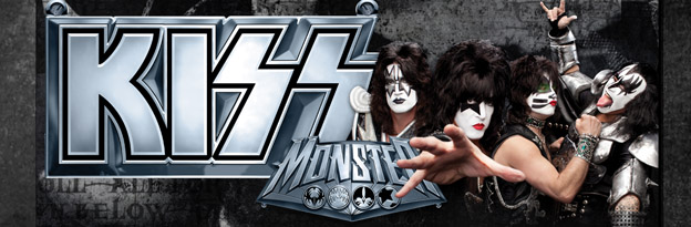
If you google “kiss”, you’ll actually get the band Kiss – which in itself is pretty impressive. Originally known as Wicked Lester, headed by Gene Simmons and Paul Stanley in 1971. But it wasn’t until 1973 that the name change to Kiss came about and a new image was born. The Kiss logo was first developed by their original lead guitarist Ace Frehley, later to be polished by designer and illustrator Michael Doret.
Since then, they haven’t just put it on a few posters and T-shirts – they ran with it. Combined with their trademark make-up and costumes, the entire Kiss brand has been built into a music empire spanning over four decades.
Chicago
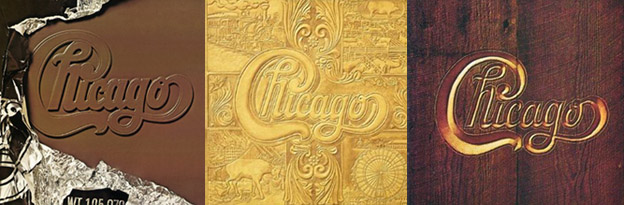
Starting out as cover band The Big Thing in 1967, a name change to The Chicago Transit Authority in 1968 was short-lived due to the threat of legal action from the actual Chicago Transit Authority. By the 1970’s the band became simply Chicago. Their final name logotype was designed by art director John Berg.
That logo has since fronted nearly all of the band’s album covers – taking on a different illustrative style each time – yet remaining true to its original design. It has also earned its place in design history, with a nod from designer and author Philip B. Meggs, in Type and Image: The Language of Graphic Design.

Daft Punk
The French duo that in 1992 was originally called Darlin’, after the Beach Boys song, quickly re-branded themselves as Daft Punk after receiving a negative review describing their music as “a daft punky thrash”.
By the latter half of the 90’s Daft Punk were beginning to not only carve out a place for their unique sound but their solid, albeit unconventional, visual brand. Known now for their look as much their music, the two robot-human hybrids have created an image for themselves without ever showing their faces.
These bands, although completely different in musical genre, have at least one thing in common, they have really taken advantage of branding to boost their identities – as have hundreds of other music greats. The music is their product, but they’ve also crafted a marketable image. And each is an example of how consistent branding can help propel any brand, or band, to the next level.
As most know, a good one-off will only give you your 15 minutes. But great branding, effective marketing and strong design can take what is already unique and give it the stage to really stand apart.
by Daniel | Apr 29, 2013 | Advertising, Creative, Design, Latest
Flyers, brochures and catalogs are used globally and on a massive scale. They are a very cost-effective way to market your product, service, brand or event, and they produce some amazing results if they’re done well. The only problem is that with so many flyers out there already (literally millions), and so many more being produced and distributed each week, it can be very hard to produce something which stands out from the crowd, grabs the attention of the reader and makes an imprint on their memory.
In order to make something like this, which produces the results you’re looking for, you need to make sure your design is different. It needs to be fresh, original and unique – the more different from everything else it is, the better it will perform. In this post I have rounded up some awesome flyer designs to help you in your design project. Try to pinpoint which elements of the designs are consistent throughout and then incorporate that into your design. What is it about each design that draws your attention, are any more memorable than others for you? If so, why. It’s thinking and designing like this which will make the difference between a successful flyer and a complete disappointment.
On to the inspiration:
These flyers should have given you plenty of inspiration, ideas and pointers to take away and incorporate into your own flyer design. If you have any amazing examples of flyers, catalogs or brochures, then please feel free to share them in the comments section!
Once you’re finished with your design and you’re looking for a company to print a catalog, flyer or brochure for you, make sure you select one who provide a manual quality check process every order. Companies that offer this will check your order by hand to make sure it looks exactly as it should, and just as good as it looks on the computer screen. After putting so much work into your design, you don’t want it to fail at the last hurdle, so go with a reputable company.
Stay creative, and good luck with your flyer design!
Author Bio:Daniel has worked in design and marketing for the past 10 years. He enjoys keeping up to date on everything to do with design, print, technology and creativity, and you can find him blogging about these things regularly here and at other top blogs around the web
by Miriam Hara | Dec 24, 2012 | Branding, Business Success, Creative, Design
 I will start this post by saying that this is not a jab at technology nor is it a rant on how business is being conducted today. Promise! Over the last 5 years the way business is being conducted has changed significantly, placing a strain on business relationships. Technology has made business accelerate at warp speed… resulting in many of us being strapped for time, overwhelmed and at wit’s end on how to meet expectations. We now have less time available for face-to-face meetings with clients and our vendor/partners. As emails have become the preferred way of business communications, phone calls are a thing of the past! I’m sure you’ll agree that calling anyone that actually picks up the phone, let alone a prospective client is like winning the lottery!
However, regardless of how the day-to-day business is being managed, ultimately relationships and the building of them is the key to any successful business. Through the years we at 3H, have noticed that quality time spent with clients is at a premium; it has increasingly become more difficult to get our clients and potential clients out for lunch, coffee or even a drink after work. That left us with the challenge of how to nurture and cultivate our relationships with our clients and even some potential clients.
Our approach was really a simply one, and one that was very natural – at least for me. You see I love birthdays. Actually, I love celebrating birthdays (I must admit I love celebrating my birthday most of all!). So every year for the last few years, an annual mandate for the 3H creative and design team is to develop, create and design a birthday card theme that would be carried throughout the year. These cards never go unnoticed. In fact, many who are on the receiving end of our birthday cards are quite touched by the thoughtfulness and are surprised that we remembered them on their birthday.
The irony doesn’t escape me either! A birthday card sent by mail is really a very traditional and low tech approach in business relationship building…. but I must say, it has garnered strong relationships for us. It has been the perfect blend of marketing, design and sales! The cards are all created and designed by the 3H creative team, allowing us to showcase our design and conceptual services. Our cards, of course, are very branded – all are purple and titanium. This not only builds the recognition of the 3H brand… it also illustrates to clients that we are effective brand builders.
Some of the concepts we’ve tackled were: Colorology, Destiny Number, Name Letter Profile, Birth Date numerology. Last year the 3H birthday card featured the Celtic Leaf Profile. The cards we send out are all created and designed by the 3H creative team. Each card is personalized. You can see these on our Pinterest Birthday Board. Feel free to download them and read about your Celtic Leaf Profile. It’s really quite accurate!
I’ll like to end this post by another heartfelt, low-tech message: Happy Holidays to one and all!
by Lindsay Sleightholm | Dec 17, 2012 | Advertising, Business Success, Creative, Design
Marketing and Design must work hand-in-hand. It really doesn’t matter if you have the best creative in the world; without a solid strategic plan to back it up, the message won’t see its full potential. Likewise, if the creative is overlooked for the strategic plan, the message won’t communicate what it needs to. Before delving into any advertising pursuit, a clear idea of what you’re aiming to achieve is essential. The following are some questions that many entrepreneurs have at onset for promoting their business venture.
Why do I need marketing?
Contrary to the hype you may have heard, marketing is not dead. Just like everything else, it’s evolving. What is dead is complacency. It doesn’t matter what business you’re in, if you’re standing still you’ll get left behind. By not continually reevaluating tactics and their efficacy, any business will suffer.
Today’s marketing initiatives need to be nimble. The surplus of new channels available to marketers means a greater challenge to find the best combination for each mandate. Determining that combination requires having the experience and understanding of both traditional and new marketing channels. Online marketing is crucial, but as any experienced marketer knows, you shouldn’t put all your eggs in one basket.
Can’t I just crowdsource design?
You can, but why would you? It will contribute no value to your business. On the surface, crowdsourced design has a certain “gloss” of something professional. But it will inevitably fall short on investment. That is, it won’t perform in the long run. And it won’t be effective communication. Similar to marketing, the creative for your communications is an integral part of your business message.
Graphic design needs to be clear. It also needs to speak clearly to a specific market segment. On top of that, it needs to be flexible. Without forethought into how the design will adapt to various media, it could end up being boxed into a corner. Any effective design solution should be able to cross platforms, channels and languages without hindering the message it’s trying to communicate.
Why do I need both marketing and design?
Marketing and design are a yin yang combination. In other words, their differences combined strengthen each other. Marketing creates the plan for the messaging while design delivers the right message. You could also say the tactics dictate the playground, while the creative shows it’s a fun place to visit.
Speaking of playgrounds, let’s use that as an example. Its marketing plan will take into account who will be using the playground, how they will interact with it and where to place the messaging. The design will address what the playground has to offer, how it will appeal to those using it and why they should check it out. Ultimately, you need to know not only where your market will hang out, but how to speak to them.
What am I investing in?
I used the term “investment” earlier. That’s what good design and marketing is. They don’t represent a cost rather an investment towards your business success. So, if you plan on communicating the benefits of your business to your market, that plan needs to be strategic. And, if you want your market to hear the right message, you need strong creative. What’s more, since you only have one opportunity to make a first impression, by all means make it professional. Effective marketing and design together equals successful communication that will produce results. You can count on it.