by Joyce Turner-Gionet | Dec 9, 2015 | Branding, Creative, Design, Latest, Marketing
The building of a brand icon
“When Andy Warhol wanted a shape to represent mass culture, he drew the [Coca Cola] bottle and when Volkswagen wanted to celebrate the shape of the Beatle, they compared the car to the bottle.” Excerpt from the Coca Cola Journey™: Celebrating 100 years of the Coca-Cola bottle.
How has the little glass Coke bottle transcended continents, cultures, languages and timelines to remain as firmly rooted in our experience today as when it first appeared 100 years ago? How did it get to be a brand icon? Which begs the question …
How does your packaging stack up to that kind of history? Are you a brand icon in the making?
When you check the retail shelf are you already blowing the dust off that packaging redesign you did last year? Every day we’re exposed to great brands with clever packaging. Some of it is truly inspired, but brand icon? That’s the kind of drawing power only a handful of brands command.
This blog was inspired by 3H Senior Designer Lindsay Sleightholm: “I love Coca-Cola branding. I was drawn to it even before I studied to become a graphic designer. Actually, it might have had a little bit to do with my career decision.”
That’s a big statement, but I’d hazard a guess that like Lindsay, each of us has been touched in some way by the allure of the little glass bottle.
Good Design Takes Things Personally
Lindsay: “For me, it started with a Coca-Cola pub mirror that my parents had hanging on a wall in our house when I was young. The copy read: “5¢, Delicious, Coca-Cola Relieves Fatigue, The Most Refreshing Drink in The World,” with a vintage photo of a young girl from the Edwardian era holding a glass of fountain Coke. No one could get away with those claims anymore (let alone the imagery). But back then I was sold. Not in the messaging so much, but in the feelings it evoked.
Today, I have a collection of Coca-Cola memorabilia: bottles, cans, signs, print ads, even an old cooler, and I still have that mirror. As far as antiques go, I don’t think the mirror holds much monetary value. For me, the value is sentimental.”
A brand moves from great to iconic by tapping into feelings and sentiments that are universal. Coca Cola’s advertising holds up a world mirror, reflecting the good times we’ve experienced with a bottle of Coke in hand, and it promises more good times to come, with a Coke in hand.
Good Design Shakes Things Up
Lindsay: “As with anything in branding and package design, it boils down to being unique. Coca-Cola learned this early on. It wasn’t enough to have a great tasting product because competitors could mimic the formula. What they needed was a way to stand apart from their competition. They accomplished this in 1915 with the contour bottle design — an abrupt departure from every other bottle design at the time. The mandate was for a bottle ‘that could be recognized when broken on the ground or by touch in the dark.‘ The design was originally patented and later trademarked. It’s a design that is ergonomic, iconic and as synonymous with the brand as the logo. You only need to see a silhouette of the bottle to know what the product is.”
Timeline: The Evolution of the Coca-Cola bottle.
See what the competition’s doing and then do it differently. Shake things up.
Good Design Walks the Talk Over Time
Lindsay: “The design of the Coke bottle is timeless because essentially it’s remained the same for 100 years and yet it’s still 100% relevant. There have been modifications over the years to allow the bottle to adapt to changing styles and trends in packaging – not so much the shape of the bottle, although that has evolved — but in the materials used to manufacture it. It was originally glass, then plastic, then aluminum, and now with certain skus there’s a return to glass. The bottle design is a perfect example of adapting to changing market demands while remaining true to a clear vision for the brand. Not to mention, ‘everything old is new again.’ Which in the case of the Coke bottle took 100 years.
Coca-Cola hasn’t drifted too far from the original design, so in essence we’ve all grown up with it. The bottle brings a sense of familiarity and nostalgia to people when they see it. Even if you don’t like the product you can’t help relating to it on some level.”
So what’s the message in the bottle?
So what’s the message in the bottle? Clarify your vision and remain true to it. When you find a design that works don’t mess (too much) with it. Coke says it best, recalling the universal backlash to a formula change in 1985: “The fabled secret formula for Coca-Cola was changed, adopting a formula preferred in taste tests of nearly 200,000 consumers. What these tests didn’t show, of course, was the bond consumers felt with their Coca-Cola — something they didn’t want anyone, including The Coca-Cola Company, tampering with.”
The coke bottle is a beautiful design and it remains relevant. But that’s not always the case. As Miriam, Chief Creative Officer at 3H, blogged, “you have to design within the framework of the culture. Even though it hurts to let a beautiful design go, if it doesn’t perform it will be let go eventually and the costs associated will be significant.”
Thank you Coca-Cola for 100 years of keeping it real and building a true brand icon. You’re an inspiration to all of us. If you haven’t seen Coca-Cola’s Celebrating 100 years of the Coca-Cola bottle, check it out, it’s a fascinating look at the life of a fascinating brand.
Want a few tips on how to get your brand’s message in a bottle, bag, box, or whatever shape you think your packaging will take? Download our free re:design e-book.
by Joyce Turner-Gionet | Nov 20, 2015 | Branding, Creative, Design, Latest
As Visual Identity ambassadors, we examine the marketing data we collect through every filter imaginable; we look at trends and we anticipate shifts. We sort and analyze the information to death and it’s important that we do. What we’re doing is looking for truths, looking for what’s real and what resonates with consumers. But as we’ve said before, if the end result — the product and the packaging — don’t reflect those truths, if our efforts don’t come across as real, then we’re wasting our time and our money.
[dt_sc_pullquote type=”pullquote6″ icon=”no” align=”center”]Good graphic designers know good design when they see it. And they know exactly why it’s good.[/dt_sc_pullquote]
I asked the graphic gurus at 3H to choose their favourite packaging design and speak to why they think it’s great. After all, they spend their days working on visual identity for clients and a big part of that is packaging design. We showcase our work on the 3H website, but sometimes it’s nice to step out and give credit to our colleagues in the great big marketing and advertising pond we’re all swimming in. My point? Good graphic designers know good design when they see it. And they know exactly why it’s good. The rest of us non-designers can learn from this…
Today’s blog is courtesy of Kyle McGuire, Senior Digital Designer at 3H.
[dt_sc_title type=”H3″ border=”Yes” align=”Left”]Kyle’s favourite packaging …[/dt_sc_title]
[dt_sc_two_third first]
Analyzing Visual Identity
Featured Brand: Toronto’s Steam Whistle Pilsner
A Toronto microbrewery started by three “fired guys,” who upon being let go from another Canadian microbrewery opened their own because they wanted to “make a Pilsner that would compete with the best in the world.”
Why Kyle likes it?
Intelligently Simple Creative with a Retro Feel
“It’s a very retro, yet clean logo. It’s a visual identity that stands out from the crowd.
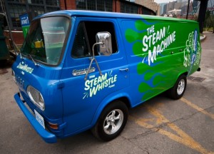
The creative is intelligently simple and always graphically on track with the other pieces in the product line via its clean lines, bold colours, and the consistent retro look. It’s a fun, light-hearted brand and the packaging reflects this, whether we’re talking about the company’s retro van, a 1967 Ford Econoline Heavy Duty that along with an entire fleet of vintage vehicles delivers beer and travels to events around the country, or the clean action of the steam trails in the company logo.
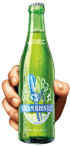
The retro look makes this brand easily identifiable on the shelf, in particular the bright green base colour that is used on everything, including the green bottle, rather than the industry-standard brown bottle. The green bottle is a great retro element, based on vintage bottles from the 1940s and ‘50s.
Smart Packaging
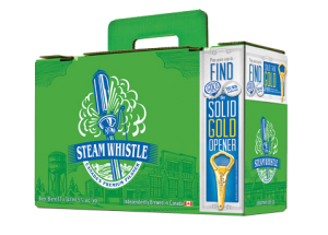
The company calls their packaging “overbuilt.” It is. Steam Whistle redesigned the 12-bottle carrying case; theirs is known as the “suitcase” 12 pack. It has a retractable handle and the top seals itself without the use of glue. It’s an ingenious innovation using die-cutting. The design is also forward thinking because for so long no one changed the format of the 12-pack of beer. It was always a 4 x 3 bottle arrangement with side holes for handles. The “suitcase” is a 2 x 6 pattern and the handle comes straight out of the center of the box so it’s an easy one-handed carry, not prone to tearing.
[/dt_sc_two_third]
[dt_sc_one_third last]
[/dt_sc_one_third]
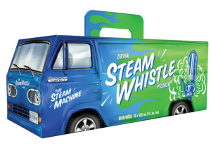
Packaging for the Can Van 10-pack box, inspired by the Steam Whistle Van, is fun, exciting and humorous; it instantly catches your eye on shelf, relying on that vintage look, but with modern packaging development. The perforated rear van doors on the Can Van box open just like the van doors on the back of the Steam Whistle van. This makes it easy to store in the fridge. The Can Van box also uses the same handle as the suitcase, so it’s also easy to carry with one hand without worrying about the handle breaking.
Forward Thinking
Steam Whistle has a very forward thinking approach to its visual identity, both in its package development and graphic design. In my eyes, this synergy makes them one of the most creative companies in package design and development. Their light-hearted, feel-good approach to design consistently comes over as real.
Want a few tips on design or redesign? Download our free re:design e-book.
by Miriam Hara | Sep 14, 2015 | Branding, Design, Latest, Marketing, Social Media
What does your product’s package design say about your brand’s personality? It should say (almost) everything.
If people haven’t seen any advertising for your product, then the first time they’re going to see it is in the store. Think of packaging as Social Media on a shelf – its role is the same: good package design is inherently social, it’s original in that it stands out from its neighbours, it starts a conversation and gets people to connect with it. Creating an engaging brand/product personality is the key to establishing these vital connections. The ultimate retail challenge is getting consumers attention.
… if your product’s package design doesn’t immediately establish a connection with consumers, it’s lost
Unlike the Social Media space, ‘real estate’ is physically limited on a store shelf, so if your product’s package design doesn’t immediately catch the consumer’s eye, it’s lost. This is particularly true if you’re launching a new product and you can’t rely on established brand equity or the halo effect.
The perfect analogy is a book cover
The cover is a book’s packaging. (Typically, authors don’t have much say about the covers of their books, it’s left to those marketing the book.) You’re at the library or in a book store. If you already enjoy the author, you’ll reach for their latest book — that’s brand equity in play. If you don’t know the author, it’s often the cover that attracts you. If it resonates with you, you reach for it. If it doesn’t, you pass over it. It’s the same with product packaging. And the process happens in seconds.
The look and feel of a product’s package design plays a definitive role in consumers’ purchasing choices
Never underestimate the power of package design and the influence it has on purchasing behaviour. Research shows that the look and feel of a product’s package design plays a definitive role in consumers’ purchasing choices.
An excerpt from The Consumer Factor’s website on consumer insights, market research, consumer behavior and neuromarketing …
“According to a recent study published by researchers from the University of Miami and California Institute of Technology in the scientific journal Proceedings of the National Academy of Sciences, the packaging of a food product would have a proven and important influence on the consumer purchase decision in-store. Researchers showed that the aesthetic aspects of products’ packaging (color, brightness, typography, etc.) will influence where the shopper’s eyes will land on the shelf – and thus the products he will look at and the time spent for each product.
The study showed that packaging influences consumers in a ratio of 1:3 or 2:3 compared to their personal preferences. Thus, even if consumer’s tastes have a bigger influence, a product’s visual attractiveness plays a significant part into the decision to buy.”
We make decisions based solely on a product’s package design
Before we even know if we enjoy the experience of the product, we make decisions based solely on its package design. It should go without saying that the inside has to deliver on what the outside promises. If the actual experience of the product is a letdown, the consumer won’t reach for that product again, no matter how smart and sexy the packaging. Packaging, particularly that for a new and as yet unknown product, gets only one chance with consumers, so it’s important to get it right.
Packaging is psychology in action
Packaging is psychology in action, particularly the psychology of design. It requires expertise and creativity to get right. Most important, it demands an understanding of the people who are going to buy your product and that’s where research comes in … who will buy your product? You can’t create personality for your packaging design without knowing your target market intimately.
Good package design tells a story
Good package design is good storytelling. You don’t skimp on the cost of packaging. As I’ve said before, packaging design shouldn’t even be viewed as a cost, good package design is an investment. My next blog will offer 7 quick tips to help you create better product package design.
Additional reading:
by Joyce Turner-Gionet | Sep 9, 2015 | Agency, Branding, Business Success, Communications, Creative, Design, Interactive, Latest, Marketing, Social Media
Rah-Rah, Google! Give us an ‘E’ (but make it crooked!).
Gotta LOVE that crooked ‘e’ in the new Google logo. It’s so Google! Irrepressible, playful. I hear it’s annoying people. They want to straighten it. Personally, I think it’s perfect. Think about it. Leaving the ‘e’ crooked speaks volumes about Google’s personality.
Not everyone agrees with me, Twitter Users Think Google Copied Heineken with its new logo’s crooked ‘e’ (Google kind of admits it.)
All done in house, the rebranding is a composite of three elements: the word mark, a four-colour ‘G’ monogram and animated dots that represent the Google search engine in ‘thinking’ mode. For those who’ve been under a rock, or enjoying the last days of summer up at the cottage, here it is:

New Google Logo

New Google Dots

New Google Monogram
Here’s a reminder of the old Google logo:

1999 – 2015
Here are some Google logo ideas that presumably didn’t make the cut
Here’s why Google did the rebranding …
Says Google … (from the official Google blog)
“So why are we doing this now? Once upon a time, Google was one destination that you reached from one device: a desktop PC. These days, people interact with Google products across many different platforms, apps and devices—sometimes all in a single day. You expect Google to help you whenever and wherever you need it, whether it’s on your mobile phone, TV, watch, the dashboard in your car, and yes, even a desktop!
Today we’re introducing a new logo and identity family that reflects this reality and shows you when the Google magic is working for you, even on the tiniest screens.
Read everything Google said …
Are we impressed?
I asked a few graphic gurus and marketing types across the industry for their opinion on the rebranding:

“Google, with an upper case G … it’s all grown up!”
“The lower case (previous) logo was approachable. With this new logo, Google has maintained its approachability, but made it more mature. More established. The colours and the playfulness with the dots has added to its “fun” nature … almost showcasing its “magic”. Turning questions into a found result. The use of an uncluttered, streamlined font adds to the contemporary nature … the G, unencumbered, is almost futuristic.
More importantly, I love the Alphabet name … the idea. It’s the basis of communications. With letters and building blocks, imaginations soar. What else can we develop? Where else can we go? It offers the ability of each letter to have its significant place in the sun!”
– Miriam H, Chief Creative Officer at 3H
“… suits their position as a search engine (wayfinding system)”
“Overall, it’s a thumbs up from me. The font they used is called Product Sans and was one they created specifically for the new logo and overall rebranding with the animated dots and icons. Similar to the new-ish Twitter icon, it was (mostly) created using only circles and semi-circles. I think it has a much more ‘current’ feel and suits their position as a search engine (wayfinding system).”
– Lindsay S, Senior Graphic Designer
“They’re still leading the way, now with their very own font.”
“It has retained its simple look and colour palette, while bringing a more accessible and contemporary feel. The font also has a uniqueness, a quirkiness, which demonstrates Google’s lighthearted, forward-thinking approach. They’re still leading the way, now with their very own font.”
– Jayne B, Integrated Marketing Manager
“fun and playful”
“I loved the way they presented it, the animation is fun and playful. I like the sans serif font more than the previous serif font. They’ve had the same logo for a long time. The previous logo was dated and the trend is towards sans serif fonts. Nice and chunky. It was a smart move since Google is now owned by Alphabet company. A new beginning for Google and the new logo is a great start.”
– Craig C, Senior Graphic Designer & Mixed Media Artist

“Just another logo”
“Just another logo. Cultural relevance? There’s a lot of talk about this, but I really don’t think it changes much.”
– Jason H, Photographer
“… reminiscent of the avant garde style of the TTC subway signs that came out in the 1950s”
“The new direction of the Google logo makes it easier to display on smaller devices, the switch from a serif to sans serif will make displaying on smaller screens much cleaner and simpler, it will also scale nicely. The thickness also lends itself to displaying more clearly on mobile screens. The change in the Google Icon, the New “G”, now reinforces the colour coding that Google has progressively moved towards, so now even the icon hints towards the growing suite of properties and product offerings. It seems to be a successful step in streamlining the branding of the complete picture of essential elements that Google is trying to put forward. I find it clean, modern and simple, reminiscent of the avant garde style of the TTC subway signs that came out in the 1950s and are still used for everything in the TTC Subway System. I like it.”
– Kyle M, Digital Designer
“Google’s big enough to be brave”
“Rebranding is never easy. You can’t please everyone and it always opens you up to negativity, particularly for a global giant like Google. Not everyone likes change but Google’s big enough to be brave. The clean, linear font ties in beautifully with the Alphabet name that came out of the overhaul of Google’s corporate structure. The company’s new url abc.xyz gave me a chuckle. Nice, clean, modern logo.”
– Mark A, Marketing, PR & Social Media Consultant
“It’s not a WOW logo, but …”
“It’s simple. The colours are very basic. It’s not a WOW logo, but I think that’s the way it should be for Google. Google is not just a company name, it’s a verb, it’s part of our culture. The logo doesn’t need to be beautiful, it needs to be recognizable and it still is. Just like ‘Google Doodles’, the logo gets changed in those but we always recognize it.”
– Yukari Y, Senior Designer
What do YOU think of the new Google logo? Does the crooked ‘e’ bug you? Let me know!
A HISTORY, FROM A TO … no Z, because Google is far from finished changing the world:
From Gizmodo … The Evolution of Google’s Iconic Logo
From Time Magazine … A History of Google Doodles
by Jayne Christopher Bintle | Jul 3, 2015 | Branding, Latest
As we approach the end of the week when we celebrated Canada’s 148th birthday, as a British ex-pat, it’s warming to me to witness the unashamed, and well-justified patriotism of the Canadian people. Their clear sense of pride in being Canadian does not manifest itself as brash or over-the-top; it’s not arrogant or repellent – it’s genuine, heart-felt and respectful – Canada is quietly confident. Canadian’s know they have something special here – that Canada is ‘cool’! Is this, then, the Canadian brand?
As someone relatively new to Canadian life – I moved here with my family just over one year ago – I can only provide you with my perspective. Growing up in Britain through the 70’s, 80’s and 90’s, Canada was always the quiet, conservative and, dare I say it, a little boring, neighbour of the brash and capitalist USA. ‘Outdoorsy’ with their log cabins. grizzly bears, moose and lots of trees – if Canada was a person, they would be robust, red-cheeked, athletic and a bit of a geek!
However, over the last 20 years, Canada’s conservative image has blossomed to become the envy of many countries across the world. People would tell us how much they envied us when we would tell them about our impending Canadian emigration – and it was more about us moving to such an aspirational country rather than us ‘escaping’ British life.
As the second largest country in the world, it is now being recognized as such and it hasn’t had to throw its weight around to achieve this – it’s all happened because Canada is not afraid to just be itself. As the host of the Vancouver Olympics in 2010, Canadians had the opportunity to showcase the true spirit of Canada. We experienced a small hint of what it must be like to live in such a big and beautiful country. Following this, the revelation that, unlike so many other countries, Canada was not part of the financial recession which hit us Brits so hard – Canada was doing just fine thank you very much! So fine in fact, that the Bank of England enlisted the expertise of Canadian Mark Carney as their new Governor, building more credibility for Canada’s ‘brand’!
In recent years a plethora of other famous Canadians from the world of entertainment, such as Jim Carrey, Mike Myers, Shania Twain, Celine Dion have also become household names, not only in Britain, but the world over. So whether it’s to entertain us or save a country from financial ruin, there is a Canadian to suit any occasion – perhaps that should be the Canadian brand strap line!
Yes, if Canada was a company, I’d like to shake its Brand Manager by the hand. From its iconic flag (logo) to its brand ethos and voice, the Canadian brand message is effortlessly emulated through the warmth, positivity, helpfulness, humanity, energy and authenticity of the Canadian people. The Canadian brand is thriving in a world that increasingly demands these attributes of their brands.
In the brash and capitalist 80’s, the USA reigned supreme – it appears now it is time for the ‘nicer North’ brand to shine!