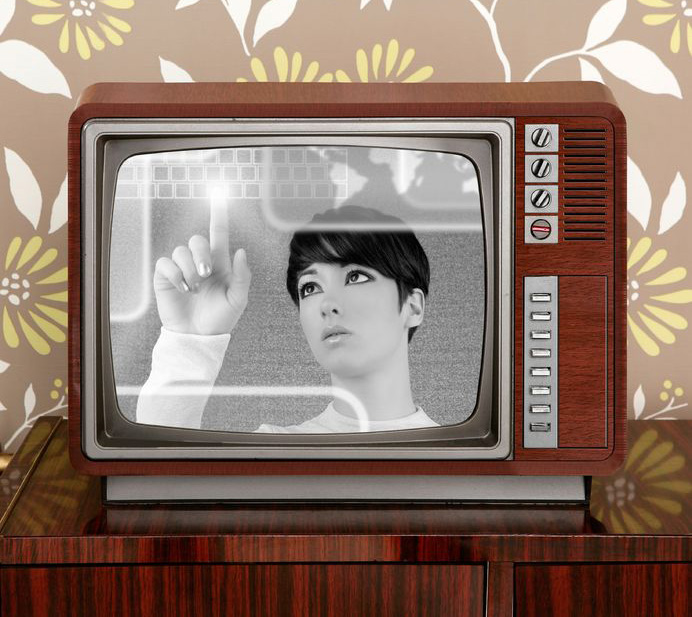
It’s been said that nothing is new, and everything old is new again. Never has that been more obvious than in today’s retro-infused consumer market. The trend towards aesthetics of the past are everywhere: fashion, art, music (the amount of remakes out there are enough to make your head spin), home decor, cars, architecture – you get the point.
So what is “retro” anyway?
According to Wikipedia, retro is “a culturally outdated or aged style, trend, mode, or fashion, from the overall postmodern past, that has since that time become functionally or superficially the norm once again.”
Basically, it’s a blast from the past. And we can’t seem to get enough of it. It’s part of human nature to gravitate towards the familiar. Psychologically, going retro gives the impression of standing the test of time. It has merit. Not to mention, it gives us that warm, fuzzy feeling that we so often crave.

Jumping on the Radio Flyer
Nostalgia seems to be something of a “new” commodity these days. Many are jumping onto the retro bandwagon, and not in an entirely elegant way. A lot of it is far too deliberate. There is no subtle throwback to a bygone era; it’s become outright blatant, down to the letter (or typeface if you will). Some may say it’s actually “retro reinvented,” meaning that it’s taken on a modern spin. But when that modern spin is just a whisper against the overall retro message, it can hardly be considered modern.
Okay, I’ll be the first to admit that I have a definite inclination towards thing of the past. But if Cyndi Lauper were to walk up to me today and ask me to design her new identity, it would not look like something from her earlier albums. Why? Because even she has moved forward. She’s not the same flamboyant performer of her past. She has evolved – not just reinvented, but changed.
Has retro design seen its day?
The primary goal of today’s retro revival seems simply to be to mimic a style instead of creating one. Actual art and design movements of the past were born in large part due to a cultural shift. And for the most part, they generally shifted forward. But there’s no shifting forward with retro design; it’s going back, because that’s what retro does.
Maybe we’ve run out of ideas, or we don’t know how to design for this nameless age. Or maybe we really do want to go back in time.
Graphic design will always have a strong link to its roots. That is, to those who came before and blazed a powerful trail to follow – great periods such as Art Nouveau, the Victorian era, the Industrial Revolution and, yes, even the latter half of the 20th century. But when we lean on the ideals of the past too much, we stop ourselves from moving forward.
Instead of going back, perhaps we should take a moment to think about where we’re going to be in the future. Maybe – just maybe – we’ll like it just as much. And if not, in 20 years it’ll become retro again anyway.
So, what do you think? What else have you’ve seen? Share your examples of the good, the bad and the downright embarrassing of retro graphic design…

