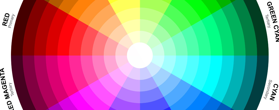
As a creative person, passionate about digital media, graphic design and the visual arts, colour has always been an important factor in my work.
How colours interact with each other or to a specific object can be significant especially in design. The same can be said about how colour relates to your brand and its impact on the consumer and what emotive feeling will be identified with your brand. Will the perception of your brand be a positive or negative behavioural reaction?
Pairing the wrong colour palette with your brand can kill your identity. It’s important to know your target audience, culturally, geographically, gender, age, and also the purpose for your campaign so that you launch your business in the right direction.
Just by viewing a colour in a design, and how it interacts with your brand can completely change or send out a false representation of your brand to the viewer. Colour is such a powerful and important communication tool that it should not be neglected; it is part of our daily actions in life represented in religious, cultural, political and social influences.
Studies have shown when users are shown a bright red hue; it will create a physical feeling of anxiousness and an increase in heart rate. This would not be a good use of colour if used on the interior walls of an emergency room, but if the colour red were associated with food, it would be a positive action to a reaction. You want the consumer to feel hungry and in a response really need to go out and purchase your product.
There is so much more complexity to colour and colour theory and I could go on, but maybe I will save that for another blog.
*Just a note you may want to check out a few of my favourite artist’s that were really the pioneers with colour theory– Wassily Kandinsky and Franz Marc to name a couple.
Marc
http://www.franzmarc.org/The-Red-Horses.jsp
http://artsconnected.org/collection/111185/franz-marc
Kandinsky
http://www.wassilykandinsky.net/

