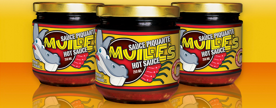
Developing packaging starts with the size and shape of the actual package. The format adds a point of differentiation that is key to consumer pick-up and sales performance. Product packaging is a marketing art. It must speak to the product it houses, tout its benefits and engage the passerby with attractive graphics – enough to pick it up and persuade them to buy it!
It’s a tall order for even the biggest package. Yet, taking a walk down the aisle of a grocery retailer, mass merchandiser or pharmacy retailer, I find that a lot of packaging doesn’t make the cut. Too often I see packages that have “lazy” design. They don’t work hard enough to earn my interest or more importantly, gain my trust in the brand.
Here are 3 brand packaging requirements:
Packaging design is about more than just a pretty on-shelf face, it’s about originality. It requires a lot of design sense to organize all the necessary information on what is usually very little real estate. And no, it’s not about slapping on a stock image to tell a story. I believe in original photography or illustration. How can you show your brand is unique if the one image on its package can be seen in an ad or POP for another brand? It’s about layering design elements to make the package more unique and appealing. Understanding and treating the type to give it propriety, while allowing for design trademark only adds cache to the product. Equally important is the placement of information. It needs to lead the consumer to read the relevant content and assist them in making the right purchasing decision.
Package design must have Brand Charisma. Just like TV campaigns, print ads or any other brand communications, brand packaging must carry the brand character, personality and voice. It has to be all about the brand persona. It may very well be the first piece of communications that your target market sees of your brand; therefore, it must establish its brand style right away. Packages that slap on stock photography to tell the story or don’t pay enough attention to visual and written messaging miss a huge opportunity to stand apart.
Packaging must sell. Getting my attention is half the battle, now you need to talk to me… in the way that I wish to be spoken to. If the product is premium priced (targeting a more affluent consumer), the packaging must reflect that. There’s nothing worse than demanding an elevated retail price for a product while not supporting that emotively! Purchasing decisions, small or large, require cognitive reinforcement. Packaging must speak effectively to its intended consumer.
Ultimately packaging design shouldn’t be viewed as ‘cost of goods sold’. When you are designing your package, seek expert counsel. It’s a marketing initiative, so it’s not the place to start cutting costs. Packaging shouldn’t be viewed as a cost, it should be viewed as an investment.
What are some good examples of solid brand packaging design that you’ve seen? Please share them here.

