by Miriam Hara | Oct 3, 2023 | Agency, Business Success, Communications, Creative, Design, Marketing
What Is Design Thinking?
We all live and work in a world that is constantly evolving and transforming. Design thinking helps guideus through the maze of challenges that traditional problem-solving methods can’t quite navigate. For sure we’ve all encountered challenges and have gotten stuck with a problem and think, “There’s gotta be a better way”? Enter design thinking. Think of it as a buddy system for your brain. It’s about teaming up, caring about the people you’re helping, and coming up with ideas that haven’t been chewed over a million times.
Design thinking is a versatile approach to problem-solving, transcending industries and disciplines.No matter what your profession is…design thinking can help you create innovative solutions that truly matter.
Lets Break It Down In 5 Easy Steps
These non linear steps, rather they are fluid, allowing for continuous refinement and improvement.
1. Empathize: Understand your users. It’s like getting into someone else’s shoes. You gotta feel what they feel. Chat with ’em, hang out, just get their vibe.
2. Define: Frame the problem. So what’s the real issue here? Break it down into simply succinct phrases and make it clear.
3. Ideate: Generate solutions. Time for a brain party! Toss around any and all ideas. Crazy is welcome. Let the creative juices flow!
4. Prototype: Bring ideas to life. Show it! Chicken scratches will do! Make a doodle, a rough thingy—anything to get your idea across.
5. Test: Refine and improve. Can you say research? I can’t say it enough. Get out there! Let your target poke at it, tell you what’s up, and then tweak as needed.
Is It Really Worth It?
Whether its about product design or social innovation, design thinking offers benefits that go beyond simple problem-solving.
Unleash Creativity: Design thinking encourages creativity and innovation. Fostering an “safe” environment, your giving your brain permission to go wild!
Better with Buddies: Collaboration drives innovation. When everyone’s in, ideas get prolific!
Users Dig It: Understand and empathy provides perspective. If your users are smiling…you’ve got a win!
Roll with the Punches: Don’t get propriety about the solution. Being flexing and open to change is the name of the game. Change is cool.
Some Real World Evidence:
- Sharing platform Airbnb was facing a crisis in 2009, with little revenue and lackluster growth. The founders turned to design thinking to identify the root cause of their problems, which turned out to be the quality of their listings. They noticed their photos were kinda meh. They jazzed that up, and now they’re big-time.
- Stanford University’s d.school: The Hasso Plattner Institute of Design at Stanford University, better known as the d.school, has been a pioneer in design thinking education. These professors teach the good stuff. Helping future world-changers do their thing.
- IDEO.org: This non-profit design and innovation consultancy focuses on addressing poverty and social challenges through human-centered design. They’re out there fighting the good fight. From health to learning, they’re making days brighter.
Thinking the Design Way
Embracing this way of thinking is about more than adopting a new methodology—it’s about cultivating a new mindset.
• Feeling is Knowing: Give a genuine listen. It’s cool to care.
• Messy is Okay: Life’s a rollercoaster. Hang tight and enjoy the ride.
• Mix It Up: More minds, more magic. Different folks, different strokes.
• Do the Thing: Whip something up. Test it out. Fix, repeat. Action beats perfection.
Design thinking is so much more than just a problem-solving methodology – it’s a mindset and a way of life. It’s not just some buzzword. For us at 3H, it’s the ‘secret’. We dig it, enabling us to deliver exceptional results for our clients.
by Miriam Hara | Jul 13, 2023 | Branding, Design, Marketing
The influential role product packaging plays in expressing a brand’s identity and values can never be underestimated.
Impactful packaging design is not just about the visuals; it’s also about how effectively it communicates and ‘walks the talk.’ Effective packaging design hinges on several elements. As with anything design or marketing, it should be clear and simple. Customers should understand the product’s purpose, its target audience, and its benefits at a single glance. And more so than ever, in today’s world, honesty is critical.
Apply the “Do No Harm” rule
A package design should not over-promise and under-deliver because this can and will harm brand loyalty. Packaging should accurately represent a brand’s personality. Whether the brand is fun, sophisticated, or quirky, this should shine through in the packaging design. An emotional connection between the brand and consumers is vital, and that often starts with the packaging.
For certain sectors like food, packaging also serves a regulatory role. It needs to comply with the legal necessities of displaying nutritional information and ingredients, which also adds to the brand’s transparency and trustworthiness.
Sustainability in packaging is the new language that your brand must speak, loud and clear.
In the context of the ‘Do No Harm’ rule, packaging must also respect the environment. Sustainable packaging is no longer a ‘nice-to-have,’ but a ‘must-have.’
This calls for a shift towards materials that are renewable, recyclable, or compostable, reducing the ecological footprint. A commitment to sustainable packaging demonstrates a brand’s awareness and responsibility towards the environment, which in turn resonates with the increasing number of eco-conscious consumers. It’s the embodiment of doing no harm not just to your customers, but to the world we all share.
Impactful packaging design, on shelf and on line
Your package design should create impact and command attention, regardless of its location on a store shelf. It should be noticeable and compelling, whether viewed from the top, middle, or bottom shelf. Knowing the placement and position of the brand upfront should weigh into the design of the package. If the brand is positioned on the bottom shelf, the package has some heavy lifting to do. I needs to perform in ways that if the brand was at at eye level.
And know, packaging must also perform virtually. In today’s digital age, the impactful design stance applies to both physical and digital spaces. A brand’s packaging should stand out just as effectively in online marketplaces, maintaining clarity and appeal on any screen size.When it comes to online retail, packaging needs to remain compelling even in the absence of physical interaction. Detailed images and descriptions should help guide the customer’s decision-making process.
Let’s talk about the ‘in’, ‘out’, and ‘on’ of the package
The ‘in’ is about the product itself – it must be of high quality and meet the expectations set by the packaging. The ‘out’ pertains to the external design – the colours, typography, and imagery that should correspond with the product inside. The ‘on’ relates to communication – brand logos, essential information, and the overall message conveyed to the consumers.
All these elements play a vital role in ensuring the brand ‘walks the talk’. Advertising and messaging may initially draw the consumer to the brand (‘the talk’), but it is when they pick the product off the shelf that the brand needs to deliver on these promises (‘the walk’). Any discrepancy can confuse customers and damage brand integrity.
To ‘wrap up’, excuse the pun, crafting impactful packaging design is a delicate balance of aesthetics and strategy, creativity and clarity, and critically, promise and delivery. It’s not merely about standing out on supermarket or pharmacy, any retail shelves or online platforms. Packaging is about consistently representing the brand’s identity, values, and promises. Essentially, it’s about ensuring that your brand not only talks the talk but walks the walk.
Please let me know your thoughts on packaging and what it needs to deliver. Let’s talk!
by Miriam Hara | Jul 7, 2023 | Agency, Branding, Creative, Design, Marketing, Social Media
A brand style guide is more than just a collection of fonts, colours, and logos. It’s the roadmap that leads every piece of your brand’s communication, ensuring consistency across different platforms, media, and teams. An effective style guide is the cornerstone of a strong brand identity, guiding your brand’s voice and visual representation while leaving room for creativity and evolution.
Consider, for instance, the brand style guides of Mailchimp and Shopify. These aren’t just sets of rules or constraints; they are comprehensive narratives that tell the brand’s story.
Mailchimp’s style guide is renowned for its perfect blend of clarity, detail, and brand personality. It outlines the brand’s tone of voice, typographical choices, colour palette, and even provides specific examples of do’s and don’ts. It’s not just an instruction manual; it’s a reflection of Mailchimp’s quirky and friendly brand personality.
Shopify’s guide, on the other hand, strikes an exquisite balance between aesthetics and functionality. It delves into the details of the brand’s visual elements, typography, and even provides guidance for writing product copy. It’s a testament to Shopify’s commitment to providing user-friendly and aesthetically pleasing e-commerce solutions.
So, how do you create a brand style guide that informs, inspires, and tells your brand’s story? Here are some best practices:
Understand Your Brand: The first step in creating a brand style guide is understanding your brand’s mission, vision, and values. What does your brand stand for? Who is your target audience? What is your unique selling proposition? Answering these questions will provide the foundation for your brand’s visual and verbal identity.
Define Your Brand’s Visual Elements: This includes your brand’s logo, colour palette, typography, and imagery. Be specific about when and how to use these elements. Provide clear examples and guidelines to ensure consistency.
Establish Your Brand’s Voice and Tone: Your brand’s voice is its personality, and its tone is how it communicates in different contexts. Is your brand voice professional, friendly, or playful? How should it adapt to different situations? Outline these in your style guide.
Include Practical Examples: Don’t just tell; show. Include real-life examples of how to apply your brand’s style in various contexts. Mailchimp’s style guide, for instance, showcases specific examples of how to use (and not to use) their logo, typography, and colour palette.
Keep It Flexible: A brand style guide should be a living document that can evolve with your brand. Allow for flexibility and updates as your brand grows and adapts to new trends or market changes.
Creating a brand style guide is an investment in your brand’s future. It ensures consistency, aids in decision-making, and sets the foundation for all your brand’s communication efforts. Above all, it tells the story of your brand – a story that is uniquely yours.
Share your brand’s story here…we’ve love to hear!
by Miriam Hara | Jun 28, 2023 | Advertising, Agency, Branding, Creative, Design
Colour is the silent language that speaks volumes about your brand. It’s the first thing that catches the eye, influencing perceptions and stimulating emotions Colours evoke emotions, convey messages, and even influence our decisions. As creatives, we’re not just painting with colours; we’re leveraging them as powerful communicative tools. The right palette can enhance brand recognition, guide user experience, and create visual harmony. It’s more than aesthetics; it’s about understanding the psychology of colour. Colour in creative plays a pivotal role in brand communication and consumer decision-making. Understanding colour psychology can help you choose the right palette for your brand, creating a strong visual identity that connects with your audience.
Consider some of the world’s most recognizable brands.
Coca-Cola, for instance, has leveraged the boldness and energy of red to convey passion and excitement. Facebook, on the other hand, uses calming blue tones to inspire trust and reliability. These brands have effectively harnessed the power of colour to shape their image and resonate with their target audience.
But how do you select the perfect colour palette that represents your brand accurately? The answer lies in comprehending the emotional and psychological undertones each colour carries. Red often stirs feelings of passion, urgency, or aggression. Blue can communicate trust, tranquillity, or melancholy. Yellow typically signifies happiness, vitality, or caution, while green is often associated with nature, growth, or envy. Let’s not forget purple, a colour that can project creativity, luxury, or mystery depending on its use. Every colour carries a plethora of meanings, shaped by cultural, demographic, and individual perspectives.
When choosing colours in creative, consider your brand’s personality and your target audience’s preferences. A brand embodying youth and energy might lean towards bold, lively colours, whereas a luxury brand might gravitate towards a more understated, sophisticated palette. It’s crucial to maintain consistency across all platforms and touchpoints, ensuring your chosen colours align seamlessly with your brand.
Never underestimate the importance of testing and research. Different cultures, age groups, and genders may react differently to certain colours. Employ tools like A/B testing, focus groups, and market research to delve into your target audience’s colour preferences. Remember, colour is not a one-size-fits-all solution. It’s both an art and a science, demanding a thoughtful approach and a profound understanding of your audience. However, when executed correctly, the right colour palette – perhaps featuring a dash of purple… or a whole lot of it! – can significantly bolster your brand identity, shape perceptions, and spur engagement.
So, how can you choose the right palette for your brand or project? Want to learn more about how colour can elevate your brand’s identity and message? Visit our website for more insights or contact us to explore how we can help you create a visually compelling brand identity.
by Joyce Turner-Gionet | Dec 9, 2015 | Branding, Creative, Design, Latest, Marketing
The building of a brand icon
“When Andy Warhol wanted a shape to represent mass culture, he drew the [Coca Cola] bottle and when Volkswagen wanted to celebrate the shape of the Beatle, they compared the car to the bottle.” Excerpt from the Coca Cola Journey™: Celebrating 100 years of the Coca-Cola bottle.
How has the little glass Coke bottle transcended continents, cultures, languages and timelines to remain as firmly rooted in our experience today as when it first appeared 100 years ago? How did it get to be a brand icon? Which begs the question …
How does your packaging stack up to that kind of history? Are you a brand icon in the making?
When you check the retail shelf are you already blowing the dust off that packaging redesign you did last year? Every day we’re exposed to great brands with clever packaging. Some of it is truly inspired, but brand icon? That’s the kind of drawing power only a handful of brands command.
This blog was inspired by 3H Senior Designer Lindsay Sleightholm: “I love Coca-Cola branding. I was drawn to it even before I studied to become a graphic designer. Actually, it might have had a little bit to do with my career decision.”
That’s a big statement, but I’d hazard a guess that like Lindsay, each of us has been touched in some way by the allure of the little glass bottle.
Good Design Takes Things Personally
Lindsay: “For me, it started with a Coca-Cola pub mirror that my parents had hanging on a wall in our house when I was young. The copy read: “5¢, Delicious, Coca-Cola Relieves Fatigue, The Most Refreshing Drink in The World,” with a vintage photo of a young girl from the Edwardian era holding a glass of fountain Coke. No one could get away with those claims anymore (let alone the imagery). But back then I was sold. Not in the messaging so much, but in the feelings it evoked.
Today, I have a collection of Coca-Cola memorabilia: bottles, cans, signs, print ads, even an old cooler, and I still have that mirror. As far as antiques go, I don’t think the mirror holds much monetary value. For me, the value is sentimental.”
A brand moves from great to iconic by tapping into feelings and sentiments that are universal. Coca Cola’s advertising holds up a world mirror, reflecting the good times we’ve experienced with a bottle of Coke in hand, and it promises more good times to come, with a Coke in hand.
Good Design Shakes Things Up
Lindsay: “As with anything in branding and package design, it boils down to being unique. Coca-Cola learned this early on. It wasn’t enough to have a great tasting product because competitors could mimic the formula. What they needed was a way to stand apart from their competition. They accomplished this in 1915 with the contour bottle design — an abrupt departure from every other bottle design at the time. The mandate was for a bottle ‘that could be recognized when broken on the ground or by touch in the dark.‘ The design was originally patented and later trademarked. It’s a design that is ergonomic, iconic and as synonymous with the brand as the logo. You only need to see a silhouette of the bottle to know what the product is.”
Timeline: The Evolution of the Coca-Cola bottle.
See what the competition’s doing and then do it differently. Shake things up.
Good Design Walks the Talk Over Time
Lindsay: “The design of the Coke bottle is timeless because essentially it’s remained the same for 100 years and yet it’s still 100% relevant. There have been modifications over the years to allow the bottle to adapt to changing styles and trends in packaging – not so much the shape of the bottle, although that has evolved — but in the materials used to manufacture it. It was originally glass, then plastic, then aluminum, and now with certain skus there’s a return to glass. The bottle design is a perfect example of adapting to changing market demands while remaining true to a clear vision for the brand. Not to mention, ‘everything old is new again.’ Which in the case of the Coke bottle took 100 years.
Coca-Cola hasn’t drifted too far from the original design, so in essence we’ve all grown up with it. The bottle brings a sense of familiarity and nostalgia to people when they see it. Even if you don’t like the product you can’t help relating to it on some level.”
So what’s the message in the bottle?
So what’s the message in the bottle? Clarify your vision and remain true to it. When you find a design that works don’t mess (too much) with it. Coke says it best, recalling the universal backlash to a formula change in 1985: “The fabled secret formula for Coca-Cola was changed, adopting a formula preferred in taste tests of nearly 200,000 consumers. What these tests didn’t show, of course, was the bond consumers felt with their Coca-Cola — something they didn’t want anyone, including The Coca-Cola Company, tampering with.”
The coke bottle is a beautiful design and it remains relevant. But that’s not always the case. As Miriam, Chief Creative Officer at 3H, blogged, “you have to design within the framework of the culture. Even though it hurts to let a beautiful design go, if it doesn’t perform it will be let go eventually and the costs associated will be significant.”
Thank you Coca-Cola for 100 years of keeping it real and building a true brand icon. You’re an inspiration to all of us. If you haven’t seen Coca-Cola’s Celebrating 100 years of the Coca-Cola bottle, check it out, it’s a fascinating look at the life of a fascinating brand.
Want a few tips on how to get your brand’s message in a bottle, bag, box, or whatever shape you think your packaging will take? Download our free re:design e-book.
by Joyce Turner-Gionet | Nov 20, 2015 | Branding, Creative, Design, Latest
As Visual Identity ambassadors, we examine the marketing data we collect through every filter imaginable; we look at trends and we anticipate shifts. We sort and analyze the information to death and it’s important that we do. What we’re doing is looking for truths, looking for what’s real and what resonates with consumers. But as we’ve said before, if the end result — the product and the packaging — don’t reflect those truths, if our efforts don’t come across as real, then we’re wasting our time and our money.
[dt_sc_pullquote type=”pullquote6″ icon=”no” align=”center”]Good graphic designers know good design when they see it. And they know exactly why it’s good.[/dt_sc_pullquote]
I asked the graphic gurus at 3H to choose their favourite packaging design and speak to why they think it’s great. After all, they spend their days working on visual identity for clients and a big part of that is packaging design. We showcase our work on the 3H website, but sometimes it’s nice to step out and give credit to our colleagues in the great big marketing and advertising pond we’re all swimming in. My point? Good graphic designers know good design when they see it. And they know exactly why it’s good. The rest of us non-designers can learn from this…
Today’s blog is courtesy of Kyle McGuire, Senior Digital Designer at 3H.
[dt_sc_title type=”H3″ border=”Yes” align=”Left”]Kyle’s favourite packaging …[/dt_sc_title]
[dt_sc_two_third first]
Analyzing Visual Identity
Featured Brand: Toronto’s Steam Whistle Pilsner
A Toronto microbrewery started by three “fired guys,” who upon being let go from another Canadian microbrewery opened their own because they wanted to “make a Pilsner that would compete with the best in the world.”
Why Kyle likes it?
Intelligently Simple Creative with a Retro Feel
“It’s a very retro, yet clean logo. It’s a visual identity that stands out from the crowd.
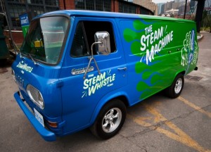
The creative is intelligently simple and always graphically on track with the other pieces in the product line via its clean lines, bold colours, and the consistent retro look. It’s a fun, light-hearted brand and the packaging reflects this, whether we’re talking about the company’s retro van, a 1967 Ford Econoline Heavy Duty that along with an entire fleet of vintage vehicles delivers beer and travels to events around the country, or the clean action of the steam trails in the company logo.
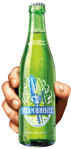
The retro look makes this brand easily identifiable on the shelf, in particular the bright green base colour that is used on everything, including the green bottle, rather than the industry-standard brown bottle. The green bottle is a great retro element, based on vintage bottles from the 1940s and ‘50s.
Smart Packaging
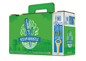
The company calls their packaging “overbuilt.” It is. Steam Whistle redesigned the 12-bottle carrying case; theirs is known as the “suitcase” 12 pack. It has a retractable handle and the top seals itself without the use of glue. It’s an ingenious innovation using die-cutting. The design is also forward thinking because for so long no one changed the format of the 12-pack of beer. It was always a 4 x 3 bottle arrangement with side holes for handles. The “suitcase” is a 2 x 6 pattern and the handle comes straight out of the center of the box so it’s an easy one-handed carry, not prone to tearing.
[/dt_sc_two_third]
[dt_sc_one_third last]
[/dt_sc_one_third]
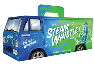
Packaging for the Can Van 10-pack box, inspired by the Steam Whistle Van, is fun, exciting and humorous; it instantly catches your eye on shelf, relying on that vintage look, but with modern packaging development. The perforated rear van doors on the Can Van box open just like the van doors on the back of the Steam Whistle van. This makes it easy to store in the fridge. The Can Van box also uses the same handle as the suitcase, so it’s also easy to carry with one hand without worrying about the handle breaking.
Forward Thinking
Steam Whistle has a very forward thinking approach to its visual identity, both in its package development and graphic design. In my eyes, this synergy makes them one of the most creative companies in package design and development. Their light-hearted, feel-good approach to design consistently comes over as real.
Want a few tips on design or redesign? Download our free re:design e-book.