by Lindsay Sleightholm | Mar 27, 2012 | Branding, Business Success, Creative, Design
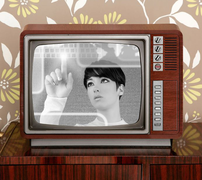
It’s been said that nothing is new, and everything old is new again. Never has that been more obvious than in today’s retro-infused consumer market. The trend towards aesthetics of the past are everywhere: fashion, art, music (the amount of remakes out there are enough to make your head spin), home decor, cars, architecture – you get the point.
So what is “retro” anyway?
According to Wikipedia, retro is “a culturally outdated or aged style, trend, mode, or fashion, from the overall postmodern past, that has since that time become functionally or superficially the norm once again.”
Basically, it’s a blast from the past. And we can’t seem to get enough of it. It’s part of human nature to gravitate towards the familiar. Psychologically, going retro gives the impression of standing the test of time. It has merit. Not to mention, it gives us that warm, fuzzy feeling that we so often crave.
Jumping on the Radio Flyer
Nostalgia seems to be something of a “new” commodity these days. Many are jumping onto the retro bandwagon, and not in an entirely elegant way. A lot of it is far too deliberate. There is no subtle throwback to a bygone era; it’s become outright blatant, down to the letter (or typeface if you will). Some may say it’s actually “retro reinvented,” meaning that it’s taken on a modern spin. But when that modern spin is just a whisper against the overall retro message, it can hardly be considered modern.
Okay, I’ll be the first to admit that I have a definite inclination towards thing of the past. But if Cyndi Lauper were to walk up to me today and ask me to design her new identity, it would not look like something from her earlier albums. Why? Because even she has moved forward. She’s not the same flamboyant performer of her past. She has evolved – not just reinvented, but changed.
Has retro design seen its day?
The primary goal of today’s retro revival seems simply to be to mimic a style instead of creating one. Actual art and design movements of the past were born in large part due to a cultural shift. And for the most part, they generally shifted forward. But there’s no shifting forward with retro design; it’s going back, because that’s what retro does.
Maybe we’ve run out of ideas, or we don’t know how to design for this nameless age. Or maybe we really do want to go back in time.
Graphic design will always have a strong link to its roots. That is, to those who came before and blazed a powerful trail to follow – great periods such as Art Nouveau, the Victorian era, the Industrial Revolution and, yes, even the latter half of the 20th century. But when we lean on the ideals of the past too much, we stop ourselves from moving forward.
Instead of going back, perhaps we should take a moment to think about where we’re going to be in the future. Maybe – just maybe – we’ll like it just as much. And if not, in 20 years it’ll become retro again anyway.
So, what do you think? What else have you’ve seen? Share your examples of the good, the bad and the downright embarrassing of retro graphic design…
by Miriam Hara | Mar 14, 2012 | Advertising, Branding, Business Success, Creative
In today’s social market landscape never has the consumer adage of “What’s it in for me?” been more key in all communications. Today, Brand must be upfront, in the consumer’s line of vision, without selling. Brand must engage with intent, with less frills, less sell and more substance. Social Brand has enabled this. Today ‘advertising’ through the social channels must be informative, educational and add value. The concept of Social Brand has emerged, trumping all other frivolous communications. I am not saying that traditional media is out, quite the contrary, it has a very strong future. It will finally evolve to the place that it should have always been… revenue generating. The emergence of social media with its marketing intimacy and emergence of inbound marketing has proven to be the catalyst for Traditional media. Entertainment value is no longer enough… mind you, the creative of advertising should never have been the focal point of advertising… and now it can’t be, because it is no longer relevant. From a brand’s point of view, it should never have been about creative, because creative doesn’t translate into revenue. Mark Stevens who wrote the book Your Marketing Sucks stated it very clearly: “Marketing that doesn’t suck should be about the revenue, not about how beautiful the advertisement is”.
From the advertising agency’s point of view, the Traditional ad (broadcast, print or out of home) needs to be tied more succinctly to Brand Persona and what the brand is communicating within its other platforms, such as social media channels. It has to be more functional. Being a Chief Creative Officer with a strong heritage of marketing and business, ad evaluation has always been about brand context. My team constantly mimics me “Are we asking the consumer to do too many calisthenics to get to the point?“. It always irks me when I see an advertisement (print, radio, TV, out of home) where the creative won over the brand… when the creative premise/idea/visual was so beautiful that it won out over the primary objective of what the ad was actually supposed to achieve. Answer these few questions when you see an ad that has captivated your attention:
- What is the Brand? (Does it have presence, seen or stated? Does it inspire you to remember it?)
- What is the single message the ad has communicated? (What is the message? Does it speak to the Brand’s Basic Premise and its reason to believe?)
- Does the message hold any relevance for you? (Are they speaking to you, the intended Target Market, in the way you wish to be addressed? Are you the Target Market?)
If you can’t answer all these questions succinctly, then the advertising has failed. Over the years, I have seen ads that are clever and witty, utilizing the latest and greatest animation techniques to create a thing of real beauty… it almost becomes a piece of art – so much so that they win awards, as they are award-winning creative. But do they win sales for the client, for the Brand? That really should be the metrics to measure the success of an advertising campaign. My creative philosophy has always stemmed from my marketing background. As such, when we are brainstorming sessions at 3H, the objective is written out, clearly on the big LCD screen. All creative ideas are scrutinized against the objective and more often than not, the objective is to increase sales.
Don’t get me wrong, there are ads that are beautifully conceptualized, executed and very brand relevant. But, more often than not, advertising loses the perspective that it’s there to promote Brand and deliver on sales, not creative. Achieving the delicate balance of creative and brand… adding in a strong understanding of target psychographics is never easy… but believe me it’s totally doable! Clear concise messaging, with strong benefits, executed with a seamless strategy relevant to the target market is what brand advertising should be all about.
by Angelika Orgacki | Feb 15, 2012 | Advertising, Branding, Creative, Design
Keep it Simple
Whether I’m watching television, driving on the highway or opening a magazine, I am exposed to advertisements. In a consumer world this constant exposure has now become the norm. However, with the immense bombardment of advertisements, it has become increasingly difficult to grab the public’s attention. Having ads that are overwhelmed with information doesn’t help either.
Companies always want to make their brand as attractive as possible, but sometimes the detailed information behind the product is not worth mentioning. Cramming too much information onto an advertisement usually produces more harm than good. When I look around and examine the ads that grasp my attention best, I begin to see a common trend; simplicity works. This is especially so for a company logo.
Graphic designer Lucien Bernhard pioneered the idea of simplicity in advertising when designing a poster for the Priester match company. His initial concept featured a setting made up of a checkered table cloth, an ash tray with a lit cigar emitting smoke in the shape a of woman, and finally the matches on the table. After analyzing his own design, Lucien began to reduce certain elements one-by-one from his ad as his scene contained too many distractions. All that was left in the ad were the matches with no other image supporting the product but the brand name and the connotations of the brand itself. Hence, the Priester match poster is a great example of how sometimes it’s best to just “keep it simple.”

by Miriam Hara | Feb 6, 2012 | Advertising, Branding
Last week there was much talk about the Super Bowl and specifically, of the Super Bowl TV commercials, which is the reason for this post. Over the years, the Super Bowl TV advertisements have been conceptualized beautifully and superbly executed. They have made us laugh, made us talk about them around the “water cooler” and now they have made us “share” them.
The best advertising campaigns are those that show the brand’s features by illustrating the benefits into a memorable 30 second TV commercial, print advertisement, radio advertising, or an online/social media initiative. In short, the ads must be developed to have a one track mind: Brand Recall. Has the creative raised the Brand to be the ultimate star or did the storyline and the execution or special effects become the star? If there are too many creative elements; creative, copy, special effects, design, or information which intrude on the “space”, then you may not necessarily lose your target audience… but you will lose the opportunity of making sure your ad builds brand awareness and recall. This is true of a 30 second TV commercial, billboard campaign, print campaign or online initiative.
Developing campaigns is part of the marketing process, so it’s important that advertising strategies are in line with the marketing plan. It is an extension of the Brand. It must communicate the marketing message though Brand’s persona and its reason to believe. It must without any exception make the brand memorable… not the ad. The objective of any creative commercial advertisement is to Brand Recall. A couple that come to mind are:
Almond Joy and Mounds Ads created an advertising jingle that became their slogan.
“Feel Like a Nut” 1980
Apple
Apple 1984
Bud Light Magic Fridge
“The Magic Fridge” Super Bowl XL Commercial
Chrysler Halftime in America
Chrysler “Halftime In America” Super Bowl XL Commercial
In all of these the creative integration of the features, the promise and the benefits and concept all in one. The Brand is totally integrated.

Next time you are involved in assessing a brand campaign for any media… ask yourself if the proposed concept asks of its audience to do too much to get to the creative message and to your Brand. Here’s a quick checklist:
- Is your Brand Logo and Brand Name prominently featured?
You really don’t want your target audience to say….what was that ad for?
- Does it speak to your Brand’s persona?
Is it too funny? Is it too casual? Is the ad fresh, innovative within the context of your brand?Does it use the right colours?
- Does the creative premise take the product’s features as the main theme?
What is your brand’s competitive edge…its unique selling point and does the advertisement speak to it.
- Does the ad have a single focused message?
You really can’t say it all. Make sure there aren’t too many messages vying for attention. Equally important, is the ad taking off on a creative track that has nothing to do with the intended message. Does the ad show the benefit/experience/promise. Don’t forget, what’s in it for the our intended audience and their psychographics.
- Is the message on brief?
Don’t get caught up in the beauty of the copy or the cleverness of the ad. If it’s not on brief. Then it’s off.
Share with me what you feel is the best advertising campaign (TV, Radio, Social Media, Billboard or Print) you’ve seen that show fabulous creative concept with strong brand recall.
by Miriam Hara | Jan 30, 2012 | Advertising, Branding, Business Success
One of my favourite marketing statements: Having a product and not advertising it… is like well… it’s like winking in the dark. You know you’re doing it… but no one else does! Advertising your product delivers awareness and the fact is… awareness sells.
How to build brand awareness?
Get your brand out there! Converse in media (social media, print, radio, tv… or all!), engage consumers by creating brand critical mass and prompting them to go to the store… checking out an online contest or calling in for a meeting. Advertising is essential in the marketing mix of achieving and building brand loyalty. It goes without saying that you can only have brand loyalty if you have brand recognition and consumers try your brand. Advertising is really just about getting your brand and brand position out there… to reach the consumers who hold value for your brand or service. Social Media has evolved the conversation and has provided a new channel, opening a slew of possibilities in achieving brand awareness: interactive ads such as online banners, viral video and mobile apps. Your website is at the hub of all activity, whether derived from traditional or new media. All this ‘new’ is still cradled with basic marketing sense: the message still must be clear, the audience identified, the strategy must be focused and the objectives have to be defined.
Brand awareness initiatives along with a deep innate understanding of psychographics are the basis of how to market a brand, service or company. It’s imperative that your target audience identify with your brand, so that it becomes part of them, of their culture and resonates with their lifestyle. Simply stated… your brand needs to show up!
by Lindsay Sleightholm | Jan 26, 2012 | Branding, Business Success, Creative, Design
Logos house a great deal of information about a brand and what it stands for, all neatly tied up into one succinct visual. In this era of social media, it is likely the first point of contact between a market and the company it represents; for that reason, it needs to make a great impression.
A lot goes into logo creation. To the casual observer, it seems simple enough. But, there is more to a successful logo design than appears at first glance. A brand logo or company logo carries more than just aesthetic appeal. In essence, a logo is the visual representation of a brand. In other words, it is a symbol that identifies the brand to an audience. As an experienced graphic designer, I can say that every single detail matters when designing a logo, right down to the logo font. I may sound a little biased; however, I’m simply stating the facts.
For a lot of new business owners, a logo is perhaps low on the list of priorities. It is sometimes viewed only as being necessary for presenting their name on a business card. But, make no mistake, a company logo as part of a brand, is actually a living organism and speaks for the business to new clients, representing the business before any live person will.
In a world of media, video, visuals and text rather than face to face communication, a logo actually ranks above personal contact as a first impression. With that said, here is my short list of ‘must haves’ for any successful first impression.
A brand or company logo must be:
-
Unique: It must differentiate itself amongst the competition: Just like your USP (unique selling proposition), your logo has to embody the brand persona.
-
Simple: It has to send a clear message about the brand: Just like your marketing plan it needs to speak to its potential consumer/client base.
- Versatile: It needs to suit a variety of uses: Just like business, it needs to ‘live’ well in all kinds of applications: social media, web design, print, signage, one colour, 4 colour.
- Timeless: It has to age better than people: Just like any product life cycle, the logo has to live a brand life and have the potential to change slightly to reach new markets without losing its existing brand franchise and recognition.
But, don’t take my word for it, see for yourself. Let me introduce you to some of what I feel are the best logos you have already met… what are your faves!
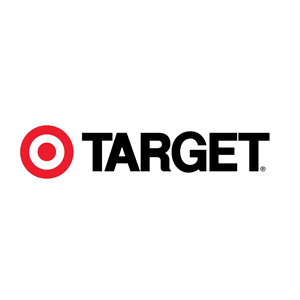
Target

Major League Baseball
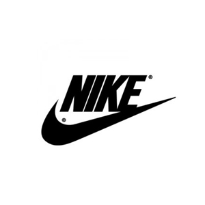
Nike
