When a business embarks on a site refresh or re-design, one of the key factors to consider is whether search optimization has been implemented in the content that lives on each page. Is the website complicated and busy? Is it intuitive and easy to navigate? While there are many elements to successfully creating a site with search optimization, this post will focus on “busy-ness” and how that may affect your sales:
Using less will give you more when it comes to search optimization.
Consider this as an example:
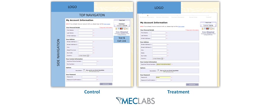
A recent test was done on MECLABS’ online retail Research Partners and how the team was able to achieve a 10% lift in checkout completion rate by simply removing distracting elements.
The MECLABS team recently ran a test within the checkout pages for an online retailer. The goal of the test was to increase the checkout completion rate. The team identified a number of elements causing friction within the checkout pages and likely distracting visitors from completing the checkout process. The most drastic change was removing the static navigation bars (left and top navigation) from the checkout pages.
This removed visually distracting elements from the pages as well as deleted possible exit points for visitors, keeping visitors focused on proceeding through the checkout process.
The team also took out a page within the checkout process that was simply confirming the visitor had created an account.
This step was unnecessary and forced visitors to make one extra click to proceed through the funnel, giving them an additional opportunity to abandon the funnel, and again, distracted them from the goal of the checkout pages.
By simply removing friction-causing elements from the checkout pages, the team was able to increase the checkout completion rate by 10%, which turned out to be a 19.95% increase in revenue per visit to the checkout process.
When implementing search optimization to your website, you should evaluate each page element and consider whether it is helping the goal of your site or distracting visitors. Any potentially distracting element is an opportunity to test how your pages perform with those elements removed.
Always remember that less is more when it comes to your website. Keep your pages focused and remove any elements that prevent visitors from completing your goals for the site, such as completing a checkout.

