Meta-vertising

Let’s face it.

Things have been challenging for print advertising. The rise of social media has made it apparent that online, mobile content gives clients more opportunities when trying to leverage sales.

The recession also didn’t help.

You’d think advertising budgets would go down, but is that really true?.

New trade ads show print media is investing in advertisements for advertisers – defining their readership in order to attract the right ones.

In the good old days, publications were the platform, period.

But according to Nielsen ratings, Canadian ads fell 21 per cent in the last year. And so print must respond, “We are worthy!”

Despite global cuts to ad funding, more and more publications have chosen to invest in their own in-house marketing departments and now ad revenue is climbing.

Media buyers and advertisers are selecting ad space with a critical eye and marshalling traffic for strategic placement.

The market is pressing reset, and largely distributed publications are launching these sophisticated marketing outfits in order to (re)define their readership and attract the right consumers.

The Globe and Mail’s Globe Media have launched a campaign that “gives a glimpse inside the lives of [Globe & Mail readers].” Oxygen magazine went so far as to label their ideal reader as the “O Generation,” creating a trade ad, which depicts a young, fashionable blond woman carrying an iPod™.

Savvy of their image, modern print media is strengthening their revenue backbone, turning the financial tables by controlling what they have, in the past, relied so heavily on.

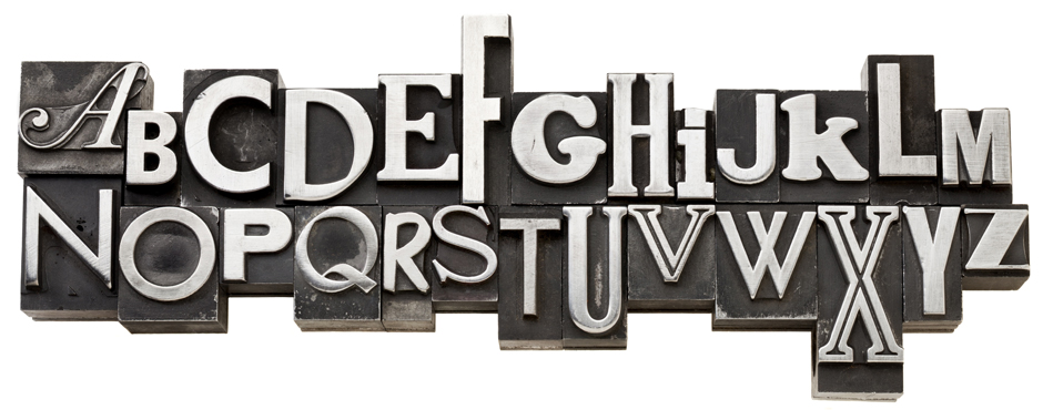
Typography: In the Headlines

Typography, although not known to many outside of the design field, is a huge factor when it comes to print and interactive media. A lot of the toil and sweat goes unnoticed in those 2-10 key words that usually make up headlines. It is a subtle art, and is not as simple as some have surmised – the ability to convey a message that marries the design perfectly. It is an integral process of the design strategy. It can’t be obvious, has to be understated – yet it has to be bold enough to marshal attention. A good headline could even be the entire base of a creative.

Think of the creative dynamic as a sturdy table, and the headline is the top of the table, where all the ideas sit, and the design, copy, creative are the legs.

A good headline not only conveys an instant message, but also embodies the concept of the ad total. It can’t compete with the visual, it has to make the visual snap into a conscious place in the ad viewer’s conscious – and it has to aim to stay there.

The message has to be clear, but the typography should somehow embody it.

TypographyTypography is no accident – just look at your ads and decide – what really catches your eye? What do you remember? If typography wasn’t essential, do you think most corporations would bother regulating their font types? (ie. Apple’s most notable success found with the now iconic Adobe Myriad, and the market’s constant notice of its change.)

3 things to remember:

Positioning : placement tells a story

Size and font type: sets the tone and feel

Content: Consider what will make the design memorable