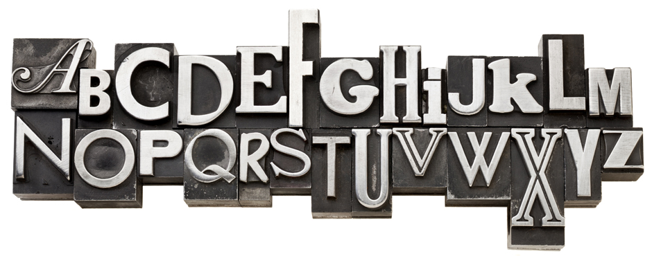
Typography, although not known to many outside of the design field, is a huge factor when it comes to print and interactive media. A lot of the toil and sweat goes unnoticed in those 2-10 key words that usually make up headlines. It is a subtle art, and is not as simple as some have surmised – the ability to convey a message that marries the design perfectly. It is an integral process of the design strategy. It can’t be obvious, has to be understated – yet it has to be bold enough to marshal attention. A good headline could even be the entire base of a creative.
Think of the creative dynamic as a sturdy table, and the headline is the top of the table, where all the ideas sit, and the design, copy, creative are the legs.
A good headline not only conveys an instant message, but also embodies the concept of the ad total. It can’t compete with the visual, it has to make the visual snap into a conscious place in the ad viewer’s conscious – and it has to aim to stay there.
The message has to be clear, but the typography should somehow embody it.
 Typography is no accident – just look at your ads and decide – what really catches your eye? What do you remember? If typography wasn’t essential, do you think most corporations would bother regulating their font types? (ie. Apple’s most notable success found with the now iconic Adobe Myriad, and the market’s constant notice of its change.)
3 things to remember:
Positioning : placement tells a story
Size and font type: sets the tone and feel
Content: Consider what will make the design memorable

