by Lindsay Sleightholm | May 15, 2012 | Advertising, Business Success, Creative, Design
As creative professionals, we all know that it’s not always easy to communicate the thinking behind design solutions to a client. There are several reasons for this. If it’s a new client, they may have yet to trust your expertise, or you have yet to earn their trust. Another scenario, is that the client may not have enough experience or knowledge of design and branding. Lastly, it could be because the creative you presented pushes the client beyond their comfort level.
No matter what the reason, there are going to be times when you need to make that extra effort to communicate just exactly why your fantastic concept is so… well, fantastic. Chances are, if the client is reluctant in any way, you won’t sell them on the idea. So, in order to avoid going back to the drawing board, try to minimize the margin of error with better client communication.
Here’s 5 tips to maximize your client communication…
1. Start with the basics.
Refer back to the brief. Knowing and having an understanding of the goals the client had in mind is crucial to achieving a solution. Reiterate what was first given as the creative and strategic mandate and tie it directly into the creative solution you’re offering. After that, explain the thinking process that took place for you to reach your creative solution.
2. Don’t use too much design lingo.
Many clients don’t have a background in marketing or design, so it’s best to refrain from throwing out terms that the client may not be familiar with; it’ll only lead to more confusion and frustration on their part. Instead of talking about hierarchy, typography, negative space or Gestalt principles, express these intentions in more universal terms like “focus,” “eye path” and “emphasis.”
3. Show it.
Most clients – and people for that matter – are much more inclined towards visuals than words. Present clear, polished creative options to your client. But don’t just leave it at one solution. It may require a lot more legwork, but an effective and professional client presentation means providing multiple options. As we as creative professionals know, there’s always more than one way to achieve a solution. Give your client the opportunity to see those other options.
4. Throw in a little 101.
Although you don’t want to overwhelm them with industry jargon, you do want your client to get a peak at the method behind the madness. Sometimes that means educating them about the principles of design and the strategy behind the marketing. If your client doesn’t understand these strategies or principles, try explaining it to them. But again, break it down into ideas and terms they can relate to.
5. Listen and address concerns.
Sometimes the brief may have been followed to a ‘T’, but ends up not ringing true for what the client actually wanted. In that case, ask questions and listen to the answers. What’s not working for them? How are your concepts different from what they expected? Dig around a little and find out where you and your client’s thinking differs. It may mean taking a step back to reevaluate the goals and possibly reworking the creative. But it’s important to realize and respond to these concerns so you have more effective communication in the future.
Bottom line: The communication you have with your client can make the difference between a good relationship with them or a bad one. You want them to trust in your expertise. The easier you make it for them to do that, the better it will be for you both. However different your backgrounds may be, finding that common ground will allow for the possibility of greater success on both sides.
What other tips can you share about successful client communication?
by Lindsay Sleightholm | Apr 30, 2012 | Branding, Business Success, Creative, Design
Pantone. What a beautiful word. It just rolls off the tongue.
As any designer knows, Pantone provides a collection of numbered spot colours that cannot be reproduced in CMYK. It is device independent, thus ensuring solid, accurate colour reproduction every time. Basically, it means “I want this colour – I get this colour.”
Pantone guides are now a staple of the graphic design industry. In fact, most designers can easily name their favourite swatch; mine’s 485.
Humble beginnings
It’s hard to believe Pantone has only been around for 50 years. The organization started out as a small print company in New Jersey, and was propelled forward with the help of a then temporary employee, Lawrence Herbert.
Herbert was hired fresh out of university and had originally planned on going back to school to study medicine. His plans changed, and in 1962 he bought them out. A year later he introduced PMS (Pantone Matching System) and, in doing so, revolutionized the business of colour.
Today, Pantone is known as the global colour authority, with millions of brands banking on Pantone ink to ensure consistent identity colour.
Drool-worthy
As with any successful brand, the company expanded – and somewhere along the way came the swag.
I remember when I received my first Pantone mug as a gift. I was thrilled and, of course, wanted more. With a heads-up from a colleague, I visited my local Chapters store and was overjoyed to find a colourful pyramid display of bright, shiny Pantone mugs. It was like a little piece of designer heaven against a backdrop of lattes and magazines.
While I was standing in line to purchase the second piece in what would surely become an abundant and drool-worthy Pantone collection, the question occurred to me: “Pantone in Chapters? Has Pantone gone… mainstream?”
The Pantone Universe
Today, what was once reserved only for designers, creatives and the print industry has now indeed become part of the mainstream. Perhaps even more quickly than the introduction of additional colours, Pantone is now churning out consumer products.
It’s become much more than a standardized colour system, and enveloped a market far greater-reaching than it initially intended. In fact, anyone with an appreciation for colour and branding can get their hands on scads of Pantone-inspired items courtesy of the fast-growing “Pantone Universe“.
The universe expands
The Pantone Universe – as one would expect by the name – is a full-fledged cosmos comprised of products from the Pantone brand.
In addition to clothing, accessories, electronics and housewares, the Pantone Universe also includes the Pantone Hotel, which is as brand-infused as you’d imagine. (Incidentally, if you happen to be headed to Brussels and book far enough in advance, you can stay the night for under 100 Euro.)
Then, of course there’s Pantone’s newly introduced line of cosmetics. Partnering with Sephora, the Pantone Universe is banking on the lure of its booming brand – as well as its colour of the year, Tangerine Tango – to entice cosmetics buyers to open their wallets.
Zero to hero
I don’t know about Tangerine Tango, but I’m okay with just my Pantone mugs for now. I don’t really need a whole universe.
But my thoughts are mixed about whether or not it’s a good thing that this universe even exists. In one respect, it’s amazing to the see the complete transformation of a brand from zero to hero. In another, I do hope it keeps its roots intact and holds strong to the goals on which it began.
Either way, no one knows how far the universe reaches. But as long as the Pantone entity remains true and authentic, the sky’s the limit.
What are your thoughts on the rise of Pantone?
by Lindsay Sleightholm | Apr 19, 2012 | Advertising, Branding, Business Success, Creative, Design
Psychology has always strived to create measures for how to categorize one’s aptitude and behaviour based on brain function. “What’s your IQ? What’s your EQ? What do you see in this ink blot?” There are innumerable tests designed to determine how we as people think and process information.
Mapping Psychology
The cognitive tests, models and theories based on studying the human mind can help us determine individual and group responses to certain stimuli. With this research, we have a better understanding of the differences in the way people think.
Taking into consideration the theory that our brains function differently from person to person, yet can be categorized into different groupings, we can also divide people into right brained and left brained. This of course is nothing new. The basic understanding of right vs. left brain is that the right brain controls creativity, visual and spacial perception and thinks “big picture” and ideas. The left brain controls logic, maths and sciences and thinks “practical” and reality based solutions.
The right brained tendency
Personally speaking, I have always been categorized by others as a “right brained” person – long before I had an understanding of what that truly meant. I’ve taken the tests online, seen the dancer spinning clockwise and sometimes even counterclockwise. When I wash the dishes, sometimes I stack them neatly and other times I balance them precariously in a pile. But, I can say that I believe I do have a right brained tendency – tendency being the key word.
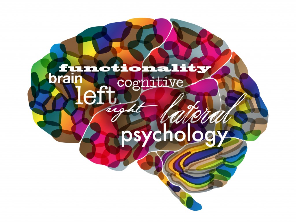
So, who are right brained people?
There is a lot of theory as to what makes the right brained person tick. According to my go-to source, Wikipedia: “The processing of visual and auditory stimuli, spatial manipulation, facial perception, and artistic ability are represented bilaterally, but may show a right hemisphere superiority.”
Of course, not everyone with a right brained tendency has the same behaviour and thought patterns. The same is true for those with a left brained tendency. Although, there seems to be enough common ground (or mind) that these hemispherical categorizations can and have been made.
What’s the point?
The point is, even with all the research, individuals with a right brained tendency are not that well understood. They don’t typically fit the mold. However, right brained thinkers have contributed to some of the greatest discoveries and creative masterpieces we’ve ever known.
A few likely right brained thinkers
- Thomas Edison
- Michelangelo di Lodovico Buonarroti Simoni
- Pablo Picasso
- Rembrandt Harmenszoon Van Run
- Walt Disney
- Nelson Rockefeller
- Hans Christian Anderson
- Leonardo da Vinci
- Sir Winston Churchill
- Benjamin Franklin
- John F. Kennedy
- Wolfgang Amadeus Mozart
- John Lennon
- Louis Pasteur
- Orville and Wilber Wright
- Alexander Graham Bell
- Ludwig Van Beethoven
- Thomas Jefferson
- George Washington
- Vincent Van Gogh
- Agatha Christie
- Ernest Hemmingway
- Mark Twain
- Anna Roosevelt
- King Gustav IV of Sweden
- Albert Einstein
- Marie and Pierre Curie
- Socrates
- Galileo Galilei
- F. Scott Fitzgerald
- Abraham Lincoln
- Steven Spielberg
Bottom line
Don’t underestimate those right brained people that you know. Perhaps they have more clarity of thought than you realize. And, don’t be surprised when they come up with a really good idea seemingly out of nowhere. I have the privilege to work with some exceptional creative thinkers who have strongly developed right brains. Do you?
What do you think about the theories surrounding right brained psychology?
by Lindsay Sleightholm | Mar 27, 2012 | Branding, Business Success, Creative, Design
It’s been said that nothing is new, and everything old is new again. Never has that been more obvious than in today’s retro-infused consumer market. The trend towards aesthetics of the past are everywhere: fashion, art, music (the amount of remakes out there are enough to make your head spin), home decor, cars, architecture – you get the point.
So what is “retro” anyway?
According to Wikipedia, retro is “a culturally outdated or aged style, trend, mode, or fashion, from the overall postmodern past, that has since that time become functionally or superficially the norm once again.”
Basically, it’s a blast from the past. And we can’t seem to get enough of it. It’s part of human nature to gravitate towards the familiar. Psychologically, going retro gives the impression of standing the test of time. It has merit. Not to mention, it gives us that warm, fuzzy feeling that we so often crave.
Jumping on the Radio Flyer
Nostalgia seems to be something of a “new” commodity these days. Many are jumping onto the retro bandwagon, and not in an entirely elegant way. A lot of it is far too deliberate. There is no subtle throwback to a bygone era; it’s become outright blatant, down to the letter (or typeface if you will). Some may say it’s actually “retro reinvented,” meaning that it’s taken on a modern spin. But when that modern spin is just a whisper against the overall retro message, it can hardly be considered modern.
Okay, I’ll be the first to admit that I have a definite inclination towards thing of the past. But if Cyndi Lauper were to walk up to me today and ask me to design her new identity, it would not look like something from her earlier albums. Why? Because even she has moved forward. She’s not the same flamboyant performer of her past. She has evolved – not just reinvented, but changed.
Has retro design seen its day?
The primary goal of today’s retro revival seems simply to be to mimic a style instead of creating one. Actual art and design movements of the past were born in large part due to a cultural shift. And for the most part, they generally shifted forward. But there’s no shifting forward with retro design; it’s going back, because that’s what retro does.
Maybe we’ve run out of ideas, or we don’t know how to design for this nameless age. Or maybe we really do want to go back in time.
Graphic design will always have a strong link to its roots. That is, to those who came before and blazed a powerful trail to follow – great periods such as Art Nouveau, the Victorian era, the Industrial Revolution and, yes, even the latter half of the 20th century. But when we lean on the ideals of the past too much, we stop ourselves from moving forward.
Instead of going back, perhaps we should take a moment to think about where we’re going to be in the future. Maybe – just maybe – we’ll like it just as much. And if not, in 20 years it’ll become retro again anyway.
So, what do you think? What else have you’ve seen? Share your examples of the good, the bad and the downright embarrassing of retro graphic design…
by Lindsay Sleightholm | Mar 8, 2012 | Business Success, Creative, Design
Okay, so as designers, we all loved “You know you’re a graphic designer when…”. For those of you who weren’t around or don’t remember, this was a viral list of some of the many oddities and unique characteristics that describe graphic designers. It was a little tongue-in-cheek, and for the most part, it really rang true.
When it first hit the web a number of years ago, it was extremely well received. I remember being huddled around a single computer in the studio with the rest of the designers. We all shrieked in delight about how much we related to it and about how much we really had in common with each other. Many similar lists spawned from the same idea. You can Google pretty much anything on the end of “You know you’re a” and come up with a list.
But, why did we like it so much? Perhaps because we felt someone took the time to get to know us. Well, they may not have really known us, but they touched upon aspects of ourselves that we could relate to. Someone articulated things about who we were that we may not have even realized. And, they not only made sense, they made us laugh and think about ourselves in a different way. That connection is what we gravitated to and why we shared it with everyone.
It is that same connection we as creative professionals still strive to achieve with our design and communications. We want our audience to know that we took the time to get to know them. We want them to think about something differently. We want to appeal to who they are as individuals and provide them with a message they can relate to.
In a world that’s getting a lot smaller, where we’re constantly inundated with messages – a lot of which are just noise – we want to have a clear voice that can speak to our audience and achieve that desired connection. So, how do we do that? We ask questions, we listen, we share and we learn. We then take what we know and apply it to our work. Hopefully, at the end of the day, that attention to detail has made a difference – not only in what we say, but how we say it.
On that note, how about reviving the list for today’s designer, just for fun? And this time, let’s make it a quiz… are you a graphic designer?
- When selecting a greeting card, do you opt for the better design over the perfect sentiment?
- Do you ever wonder how it’s legal to have the names of street signs horizontally scaled to fit the allotted space?
- Have you ever tried to command/control ‘S’ while reading a web page that you weren’t finished with?
- Do you feel that if someone touches your monitor it’s an intrusion upon your personal space?
- When you discover the list of web safe fonts has been added to, do you feel the need to high-five someone?
So, how did you do? Or, better yet, what questions would you rather ask?
