by Lindsay Sleightholm | Apr 19, 2012 | Advertising, Branding, Business Success, Creative, Design
Psychology has always strived to create measures for how to categorize one’s aptitude and behaviour based on brain function. “What’s your IQ? What’s your EQ? What do you see in this ink blot?” There are innumerable tests designed to determine how we as people think and process information.
Mapping Psychology
The cognitive tests, models and theories based on studying the human mind can help us determine individual and group responses to certain stimuli. With this research, we have a better understanding of the differences in the way people think.
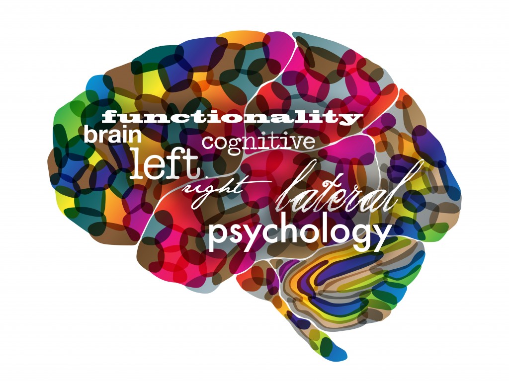
Taking into consideration the theory that our brains function differently from person to person, yet can be categorized into different groupings, we can also divide people into right brained and left brained. This of course is nothing new. The basic understanding of right vs. left brain is that the right brain controls creativity, visual and spacial perception and thinks “big picture” and ideas. The left brain controls logic, maths and sciences and thinks “practical” and reality based solutions.
The right brained tendency
Personally speaking, I have always been categorized by others as a “right brained” person – long before I had an understanding of what that truly meant. I’ve taken the tests online, seen the dancer spinning clockwise and sometimes even counterclockwise. When I wash the dishes, sometimes I stack them neatly and other times I balance them precariously in a pile. But, I can say that I believe I do have a right brained tendency – tendency being the key word.
So, who are right brained people?
There is a lot of theory as to what makes the right brained person tick. According to my go-to source, Wikipedia: “The processing of visual and auditory stimuli, spatial manipulation, facial perception, and artistic ability are represented bilaterally, but may show a right hemisphere superiority.”
Of course, not everyone with a right brained tendency has the same behaviour and thought patterns. The same is true for those with a left brained tendency. Although, there seems to be enough common ground (or mind) that these hemispherical categorizations can and have been made.
What’s the point?
The point is, even with all the research, individuals with a right brained tendency are not that well understood. They don’t typically fit the mold. However, right brained thinkers have contributed to some of the greatest discoveries and creative masterpieces we’ve ever known.
A few likely right brained thinkers
- Thomas Edison
- Michelangelo di Lodovico Buonarroti Simoni
- Pablo Picasso
- Rembrandt Harmenszoon Van Run
- Walt Disney
- Nelson Rockefeller
- Hans Christian Anderson
- Leonardo da Vinci
- Sir Winston Churchill
- Benjamin Franklin
- John F. Kennedy
- Wolfgang Amadeus Mozart
- John Lennon
- Louis Pasteur
- Orville and Wilber Wright
- Alexander Graham Bell
- Ludwig Van Beethoven
- Thomas Jefferson
- George Washington
- Vincent Van Gogh
- Agatha Christie
- Ernest Hemmingway
- Mark Twain
- Anna Roosevelt
- King Gustav IV of Sweden
- Albert Einstein
- Marie and Pierre Curie
- Socrates
- Galileo Galilei
- F. Scott Fitzgerald
- Abraham Lincoln
- Steven Spielberg
Bottom line
Don’t underestimate those right brained people that you know. Perhaps they have more clarity of thought than you realize. And, don’t be surprised when they come up with a really good idea seemingly out of nowhere. I have the privilege to work with some exceptional creative thinkers who have strongly developed right brains. Do you?
What do you think about the theories surrounding right brained psychology?
by Madi Secareanu | Apr 16, 2012 | Advertising, Branding, Business Success, Creative, Interactive, Social Media
There’s no doubt that social media has changed the marketing landscape significantly within the last few years. There’s always something new; a new social networking site this year, a new app tomorrow, a new feature next week, a new enhancement next month…social media is constantly in flux. I think what makes it so successful is not only it’s ability to re-invent itself, but it’s ability to re-invent itself while keeping its core proposition intact – social media, for brands, for marketers, for individuals, helps tell a story.
What is social media storytelling?
The concept of brand storytelling is not a new one; it’s just also been re-invented to social media storytelling. Brands aim to take their consumers on an emotional journey by connecting with them, to create a demand by appealing to a consumer’s wants, needs and desires. That is the essence of social media storytelling. This connection is very important and partly the reason why social media has emerged as the ideal tool to tell the brand story and connect, more personally and more emotionally, with existing and potential customers.

Take a look at the new Facebook Timeline for example; it’s essentially a storyline. A storyline driven by the brand and enhanced by its followers. It’s about generating and amplifying stories, and because of this, timeline helps brands become better storytellers. How does it do this? Well getting people(followers) involved for one, they can help bring their own unique perspective to your brand, and helping facilitate that emotional bond between brand and consumer. But its layout is really what sets its ability to tell a story apart. Timeline speaks to a story about a brand’s history and its present but it’s designed with the future in mind. The bigger emphasis on visuals makes more impact – images often make better stories and the Millstones feature helps highlight important dates and facts that are essential to the brand’s (hi)story.
Pinterest, for example, is based on visuals. It tells a brand story through images, and how far can a brand go if the only images they feature are product images? With Pinterest, brands must show the bigger picture (pun intended). What inspires the brand? What type of lifestyle does the brand fit into? Pinterest is about going beyond the product and about creating a more complete story around a brand, visually.
Let’s not forget Twitter. It’s immediacy has been the reason brands have had such success with it – it helps brands tell quick and interesting stories while connecting with followers on a more personal level. I, for one, love when I tweet about a brand and they immediately acknowledge it by commenting or retweeting – I feel like they care about my story and how it fits into theirs.
Every brand has a story, and social media is here to help tell it in a more engaging way. How do you help contribute to the brand story through social media storytelling?
by Christine Marr | Apr 12, 2012 | Branding, Creative, Design
Our reaction to colour is subliminal. As consumers, we are generally unaware of the persuasive effects of colour. Psychological effect is instantaneous, stimulating the senses and power of suggestion. We see it in every level of communication: in corporate identification and logos, signage, advertising on tv, billboards, in print media and packaging, on the computer and in-store. As we zip down isles in our favourite stores, our eyes rest on a package for approximately .03 seconds. In that blinking-of-an-eyelash timing, the packaging/sign/logo must rivet the observers’ eyes, inform them of the product, and, more importantly, appeal to their psyches.
I doubt I am saying anything new here. However, last week, we went to visit a client at their office and what happened there, prompted me to take note about colour and how we identify with it. We hadn’t been to Dentsply Canada’s office in a little over six months. As we walked through the door, the receptionist glanced up and said “…from 3H?”. Wow, that completely floored me. We make a point of always wearing purple when we see clients, because purple is the dominent 3H brand colour. This was enough for the receptionist to remember our visit from 6 months ago. We, at 3H, are strong believers in Brand Recognition!
We practice what we preach. While we clearly know and acknowledge that it takes much more than colour to build a brand… what you do with a “brand” colour clearly enables and facilitates brand recognition. Colours are so intimately associated with a brand that just the suggestion of a colour is enough to bring a brand to mind. That’s isn’t simply amazing… it’s awesome in building equity.
Think about this…
When you think of Home Depot, what colour comes to mind?
Which bank is “blue”, which one is “orange”, and which one is ‘green”? Close your eyes and picture the Google logo. The McDonald’s logo? And for my Canadian readers… what is meant by the “Windsor” blue.
Our reaction to color is instantaneous and this lens is a quick look at general responses based on research, historical significance of color and word association studies. Let’s take this one step further… picture the Home Depot logo, but with different words in the same font in the orange box… would you still recognize it? Would you see the logo as a whole, as one image, and recognize it instantly, associating it with Home Depot.
So when developing a brand and beginning with the basics of creating a logo… choose a colour that would represent your brand identity effectively for now and the future…And repeat after me….
Repetition, repetition, repetition… consistency… everywhere… all the time. Exposure over time ensures success….. but that’s a different point of discussion! Colour makes a brand stand out and command attention and make sure that the Logo colour matches your brand mission and message to create the brand identity you want.
So what do colours mean anyway? Here’s a brief overview.
Green occupies more space in the spectrum visible to the human eye than most colours. Green is the pervasive color in the natural world, making it an ideal backdrop in interior design because we are so used to seeing it everywhere. Green is considered the colour of peace and ecology.
Purple embodies the balance of red’s stimulation and blue’s calm. This dichotomy can cause unrest or uneasiness unless the undertone is clearly defined, at which point the purple takes on the characteristics of its undertone.
Blue is seen as trustworthy, dependable, and committed. As the collective colour of the spirit, it invokes rest and is calming.
Yellow shines with optimism, enlightenment, and happiness. Shades of golden yellow carry the promise of a positive future. Yellow will advance from surrounding colors and instill optimism and energy, as well as spark creative thoughts.
Pinks are youthful, fun, and exciting, while vibrant pinks have the same high energy as red; they are sensual and passionate without being too aggressive. Pink is the color of happiness and is sometimes seen as lighthearted.
Orange sparks more controversy than any other hue. There is usually strong positive or negative association to orange and true orange generally elicits a stronger “love it” or “hate it” response than other colours. Fun and flamboyant orange radiates warmth and energy.
Understanding colour and what they represent is important in establishing a brand persona. In today’s world of fast communication and overload of visual stimuli, it is more than vital that brand expresses its identity at the blink of an eye.
If you had to define your personality as a brand colour, what would it be?


by Madi Secareanu | Apr 9, 2012 | Advertising, Branding, Business Success, Creative, Interactive, Social Media

On or around March 30th, you may have noticed that Facebook has automatically changed your brand page to Timeline. While some were resistant to the change, let’s remember that if we don’t move forward, we get left behind and for brands on Facebook, hopping on board and getting to know the new Timeline is imperative. The nature of the Facebook brand page has changed so here are some of the pros and cons of the new Timeline for brands: Pros
- Visuals Traditionally social media has focused on words, but as we’ve seen with Pinterest, visuals are starting to have a more significant impact. With Timeline, brands now have more visual space to work with. There is now a large cover photo, a profile photo and larger photo stories. Brands can also pin images to the top of the Timeline. Apps are also now visually represented under your cover photo. This is very valuable for consumer engagement and creating a dynamic page.
- Highlighting and Pinning A great opportunity for brands to showcase important content and engage followers. By pinning a story or an image, it automatically gets priority on your page, remaining at the top of the timeline for up to 5 days. It lets important posts “cut through the clutter” and drives attention to what’s new or what’s important to your brand’s followers.
- About The “About Us” section has been given a facelift. Right below your cover and profile photos you now have a small “About” space where you can write an engaging description about your brand. The “About” link found right below this description takes you to a page where you can share more comprehensive information about your brand.
Cons
- No more default landing tab Currently working on several Facebook campaigns, I’ve realized that the loss of the default landing tab has really changed the way brands can drive people to their Facebook pages and promotions. Facebook has taken away the privilege of putting promotions, welcome pages, or other customized apps as default landing pages. Brands have to get creative – and use the available features to support and promote Facebook campaigns on Timeline.
- Cover Photo Restrictions Putting restrictions over the kinds of images that brands can use in their cover photo can be a good thing if they are limiting offensive and inappropriate content. However, Facebook has restricted the option to encourage new followers to “Like” a brand, show promotional and brand information or use a call to action in a cover photo. Considering that the default landing page option has also been removed, a cover photo without these restrictions could have been a useful area for brands to showcase new and exciting promotions or important information.
At 3H, we’ve embraced the new timeline. But what do you think of the new Facebook Timeline for brands: Like? Or Dislike? Does it give brands more or less opportunities to successfully market themselves on Facebook?
by Miriam Hara | Apr 5, 2012 | Advertising, Branding, Business Success, Creative, Social Media
Is the way we are communicating SAFE? Has the less “physical” interaction that we are now all adopting with so much enthusiasm curtailed our ability to develop original thinking and thought provocative inventions and innovations? Has being faceless allowed us to be impolite, rude and COLD?
Humans have never been more “social” then in the present… and yet, recently, on a discussion I posted on Linkedin, I received one statement that left me quite chilled! My discussion point was very succinct: Is the way we communicate digitally impacting negatively on the way we network in business or not? This discussion topic, based on a post to our company blog Hoopla, written by one of my colleagues about the “social in social media.”
With the onslaught of social media, the ability to communicate has never been easier nor more immediate. But does more mean less? Is the quality of the communication and the connection as important or as necessary as it was in the past, a mere 2 or 3 years ago? Has our ability to be considerate been diminished by the fact that we can be impersonal. That we are one step removed from the person trying to connect with us. No longer is a voice or a face to the conversation reminding us that there is a person at the other end of the communication. We have become fonts and letters.

In my original discussion, there was much conversation over how relevant the Connections were and that having replaced the “personal” in the interaction with a computer screen that communication has become faceless. The one comment that I previously referred to was stated by a fellow group member from the Marketing Executives Group, Caron Hughs , and it is the one I really would like your opinion on. This statement is the reason for this post.
“… There are few left who practice manners in acknowledging a phone call, or an email. It is far easier to ignore someone’s plea for help if you are not looking into their eyes. It is far easier to miss a career changing proposal because you are too busy to read an email or return a phone call. We are becoming a very SAFE society in the way we communicate … and there are no manners, or “outside of the box” thinking in our communications. We choose to respond to what is safe and what is familiar … and from that the great new ideas that could be born to life in a collaborative effort are fading away. Even in entertainment … could there be any more remakes from stories of old or copycat competitions born from the original’s success?”
When I read her comment, it made me realize how much of what she said is accurate. You only have to look to fashion, listen to music, look at design and see how re-inventing the old has become the norm. Where is the trend-setting? What is new and novel? Even Lady Gaga… has taken so much of Madonna… in attitude but also in sound and music. Madonna was the first, Micheal Jackson was a first, the Beatles were a first and so were the Rolling Stones. They were and are original. They made the moves. They struck the cords. They established the trends. Okay, so that is music…. what about fashion? Dare I say sunglasses…. big buggy sunglasses, or how about the new Aviator look? And let’s speak to design… Retro is in!!! Yes indeed… everything new… well, isn’t.
So has social media and the ease of communication lessened our ability to think outside the box because we spend so much time staring into a frame….so to speak?
What are your thoughts on this?
by Miriam Hara | Apr 3, 2012 | Advertising, Branding, Business Success, Creative
Way too often, ads are filled with too much information and lots of copy. How does that happen? Why does it happen? I can almost hear the collective grumble from all my peers saying…. “Clients!” But I believe that laying blame at the doorstep of clients, absolves us, the creative professional of any blame. I believe as Creative Professionals, it is our role to accommodate but also to advise. In my experience, once you explain the reasons why you shouldn’t do something , or even show them what is being compromised, clients really do get it.
Just think back… even recently and consider this:
- Ever watch a TV commercial and say, I don’t get it?…. or worse, what’s the brand? Remember the Head On ad?

- Drive and spot an outdoor billboard and you can’t read the caption because there’s too many words like the one below…. and the type is so small?

- Flip through a magazine ad and miss the total point of the ad? Like this one.

It always amazes me that there are ads that actually get to the marketplace without a clear single focused message. Or the creative is sooo out there, that it doesn’t circle back to the brand or to the product. This is a particular pet peeve of mine, as I just recently wrote an entire blog on this issue! An ad (any kind of ad) shouldn’t be closing the sale…. it should be generating interest… It needs to communicate benefit and to engage consumers enough so that they take action. Ads were never meant to replace sales people! They were meant to increase awareness of a product and service and increase the knowledge of the benefits within that product or service. Ads are meant to get traffic, whether it’s a website or a physical location.
So the next time you face a challenge, think back on what makes you a creative professional. Advertising isn’t about pretty pictures and for it to work there are certain protocols that need to be followed. At times it can be challenging, but that is what our profession is all about. How often are we faced with and given mountains of information to decipher and create a single succinct statement that says is all. Or given so many logos and visual elements to layout into a visual flow that directs the consumer’s eyes and makes sure that the main message is delivered. The minute we let go of this basic standard, then everyone and anyone who owns a computer can “create” an ad. All they need is Indesign or Illustrator knowledge.