by Lindsay Sleightholm | Jun 28, 2012 | Business Success, Creative, Design
If an image is worth 1000 words, combine that image with text and the actual meaning behind the image becomes clearer. The variable of 1000 different words is reduced to only those that are necessary. This is not to say an image cannot speak on its own – many talented photographers, illustrators and artists can attest to that. Nonetheless, image and text together create a more focused message and is the root of great advertising. Further, the chosen typeface not only speaks with the image, it also speaks for itself.
Let’s start with typography
The origins of typography can include the first forms of written language and date back to about 3000 B.C. with Cuneiform by the Sumerians. However, it wasn’t until about 1440 A.D. when Johann Gutenberg created the printing press utilizing moveable type that typography as a craft really took off. This involved the process of printing by use of type blocks made of metal with raised letterforms that could be inked and pressed into a substrate.

What is the role of typography?
The roles of typography, typographic style and the typeface as parts of visual communication have evolved over the ages. Fast forward to today, within the information age (digital age) and there isn’t much we can’t do with type. We have many different tools and methods for working with typography. However, the principles behind it have not changed much since Gutenberg’s contribution. Ultimately, the role of typography should remain to honour content.
So, what’s in a typeface?
A typeface in itself is a visual. If you do not understand the language presented in type, you see it only as a visual. Although, a typeface is much more than it would appear at first glance. It is ruled by legibility, but also communicates through the form of it’s characters to provide meaning.
As designers and creatives know, we all have quite an attachment to the typefaces we work with. Unlike images, typefaces as elements are the ones that we refer back to on more than one occasion, so much so, we know most of them by name. Also, we know their “personalities” and which one of them would pair best with any given image.
A good typeface as part of a design can be compared to a good orchestra as part of a stage production. The music is heard and felt, but does not bring undue attention to itself. It aids the message. This happens not just through its personality and style, but also the mesh it makes with its image counterpart. It is the partnership of these elements that create a complete spectacle. If one overshadows the other, the message may suffer.
Respect for the typeface
If typefaces are ruled by legibility, we also need to consider their readability. As designers we aim to strengthen the meaning conveyed by a typeface through proper setting, size and placement. After all, any good “face” deserves that much. Without respect for the typeface, and its letterforms, many beautifully designed and legible typefaces can lack readability.

Where is typography now?
Well, through its many evolutions, typography has been handcrafted, mechanized and digitized. With these advancements in technology our relationship with typography has become strained. The speed, ease and flexibility that we have been afforded also means the time consuming task of attention to type can sometimes suffer.
Generally speaking, typefaces have been battered and bruised, scaled, pushed, prodded, stretched, outlined and sometimes just ignored entirely. However, as with any good element, the well intentioned and humble typeface continues to hold strong to it’s rightful place in graphic design.
Once upon a time (and not that long ago), there was an entire industry dedicated to typesetting. The specialized role of the typesetter was to govern the accuracy of the text component in conjunction with the designer’s visuals. Now, the role of designer includes typesetting. Graphic designers hold sole responsibility towards the success of typography within visual communication.
“By all means break the rules, and break them beautifully, deliberately and well.”
– Robert Bringhurst: The elements of typographic style
A good typeface should be embraced for its succinct presence, rather than written-off to optical software. So, let’s all just remember for a moment how much our typefaces mean to us, and how we can best show off their strengths.
What role does typography take in your design and more importantly, how much attention do you give it?
Further reading:
The Elements of Typographic Style
Typographic Design: Form and Communication
Type and Image: The Language of Graphic Design
Stop Stealing Sheep & figure out how type works
by Madi Secareanu | Jun 20, 2012 | Branding, Business Success, Creative, Design
Change is inevitable and as your business changes, so will your brand. With a lot of hard work and dedication to your brand, your customers might come to recognize you, your colours and your voice as much as your products or services. Depending on where your business stands you may consider a rebrand or a brand evolution to breathe new life into your brand and reach new consumers. Rebranding or evolving your brand can:
- make it more current
- develop or improve your brand identity
- increase sales
- differentiate you
In recent years there have been several high profile rebranding and brand evolution exercises. In 2011 Starbucks rebranded to support it’s international go-to-market strategy. Note that they removed their name “Starbucks Coffee” from their logo as they are no longer just about coffee. Pepsi is notorious for rebranding itself at least once a decade and Wal-Mart famously up-grated their brand in 2008. What these three brands have in common is not only their size but the frequency with which they rebrand themselves, and the level of familiarity they’ve maintained while appealing to new consumer generations and demographics. They all also have a substantial and loyal customer base and their iconic status no doubt helped make the transition from the old to the new brand more seamless.
 * source: starbucks.com
Be cautious though – if you have a growing brand, one that is building recognition and loyalty – a rebrand might not be the right thing to do. Taking away the elements that make your brand top of mind might hurt more than help your growth. But if you feel that your company is ready and could benefit from a rebrand, consider the following:
Why do you want to rebrand or evolve?
Ask yourself the following questions. Are sales low? Is your brand recognition suffering? Is your image outdated? Do you want to reach a new demographic or target market? Make sure that it’s the right strategy to achieve your goals – a rebrand isn’t just about making your brand look nice. It is a risky endeavor but if done correctly, it can help your business tremendously.
Develop a plan and strategy
How are your going to rebrand or evolve yourself? Is it going to be a complete overhaul, just the logo, the positioning or the tagline? The packaging? Moving your business forward requires a plan and a strategy and it doesn’t end with a new look – a new business strategy might require a rebrand and vice versa.
Don’t forget the past
This is key to retaining brand recognition and customer loyalty. The reason why Pepsi, Wal-Mart and Starbucks have been successful was because they didn’t stray much from the past. They were inspired it but they evolved. The familiar elements were retained and improved.
Focus on the future
You may take some elements of the past with you but remember the reason you’re rebranding in the first place – the future. You want your business to grow with the times. Your rebranding efforts should be able to stand up for at least a decade or two. Don’t go with anything too trendy or language that could be outdated. Keep it fresh yet timeless.
Consider your customers
Ultimately a rebrand or evolution is about the consumer. You can hire the best rebranding experts in the world but if your consumers don’t relate, you’ve make a big mistake. You must consider your costumers. How will they respond to your rebrand? Hold a focus group and have them review your rebranding efforts. Do they resonate? Do they still recognize and relate to your brand? Are they more inclined to buy? Then there are also the new consumers, ones that you could gain by appealing to them through your rebrand, the ones that may not be familiar with your current brand.
Just last year we updated the 3H brand identity that included an evolution of our logo, new typography, updated corporate colours and a website redesign. We kept elements of the past – the purple is our brand but the redesign helped us evolve into the 21st century of brand marketing. Our rebranding efforts don’t stop with us, we have helped clients such as Trispec evolve their brand with a new logo, positioning statement and brand visual, Liquid Nutrition with a rebranded vocabulary and Agropur, updating their Aged Cheddar packaging and website.
What elements do you think are essential to a successful rebrand?
by Lindsay Sleightholm | Jun 1, 2012 | Business Success, Design
To spec, or not to spec: that is the question
As a graphic designer, I understand the need to build your portfolio, expand your client base and stretch your creative muscles as much as possible. But from one creative professional to another, I feel compelled to urge you not to participate in spec (speculative) work – including design contests and crowdsourcing.
What is spec work? It’s submitting creative or graphic design to a potential client who hasn’t yet agreed to pay you for that work. As a result, that potential client can offer up any type of possible compensation, or, I should say, the possibility of compensation – without legally promising anything. And you may never see a dime.
Need an example?
All right, let’s say Company X launches a promotion calling for entries for the design of their new logo. In return, they’re offering a $250 prize to the winner – plus, the bragging rights that go along with having published work. What’s more, no experience is necessary. If you win, there is also the possibility to include that piece in your portfolio, opening the doors to many more opportunities in the future. Sounds great, right?
Well, there are a few more questions you need to ask yourself before proceeding with your contribution. First of all, why is Company X using a contest to develop their new logo? Why not just hire a designer? Do they not have the funds to actually pay for graphic design? Is this actually what my time and skills are worth? Will this really lead to more opportunities from bigger clients in the future?
Amateur or professional?
There are certain groups of individuals that are within the rank of amateur. Amateurs often are going through the process of participating in competitions in order to hone their skills and improve their rank. There is a judging panel that decides final rank and ultimately a winner. Typically, this also means no payment is received. Some of these include Olympic athletes, voice, dance or acting talent hopefuls.
On the other side of the spectrum, there are professionals. These individuals are paid to perform specialized tasks. Graphic designers are within this category. Unfortunately, as is common practice within the industry, there is a process called “pitching” to a potential client. This is generally understood, as mandated by clients, as being spec. To any agency, this means their creative potential is cut short by having only the limited information given within the brief. In addition, the agency may or may not be informed that they have competition. Ultimately, it is the time, concepts and designs of the creative team that are presented; yet, these individuals are the only ones around the boardroom table who will not be paid to be there.
Why is it that creative professionals should have to take on gratis work, that in effect, puts them in the category of an amateur?
Is spec work bad?
When it comes to spec work, “bad” may not be the right word to choose. “Unethical” would be more appropriate. “Risky” might be even better.
By not having a solid agreement in place between the designer and client, there’s greater risk for the designer. The designs offered up could potentially be used without the designer’s knowledge, and he or she is by no means guaranteed compensation. Even the prize initially promised could end up being less than advertised. What at first seemed like a nice, shiny carrot could later resemble little more than scraps.
As a designer, you’re not the only one who may lose out from being part of a design contest. Spec work devalues the entire graphic design industry. It drives down the going rate for design work, while driving up the misconception that graphic design can and should be acquired as cheaply as possible. Put simply, it makes it difficult for everyone else in the industry to be respected for their worth.
We all make mistakes
Okay, so now you know a little more about spec work. Think back to that contest you entered a few months ago. You put a lot of hard work into that design, and sent it off with high hopes of being chosen as the winner, right? I’m guessing not much resulted from that entry. If you were lucky, maybe you got a “thank you” for a job well done. Does this sound familiar to you?
Everyone makes mistakes. What’s important is learning from them and passing on those lessons to others. Instead of entering contests, there are much more effective ways to build up your experience and credibility. If you haven’t already, get yourself on LinkedIn, visit your local design council, or talk to that friend-of-a-friend who knows someone in the industry. Fostering good relationships with your peers is a much more reliable way to further your career.
While we’re on the subject, here are some great resources for learning more about spec work:
• AIGA, the professional association for design (AIGA – USA)
• Society of Graphic Designers of Canada (GDC – Canada)
• No!Spec (international)
There are always different sides to the same story. This is my view. I’d like to know your view on spec work.
by Lindsay Sleightholm | May 15, 2012 | Advertising, Business Success, Creative, Design
As creative professionals, we all know that it’s not always easy to communicate the thinking behind design solutions to a client. There are several reasons for this. If it’s a new client, they may have yet to trust your expertise, or you have yet to earn their trust. Another scenario, is that the client may not have enough experience or knowledge of design and branding. Lastly, it could be because the creative you presented pushes the client beyond their comfort level.
No matter what the reason, there are going to be times when you need to make that extra effort to communicate just exactly why your fantastic concept is so… well, fantastic. Chances are, if the client is reluctant in any way, you won’t sell them on the idea. So, in order to avoid going back to the drawing board, try to minimize the margin of error with better client communication.
Here’s 5 tips to maximize your client communication…
1. Start with the basics.
Refer back to the brief. Knowing and having an understanding of the goals the client had in mind is crucial to achieving a solution. Reiterate what was first given as the creative and strategic mandate and tie it directly into the creative solution you’re offering. After that, explain the thinking process that took place for you to reach your creative solution.
2. Don’t use too much design lingo.
Many clients don’t have a background in marketing or design, so it’s best to refrain from throwing out terms that the client may not be familiar with; it’ll only lead to more confusion and frustration on their part. Instead of talking about hierarchy, typography, negative space or Gestalt principles, express these intentions in more universal terms like “focus,” “eye path” and “emphasis.”
3. Show it.
Most clients – and people for that matter – are much more inclined towards visuals than words. Present clear, polished creative options to your client. But don’t just leave it at one solution. It may require a lot more legwork, but an effective and professional client presentation means providing multiple options. As we as creative professionals know, there’s always more than one way to achieve a solution. Give your client the opportunity to see those other options.
4. Throw in a little 101.
Although you don’t want to overwhelm them with industry jargon, you do want your client to get a peak at the method behind the madness. Sometimes that means educating them about the principles of design and the strategy behind the marketing. If your client doesn’t understand these strategies or principles, try explaining it to them. But again, break it down into ideas and terms they can relate to.
5. Listen and address concerns.
Sometimes the brief may have been followed to a ‘T’, but ends up not ringing true for what the client actually wanted. In that case, ask questions and listen to the answers. What’s not working for them? How are your concepts different from what they expected? Dig around a little and find out where you and your client’s thinking differs. It may mean taking a step back to reevaluate the goals and possibly reworking the creative. But it’s important to realize and respond to these concerns so you have more effective communication in the future.
Bottom line: The communication you have with your client can make the difference between a good relationship with them or a bad one. You want them to trust in your expertise. The easier you make it for them to do that, the better it will be for you both. However different your backgrounds may be, finding that common ground will allow for the possibility of greater success on both sides.
What other tips can you share about successful client communication?
by Lindsay Sleightholm | Apr 30, 2012 | Branding, Business Success, Creative, Design
Pantone. What a beautiful word. It just rolls off the tongue.
As any designer knows, Pantone provides a collection of numbered spot colours that cannot be reproduced in CMYK. It is device independent, thus ensuring solid, accurate colour reproduction every time. Basically, it means “I want this colour – I get this colour.”
Pantone guides are now a staple of the graphic design industry. In fact, most designers can easily name their favourite swatch; mine’s 485.
Humble beginnings
It’s hard to believe Pantone has only been around for 50 years. The organization started out as a small print company in New Jersey, and was propelled forward with the help of a then temporary employee, Lawrence Herbert.
Herbert was hired fresh out of university and had originally planned on going back to school to study medicine. His plans changed, and in 1962 he bought them out. A year later he introduced PMS (Pantone Matching System) and, in doing so, revolutionized the business of colour.
Today, Pantone is known as the global colour authority, with millions of brands banking on Pantone ink to ensure consistent identity colour.
Drool-worthy
As with any successful brand, the company expanded – and somewhere along the way came the swag.
I remember when I received my first Pantone mug as a gift. I was thrilled and, of course, wanted more. With a heads-up from a colleague, I visited my local Chapters store and was overjoyed to find a colourful pyramid display of bright, shiny Pantone mugs. It was like a little piece of designer heaven against a backdrop of lattes and magazines.
While I was standing in line to purchase the second piece in what would surely become an abundant and drool-worthy Pantone collection, the question occurred to me: “Pantone in Chapters? Has Pantone gone… mainstream?”
The Pantone Universe
Today, what was once reserved only for designers, creatives and the print industry has now indeed become part of the mainstream. Perhaps even more quickly than the introduction of additional colours, Pantone is now churning out consumer products.
It’s become much more than a standardized colour system, and enveloped a market far greater-reaching than it initially intended. In fact, anyone with an appreciation for colour and branding can get their hands on scads of Pantone-inspired items courtesy of the fast-growing “Pantone Universe“.
The universe expands
The Pantone Universe – as one would expect by the name – is a full-fledged cosmos comprised of products from the Pantone brand.
In addition to clothing, accessories, electronics and housewares, the Pantone Universe also includes the Pantone Hotel, which is as brand-infused as you’d imagine. (Incidentally, if you happen to be headed to Brussels and book far enough in advance, you can stay the night for under 100 Euro.)
Then, of course there’s Pantone’s newly introduced line of cosmetics. Partnering with Sephora, the Pantone Universe is banking on the lure of its booming brand – as well as its colour of the year, Tangerine Tango – to entice cosmetics buyers to open their wallets.
Zero to hero
I don’t know about Tangerine Tango, but I’m okay with just my Pantone mugs for now. I don’t really need a whole universe.
But my thoughts are mixed about whether or not it’s a good thing that this universe even exists. In one respect, it’s amazing to the see the complete transformation of a brand from zero to hero. In another, I do hope it keeps its roots intact and holds strong to the goals on which it began.
Either way, no one knows how far the universe reaches. But as long as the Pantone entity remains true and authentic, the sky’s the limit.
What are your thoughts on the rise of Pantone?
by Lindsay Sleightholm | Apr 19, 2012 | Advertising, Branding, Business Success, Creative, Design
Psychology has always strived to create measures for how to categorize one’s aptitude and behaviour based on brain function. “What’s your IQ? What’s your EQ? What do you see in this ink blot?” There are innumerable tests designed to determine how we as people think and process information.
Mapping Psychology
The cognitive tests, models and theories based on studying the human mind can help us determine individual and group responses to certain stimuli. With this research, we have a better understanding of the differences in the way people think.
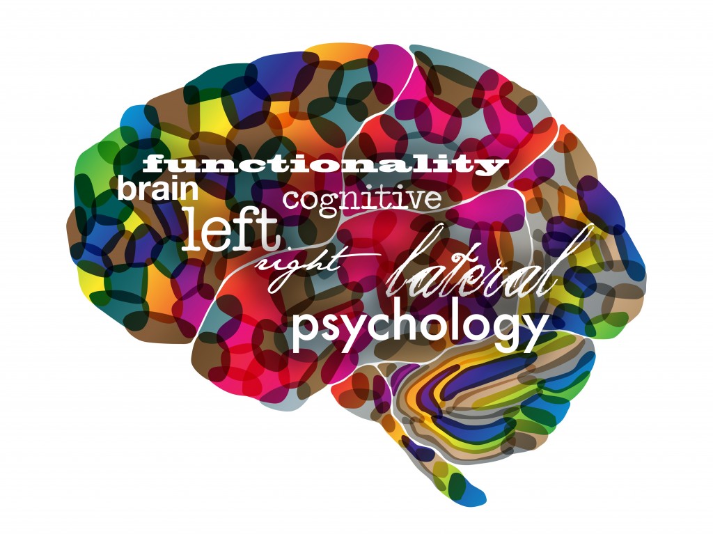
Taking into consideration the theory that our brains function differently from person to person, yet can be categorized into different groupings, we can also divide people into right brained and left brained. This of course is nothing new. The basic understanding of right vs. left brain is that the right brain controls creativity, visual and spacial perception and thinks “big picture” and ideas. The left brain controls logic, maths and sciences and thinks “practical” and reality based solutions.
The right brained tendency
Personally speaking, I have always been categorized by others as a “right brained” person – long before I had an understanding of what that truly meant. I’ve taken the tests online, seen the dancer spinning clockwise and sometimes even counterclockwise. When I wash the dishes, sometimes I stack them neatly and other times I balance them precariously in a pile. But, I can say that I believe I do have a right brained tendency – tendency being the key word.
So, who are right brained people?
There is a lot of theory as to what makes the right brained person tick. According to my go-to source, Wikipedia: “The processing of visual and auditory stimuli, spatial manipulation, facial perception, and artistic ability are represented bilaterally, but may show a right hemisphere superiority.”
Of course, not everyone with a right brained tendency has the same behaviour and thought patterns. The same is true for those with a left brained tendency. Although, there seems to be enough common ground (or mind) that these hemispherical categorizations can and have been made.
What’s the point?
The point is, even with all the research, individuals with a right brained tendency are not that well understood. They don’t typically fit the mold. However, right brained thinkers have contributed to some of the greatest discoveries and creative masterpieces we’ve ever known.
A few likely right brained thinkers
- Thomas Edison
- Michelangelo di Lodovico Buonarroti Simoni
- Pablo Picasso
- Rembrandt Harmenszoon Van Run
- Walt Disney
- Nelson Rockefeller
- Hans Christian Anderson
- Leonardo da Vinci
- Sir Winston Churchill
- Benjamin Franklin
- John F. Kennedy
- Wolfgang Amadeus Mozart
- John Lennon
- Louis Pasteur
- Orville and Wilber Wright
- Alexander Graham Bell
- Ludwig Van Beethoven
- Thomas Jefferson
- George Washington
- Vincent Van Gogh
- Agatha Christie
- Ernest Hemmingway
- Mark Twain
- Anna Roosevelt
- King Gustav IV of Sweden
- Albert Einstein
- Marie and Pierre Curie
- Socrates
- Galileo Galilei
- F. Scott Fitzgerald
- Abraham Lincoln
- Steven Spielberg
Bottom line
Don’t underestimate those right brained people that you know. Perhaps they have more clarity of thought than you realize. And, don’t be surprised when they come up with a really good idea seemingly out of nowhere. I have the privilege to work with some exceptional creative thinkers who have strongly developed right brains. Do you?
What do you think about the theories surrounding right brained psychology?