Designing Restaurants: It’s the outside that counts.
If there is one thing you should know about me, its that I have a huge obsession with food. Cooking, eating, watching food network, I love it all. Growing up in an Italian family and spending hours sitting around a table might have something to do with it. So when thinking of a good topic to share, I thought it would be best to combine my love with food and my love for designing.
I spent 2 of my best years living in Toronto where there are restaurants every where you turn. What makes Toronto a world class city is the diversity in restaurants, but how do they stand out from one another? It seems now more than ever a restaurants brand is as important, if not more important than the food they serve you. It’s your first impression from the outside that brings people inside. Designing a restaurant logo is only one factor in designing a strong and unique restaurant identity.
Here are some great examples of restaurants that got designing appetite appeal right…. from the outside in!
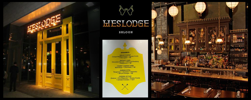
Weslodge, weslodge.com
This new on-the-scene restaurant in the popular king west area, has been branded as a “modern saloon”, with its impossible to miss canary yellow doors jumping right out at you. The interior is dark and feels like you have walked into a twisted pioneer hunting lodge with taxidermy filling the walls. Its logo has a modern back-woods feel to it and that canary yellow is shown very subtlety through menu design. What I love the most about this restaurant is how it celebrates it’s identity by the use of lights on the logo which separates this place from everything else on King west.
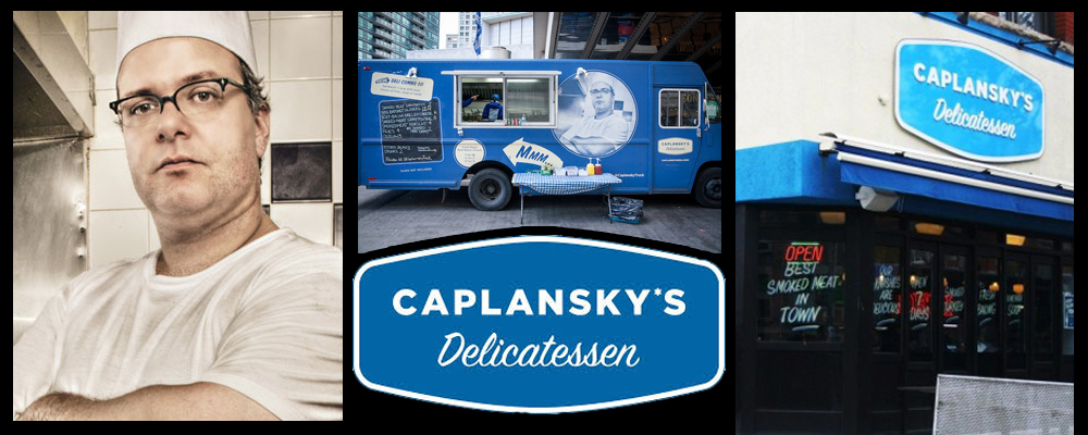
Caplansky’s Delicatessen, caplanskys.com
Oh so retro! Zane Caplansky is his brand as seen on the home page of his website dressed as a 60’s breakfast line cook, and good quality kosher food is his game. But before you go inside this eatery, it’s the outside that catches your attention. The retro throw back look is evident in the logo to the paint and design of the actual building. You feel like your looking back in time when your gazing at this place and in many ways you are. It’s simple yet forceful, establishing the Caplansky brand on the the corner of College and Brunswick for the past several years. To top it off, the Caplanksy food truck is a moving brand machine. Going to private events to food truck cook-offs, the proven look of the restaurant is arguably more powerful as a driving diner along the streets of the GTA.
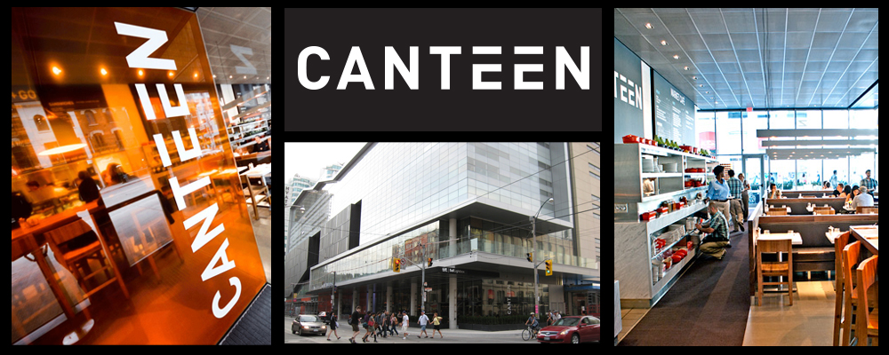
Canteen, oliverbonacini.com
Location, location, location! Ok so were not here to talk about the importance of location, were talking branding. But there is no denying that a superb location is only going to help any company, especially a restaurant, by solidifying it’s brand to the public. Canteen, located in the TIFF building on King street is front and centre in terms of a restaurant establishing it’s identity in the heart of Toronto. The logo itself is what you might call simple. Clean and cut, it makes you think of what a space station eatery might look like but than it’s location in the TIFF building reminds you that this is no ordinary place to eat. The brand is established really by it’s location more than anything. Hollywood meets Toronto for the perfect place to buy an over priced pizza while looking good doing it.