If an image is worth 1000 words, combine that image with text and the actual meaning behind the image becomes clearer. The variable of 1000 different words is reduced to only those that are necessary. This is not to say an image cannot speak on its own – many talented photographers, illustrators and artists can attest to that. Nonetheless, image and text together create a more focused message and is the root of great advertising. Further, the chosen typeface not only speaks with the image, it also speaks for itself.
Let’s start with typography
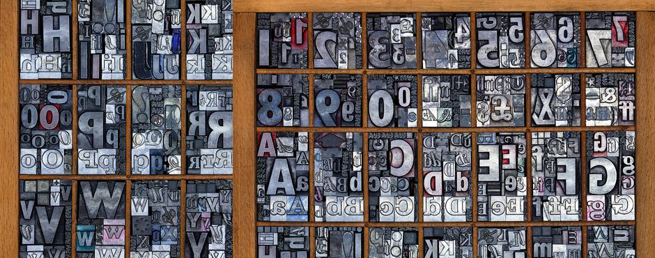
The origins of typography can include the first forms of written language and date back to about 3000 B.C. with Cuneiform by the Sumerians. However, it wasn’t until about 1440 A.D. when Johann Gutenberg created the printing press utilizing moveable type that typography as a craft really took off. This involved the process of printing by use of type blocks made of metal with raised letterforms that could be inked and pressed into a substrate.
What is the role of typography?
The roles of typography, typographic style and the typeface as parts of visual communication have evolved over the ages. Fast forward to today, within the information age (digital age) and there isn’t much we can’t do with type. We have many different tools and methods for working with typography. However, the principles behind it have not changed much since Gutenberg’s contribution. Ultimately, the role of typography should remain to honour content.
So, what’s in a typeface?
A typeface in itself is a visual. If you do not understand the language presented in type, you see it only as a visual. Although, a typeface is much more than it would appear at first glance. It is ruled by legibility, but also communicates through the form of it’s characters to provide meaning.
As designers and creatives know, we all have quite an attachment to the typefaces we work with. Unlike images, typefaces as elements are the ones that we refer back to on more than one occasion, so much so, we know most of them by name. Also, we know their “personalities” and which one of them would pair best with any given image.
A good typeface as part of a design can be compared to a good orchestra as part of a stage production. The music is heard and felt, but does not bring undue attention to itself. It aids the message. This happens not just through its personality and style, but also the mesh it makes with its image counterpart. It is the partnership of these elements that create a complete spectacle. If one overshadows the other, the message may suffer.
Respect for the typeface
If typefaces are ruled by legibility, we also need to consider their readability. As designers we aim to strengthen the meaning conveyed by a typeface through proper setting, size and placement. After all, any good “face” deserves that much. Without respect for the typeface, and its letterforms, many beautifully designed and legible typefaces can lack readability.
Where is typography now?
Well, through its many evolutions, typography has been handcrafted, mechanized and digitized. With these advancements in technology our relationship with typography has become strained. The speed, ease and flexibility that we have been afforded also means the time consuming task of attention to type can sometimes suffer.
Generally speaking, typefaces have been battered and bruised, scaled, pushed, prodded, stretched, outlined and sometimes just ignored entirely. However, as with any good element, the well intentioned and humble typeface continues to hold strong to it’s rightful place in graphic design.
Once upon a time (and not that long ago), there was an entire industry dedicated to typesetting. The specialized role of the typesetter was to govern the accuracy of the text component in conjunction with the designer’s visuals. Now, the role of designer includes typesetting. Graphic designers hold sole responsibility towards the success of typography within visual communication.
“By all means break the rules, and break them beautifully, deliberately and well.”
– Robert Bringhurst: The elements of typographic style
A good typeface should be embraced for its succinct presence, rather than written-off to optical software. So, let’s all just remember for a moment how much our typefaces mean to us, and how we can best show off their strengths.
What role does typography take in your design and more importantly, how much attention do you give it?
Further reading:
The Elements of Typographic Style
Typographic Design: Form and Communication
Type and Image: The Language of Graphic Design
Stop Stealing Sheep & figure out how type works


