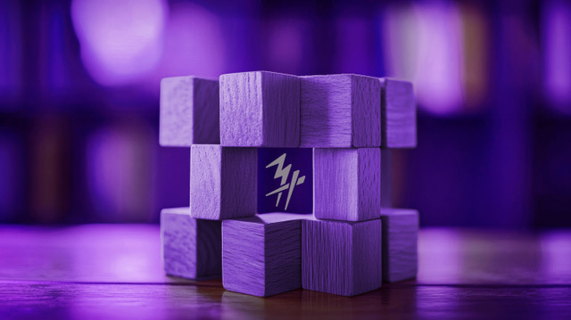
Unmistakably Purple
If voice shapes how a brand sounds and represents, its visual identity is how it’s remembered. In a world crowded with choices, visuals are strategy, personality, and first impression all at once. For my business… my brand, that unforgettable visual identity begins with one unexpected colour: purple.
The Layering Approach
An unforgettable visual identity is never just about what looks good on a page. It’s about crafting patterns, moments, and details that make an impression before you’ve said a word. It embodies and propels forward the brand’s logo while carrying the momentum to social media communications, and advertising.
When I considered what would signal my business to the world, I started with the simplicity of a my business’ visual identity. I started with a colour that was unexpected 37 years ago. It was a colour that was rarely seen or utilized in the business world yet oddly traditional. It was a bold move in the seas of grey, blue and burgundy. Additionally, I wanted a colour that sparked curiosity, commanded attention, and reflected the kind of creative courage I bring to every project.
Why Purple?
Purple wasn’t chosen by accident. It’s the signature of my brand for a reason. Throughout history, purple has signalled creativity, originality, and even a little bit of rebellion. It’s confident, distinctive, and unapologetic just like the brands I love to build. And let’s not forget…purple is often associated with courageousness…with braveness.
Albeit, purple is also personal for me. It reflects imagination, a bias toward bold ideas, and a commitment to standing for something unique, not just what’s expected. It’s the heartbeat of every piece of creative, every campaign, and every brand moment we deliver.
Consistency Creates Confidence
Of course, visual identity is about more than just one shade. It’s the patterns, rhythms, and small details that turn colour into memory. Purple is the visual thread that runs through our brand. It appears in the logo, the website, event booths, even the energy of the team.Consistency is a competitive advantage. I want people to feel the brand before they even know it’s us.
Purple invites a double take. It stands out in a sea of sameness and, in our world, that matters. Clients and potential clients alike, take note of our brand colour. Unbeknownst to them, from the very first hello, we are already having a brand conversation. One that enables us to really show what we can accomplish for their brands. The use of purple is very intentional.
Visuals That Speak Volumes For My Clients, Too
Many of the brands I work with are navigating complex, crowded spaces; health, innovation, food, lifestyle, and legacy industries that can feel overwhelming and even feel a little sterile. For them, standing out isn’t just a luxury; it’s survival.
When I and my team are given to develop an unforgettable visual identity… it isn’t only about colour. It’s about being unexpected…and whatever that form takes. We aim to make their message impossible to ignore and giving their brand sense of confidence and cohesion that transcends vehicle. Confidence in their communications, advertising and of course, confidence for their sales force to articulate what needs to be. The visual identity is the springboard for which all brand communications (digital, print, sales) take flight. Clients have told me that our creative choices, especially the signature visual elements, help their brands claim space, spark conversations, and signal that they’re not afraid to lead.
When someone is exposed to one of my businesses’ campaigns or walks into our office, I want them to feel that spark. Purple makes sure they do. It’s a colour that opens doors, starts conversations, and makes the brand unforgettable not just for me, but for every client I have the privilege to work with.

