Rah-Rah, Google! Give us an ‘E’ (but make it crooked!).
Gotta LOVE that crooked ‘e’ in the new Google logo. It’s so Google! Irrepressible, playful. I hear it’s annoying people. They want to straighten it. Personally, I think it’s perfect. Think about it. Leaving the ‘e’ crooked speaks volumes about Google’s personality.
Not everyone agrees with me, Twitter Users Think Google Copied Heineken with its new logo’s crooked ‘e’ (Google kind of admits it.)
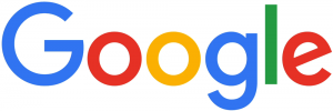
All done in house, the rebranding is a composite of three elements: the word mark, a four-colour ‘G’ monogram and animated dots that represent the Google search engine in ‘thinking’ mode. For those who’ve been under a rock, or enjoying the last days of summer up at the cottage, here it is:
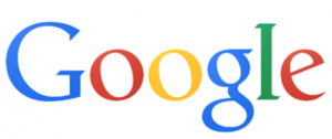
Here’s a reminder of the old Google logo:
Here are some Google logo ideas that presumably didn’t make the cut
Here’s why Google did the rebranding …
Says Google … (from the official Google blog)
“So why are we doing this now? Once upon a time, Google was one destination that you reached from one device: a desktop PC. These days, people interact with Google products across many different platforms, apps and devices—sometimes all in a single day. You expect Google to help you whenever and wherever you need it, whether it’s on your mobile phone, TV, watch, the dashboard in your car, and yes, even a desktop!
Today we’re introducing a new logo and identity family that reflects this reality and shows you when the Google magic is working for you, even on the tiniest screens.
Are we impressed?
I asked a few graphic gurus and marketing types across the industry for their opinion on the rebranding:
“Google, with an upper case G … it’s all grown up!”
“The lower case (previous) logo was approachable. With this new logo, Google has maintained its approachability, but made it more mature. More established. The colours and the playfulness with the dots has added to its “fun” nature … almost showcasing its “magic”. Turning questions into a found result. The use of an uncluttered, streamlined font adds to the contemporary nature … the G, unencumbered, is almost futuristic.
More importantly, I love the Alphabet name … the idea. It’s the basis of communications. With letters and building blocks, imaginations soar. What else can we develop? Where else can we go? It offers the ability of each letter to have its significant place in the sun!”
– Miriam H, Chief Creative Officer at 3H
“… suits their position as a search engine (wayfinding system)”
“Overall, it’s a thumbs up from me. The font they used is called Product Sans and was one they created specifically for the new logo and overall rebranding with the animated dots and icons. Similar to the new-ish Twitter icon, it was (mostly) created using only circles and semi-circles. I think it has a much more ‘current’ feel and suits their position as a search engine (wayfinding system).”
– Lindsay S, Senior Graphic Designer
“They’re still leading the way, now with their very own font.”
“It has retained its simple look and colour palette, while bringing a more accessible and contemporary feel. The font also has a uniqueness, a quirkiness, which demonstrates Google’s lighthearted, forward-thinking approach. They’re still leading the way, now with their very own font.”
– Jayne B, Integrated Marketing Manager
“fun and playful”
“I loved the way they presented it, the animation is fun and playful. I like the sans serif font more than the previous serif font. They’ve had the same logo for a long time. The previous logo was dated and the trend is towards sans serif fonts. Nice and chunky. It was a smart move since Google is now owned by Alphabet company. A new beginning for Google and the new logo is a great start.”
– Craig C, Senior Graphic Designer & Mixed Media Artist
“Just another logo”
“Just another logo. Cultural relevance? There’s a lot of talk about this, but I really don’t think it changes much.”
– Jason H, Photographer
“… reminiscent of the avant garde style of the TTC subway signs that came out in the 1950s”
“The new direction of the Google logo makes it easier to display on smaller devices, the switch from a serif to sans serif will make displaying on smaller screens much cleaner and simpler, it will also scale nicely. The thickness also lends itself to displaying more clearly on mobile screens. The change in the Google Icon, the New “G”, now reinforces the colour coding that Google has progressively moved towards, so now even the icon hints towards the growing suite of properties and product offerings. It seems to be a successful step in streamlining the branding of the complete picture of essential elements that Google is trying to put forward. I find it clean, modern and simple, reminiscent of the avant garde style of the TTC subway signs that came out in the 1950s and are still used for everything in the TTC Subway System. I like it.”
– Kyle M, Digital Designer
“Google’s big enough to be brave”
“Rebranding is never easy. You can’t please everyone and it always opens you up to negativity, particularly for a global giant like Google. Not everyone likes change but Google’s big enough to be brave. The clean, linear font ties in beautifully with the Alphabet name that came out of the overhaul of Google’s corporate structure. The company’s new url abc.xyz gave me a chuckle. Nice, clean, modern logo.”
– Mark A, Marketing, PR & Social Media Consultant
“It’s not a WOW logo, but …”
“It’s simple. The colours are very basic. It’s not a WOW logo, but I think that’s the way it should be for Google. Google is not just a company name, it’s a verb, it’s part of our culture. The logo doesn’t need to be beautiful, it needs to be recognizable and it still is. Just like ‘Google Doodles’, the logo gets changed in those but we always recognize it.”
What do YOU think of the new Google logo? Does the crooked ‘e’ bug you? Let me know!
A HISTORY, FROM A TO … no Z, because Google is far from finished changing the world:
From Gizmodo … The Evolution of Google’s Iconic Logo
From Time Magazine … A History of Google Doodles


