by Craig Thomson | Apr 23, 2024
BAUSCH HEALTH (ELIDEL) Mastering Brand Premise Captured in muted neutral tones against a flannel grey backdrop, each portrait exudes an understated strength, showcasing individuals across different ages and life stories, all connected by their journey with Atopic...

by Craig Thomson | May 31, 2023
BAUSCH + LOMB (Essentials PLUS / Essentials HOME) Packaging Brand Identity If the contact fits, wear it! And with the Essentials PLUS packaging that’s exactly what we did. Brand identity requires relevancy. In keeping with the ULTRA brand persona, this packaging...

by Craig Thomson | May 31, 2023
THÉA PHARMA (Monoprost): Embodying Brand Benefits Keeping it real is what this brand visual for a glaucoma treatment was centred around. Featuring positive patient outcomes doing everyday ordinary activities accentuated the value and the beneficial outcome of this...

by Craig Thomson | May 31, 2023
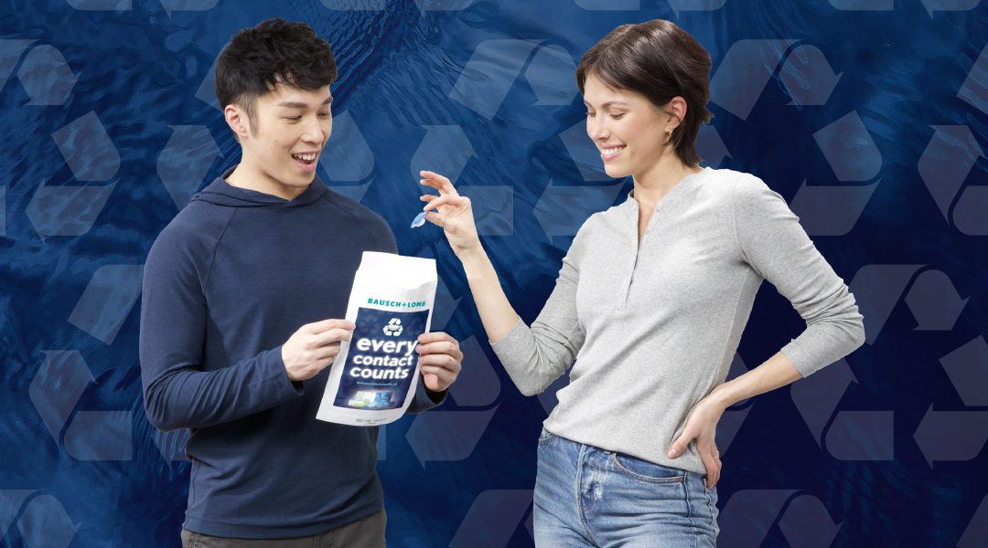
BAUSCH + LOMB (Every Contact Counts): Amplifying Brand Value Evolving the social-minded Bausch + Lomb recycling was essential in keeping with the growing fan-base of this initiative. Of equal importance is B+L’s key partnership role with Eyecare Practices, providing...

by Craig Thomson | May 30, 2023
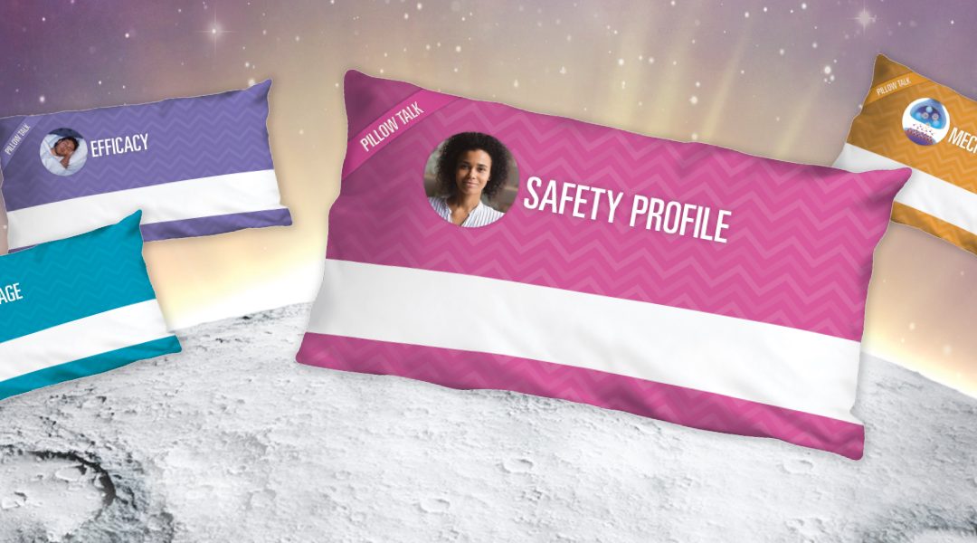
EISAI Pillow Talk (DMs) Building Brand Anticipation When clichés work…why not go all in? This Pillow Talk serial direct mail for an innovative insomnia treatment worked wonders by informing physicians on the uniqueness and the differentiating benefits of the...


