by Miriam Hara | Jul 7, 2023 | Agency, Branding, Creative, Design, Marketing, Social Media
A brand style guide is more than just a collection of fonts, colours, and logos. It’s the roadmap that leads every piece of your brand’s communication, ensuring consistency across different platforms, media, and teams. An effective style guide is the cornerstone of a strong brand identity, guiding your brand’s voice and visual representation while leaving room for creativity and evolution.
Consider, for instance, the brand style guides of Mailchimp and Shopify. These aren’t just sets of rules or constraints; they are comprehensive narratives that tell the brand’s story.
Mailchimp’s style guide is renowned for its perfect blend of clarity, detail, and brand personality. It outlines the brand’s tone of voice, typographical choices, colour palette, and even provides specific examples of do’s and don’ts. It’s not just an instruction manual; it’s a reflection of Mailchimp’s quirky and friendly brand personality.
Shopify’s guide, on the other hand, strikes an exquisite balance between aesthetics and functionality. It delves into the details of the brand’s visual elements, typography, and even provides guidance for writing product copy. It’s a testament to Shopify’s commitment to providing user-friendly and aesthetically pleasing e-commerce solutions.
So, how do you create a brand style guide that informs, inspires, and tells your brand’s story? Here are some best practices:
Understand Your Brand: The first step in creating a brand style guide is understanding your brand’s mission, vision, and values. What does your brand stand for? Who is your target audience? What is your unique selling proposition? Answering these questions will provide the foundation for your brand’s visual and verbal identity.
Define Your Brand’s Visual Elements: This includes your brand’s logo, colour palette, typography, and imagery. Be specific about when and how to use these elements. Provide clear examples and guidelines to ensure consistency.
Establish Your Brand’s Voice and Tone: Your brand’s voice is its personality, and its tone is how it communicates in different contexts. Is your brand voice professional, friendly, or playful? How should it adapt to different situations? Outline these in your style guide.
Include Practical Examples: Don’t just tell; show. Include real-life examples of how to apply your brand’s style in various contexts. Mailchimp’s style guide, for instance, showcases specific examples of how to use (and not to use) their logo, typography, and colour palette.
Keep It Flexible: A brand style guide should be a living document that can evolve with your brand. Allow for flexibility and updates as your brand grows and adapts to new trends or market changes.
Creating a brand style guide is an investment in your brand’s future. It ensures consistency, aids in decision-making, and sets the foundation for all your brand’s communication efforts. Above all, it tells the story of your brand – a story that is uniquely yours.
Share your brand’s story here…we’ve love to hear!
by Lindsay Sleightholm | Oct 16, 2013 | Branding, Design, Latest, Marketing
Though I’m a big music fan, I’m not going to pretend I know much about the actual music industry. But I do know a lot about graphic design and have my share of marketing know-how. And I recognize that there’s a lot more to creating an iconic band than great guitar riffs and a good-looking lead singer.
Is a band a brand?
Some bands are just bands. They’re not interested in creating an identity for themselves beyond what their music conveys. Although bands who want to get to the next level know that the business of music is not unlike any other business – it requires the use of marketing, advertising and design. Like anything else, good branding can help distinguish them among the competition. Bands have their own identities. Yet as musicians they’re not just creating music, they’re also shaping a brand persona – whether this was their intention or not.
Does a band need marketing and design?
Just like any other brand, a band needs to find its audience and connect with them. This happens of course through their music. However it is also created by the interactions they have with their audience, their public performances and appearances, their official and unofficial videos on YouTube, their presence on social media and their visual identities.
This is where the marketing and design comes in. Visual identities are created in order to market the music. These identities can end up on every facet of their visual branding – from T-shirts to websites. Some of the most successful bands of all time have made great use of this visual medium.
Band brands
So putting my music tastes aside, I’ll throw on my designer hat for my picks of some of the best in band branding.

Kiss
If you google “kiss”, you’ll actually get the band Kiss – which in itself is pretty impressive. Originally known as Wicked Lester, headed by Gene Simmons and Paul Stanley in 1971. But it wasn’t until 1973 that the name change to Kiss came about and a new image was born. The Kiss logo was first developed by their original lead guitarist Ace Frehley, later to be polished by designer and illustrator Michael Doret.
Since then, they haven’t just put it on a few posters and T-shirts – they ran with it. Combined with their trademark make-up and costumes, the entire Kiss brand has been built into a music empire spanning over four decades.

Chicago
Starting out as cover band The Big Thing in 1967, a name change to The Chicago Transit Authority in 1968 was short-lived due to the threat of legal action from the actual Chicago Transit Authority. By the 1970’s the band became simply Chicago. Their final name logotype was designed by art director John Berg.
That logo has since fronted nearly all of the band’s album covers – taking on a different illustrative style each time – yet remaining true to its original design. It has also earned its place in design history, with a nod from designer and author Philip B. Meggs, in Type and Image: The Language of Graphic Design.

Daft Punk
The French duo that in 1992 was originally called Darlin’, after the Beach Boys song, quickly re-branded themselves as Daft Punk after receiving a negative review describing their music as “a daft punky thrash”.
By the latter half of the 90’s Daft Punk were beginning to not only carve out a place for their unique sound but their solid, albeit unconventional, visual brand. Known now for their look as much their music, the two robot-human hybrids have created an image for themselves without ever showing their faces.
These bands, although completely different in musical genre, have at least one thing in common, they have really taken advantage of branding to boost their identities – as have hundreds of other music greats. The music is their product, but they’ve also crafted a marketable image. And each is an example of how consistent branding can help propel any brand, or band, to the next level.
As most know, a good one-off will only give you your 15 minutes. But great branding, effective marketing and strong design can take what is already unique and give it the stage to really stand apart.
by Miriam Hara | Oct 29, 2012 | Advertising, Branding, Business Success
The word branding is definitely a verb. It takes thought, intention and actions to turn a brand into a Brand.
If you take a product that delivers on its promise, give it a great name, an iconic logo and a fantastic well thought out tagline, you’re set – you have the makings of a brand. All of these elements are great, but quite frankly, if you don’t intentionally do, you’ll risk your Brand’s demise or fall short of your Brand’s potential. In order for a brand to become a Brand, it must in fact start to act. It’s important to not only look like a brand – it’s important to “walk” like a brand. Whether you’re an entrepreneur or a corporate executive in charge of brand marketing; an individual trying to become a personal brand or a major chain retail outlet; the act of becoming a brand is essentially the same
In order for a product to become a brand and establish itself as a winning brand it must adhere to the following brand exercises:
Brand Consistency: Your audience needs to recognize your Brand instantly. How can they do that if consumers are always being shown inconsistencies in style, colour, tonality or voice. Determine what these brand layers are for your Brand and feature your Brand within the same context, consistently, consecutively and simultaneously. Brand can only be established if the message is always presented in the same way. There are no short cuts in developing a brand. Cost cutting measures early in the game will often harm the Brand’s development and stunt its growth… indefinitely.
Repetitive Brand Visibility: It doesn’t matter if it’s by placing a business card sized ad in the community paper or developing a full-scale national advertising campaign, whatever your Brand is about, its messaging must be consistent with every communications initiative. Think of it like filling a bucket with water, one drop at a time. All these drops will eventually fill the bucket. Branding is about repeating your message, in a variety of different ways. It doesn’t matter if it’s an event, social media endeavour, advertising campaign, premium giveaway or a website – all visibility goes into the same bucket.
Brand Originality: Dare for your brand to be “un”-ordinary. Yes, be over the top if needed – “extra”-ordinary. If you are trying to achieve your Personal Brand or launching a product, dare to be bold in how and where you communicate. Just like no two people are truly alike, the same applies to brands – no two are alike. Take one element of your Brand’s Persona (big or small) and blow it out of proportion. This refers to colour, typeface, logo, or even a sound logo. Whatever element it is, it must be your Brand’s and your Brand’s alone. This will allow you to “own” the market. Others can and will try to mimic your brand, but they will end up falling short.
Consistency, repetitive brand visibility and originality – these actions will turn your brand into a Brand.
by Miriam Hara | Oct 18, 2012 | Advertising, Branding, Business Success, Creative
Listen up Marketing Vice-Presidents, Professionals, Brand Managers, Ambassadors and Gurus… I know only too well that it’s hard to separate yourself from the Brand you’re responsible for. After all, you work it, live it, breath it – 24/7. You understand it intimately, better than anyone else. You define its market and potential, watch its competitors (with disdain!), develop the strategy that will give it wings, provide its raison d’être (USP). Then – fight for the budget by promising the powers that be that just around the corner, there’s profit to be had (ROI)… if only they would believe, like you believe.
When you’ve done all all that and successfully received the sought after funds, you need to entrust it to an “outsider” (yes, an advertising agency!) to communicate to the world what you know is this Brand’s promise and truth… The “how” and the “why” of it.
So off goes the agency’s team, armed with your Communications Brief, Brand Guidelines, Brand’s positioning statement, market assessment and competitor’s information. They come back with creative that responds to brief, the market conditions and provides a good solid plan on how to obtain the objective that is required for that ever elusive ROI.
That’s when it begins, the shift from professional objectivity to personal judgement. That’s when business and marketing professionals change hats and become emotional human beings. The tweaks, the design directives, the micro management of font selection, type treatment, the scrutiny, the judgement calls, all about the creative. I am not suggesting for one minute that all agency work is on target, on point or on brief. Although, I am not quite sure how it can’t be if the brief provided was correct. The development and creation of Marketing Creative and ideation is very rational. Rationality doesn’t take away from creativity. Quite the contrary, it adds to it. Marketing creative is about thinking inside the box… the box that was created by the Brand Keeper.
Assessing Brand Creative properly is as important as writing a solid Marketing Plan. It’s important to learn how to assess creative effectively and efficiently. Here are 9 questions to ask yourself when assessing Brand Creative.
- Are you walking in your targets’ shoes? Remember, you aren’t the target market, even if you fit the demographic profile. You are a Marketer, and more specifically the Marketer of this product!
- Is the product benefit easily communicated? Is the communication efficient. Does the creative speak succinctly and effortlessly about the end benefit.
- Does the creative deliver? Does it offer consumers the reasons to believe so that they can take the next step in the customer journey.
- Does the creative adhere to Brand Guidelines? A good brand agency lives by guidelines. Any agency that doesn’t isn’t a brand agency.
- Is the creative in line with the Brand Persona and the Brand Voice? This is the most subtle and intuitive part of any creative. Refer back to your communications brief for guidance.
- Is the creative original and Brand Unique? Does it provide a strong identification with the Brand… and only this Brand.
- Is it provocative? No, I don’t mean showing bare skin, I mean does it resonate and engage the audience? It must provide traction to gain brand awareness.
- Is it respectful to the Brand and its audience? Does it speak to consumers and not at them, does it value the consumer’s time and mind?
- Does it work as a unit? It’s very easy to zero in on a word, colour, or small detail. The more you focus on it, the bigger it becomes and the more you feel compelled to fix it. But don’t try to fix it yourself. Articulate what is bothering you and let the agency resolve the issue. Creative is a process, so there is always room for improvement. Make that improvement effortless by communicating the issue, rather than trying to provide the solution.
I recognize that it’s not easy to let go. Often the creative of marketing is the “fun part”. Good agencies make it appear easy, but it’s not. In closing I will only say and I know it’s hard to hear but it doesn’t matter that you, the Brand Keeper, like purple or green, or that you prefer a serif type face or the use of a particular word. In short, it’s not about you. It’s about the Brand that you have been entrusted with. and have in turn, entrusted to brand agency to ensure its healthy growth by developing a strong brand awareness and position within the market.
by Christine Marr | Apr 12, 2012 | Branding, Creative, Design
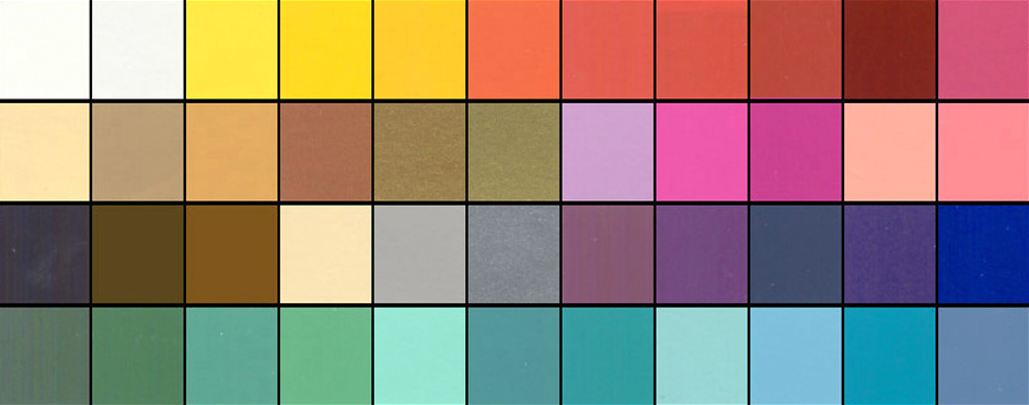
Our reaction to colour is subliminal. As consumers, we are generally unaware of the persuasive effects of colour. Psychological effect is instantaneous, stimulating the senses and power of suggestion. We see it in every level of communication: in corporate identification and logos, signage, advertising on tv, billboards, in print media and packaging, on the computer and in-store. As we zip down isles in our favourite stores, our eyes rest on a package for approximately .03 seconds. In that blinking-of-an-eyelash timing, the packaging/sign/logo must rivet the observers’ eyes, inform them of the product, and, more importantly, appeal to their psyches.
I doubt I am saying anything new here. However, last week, we went to visit a client at their office and what happened there, prompted me to take note about colour and how we identify with it. We hadn’t been to Dentsply Canada’s office in a little over six months. As we walked through the door, the receptionist glanced up and said “…from 3H?”. Wow, that completely floored me. We make a point of always wearing purple when we see clients, because purple is the dominent 3H brand colour. This was enough for the receptionist to remember our visit from 6 months ago. We, at 3H, are strong believers in Brand Recognition!
We practice what we preach. While we clearly know and acknowledge that it takes much more than colour to build a brand… what you do with a “brand” colour clearly enables and facilitates brand recognition. Colours are so intimately associated with a brand that just the suggestion of a colour is enough to bring a brand to mind. That’s isn’t simply amazing… it’s awesome in building equity.
Think about this…
When you think of Home Depot, what colour comes to mind?
Which bank is “blue”, which one is “orange”, and which one is ‘green”? Close your eyes and picture the Google logo. The McDonald’s logo? And for my Canadian readers… what is meant by the “Windsor” blue.
Our reaction to color is instantaneous and this lens is a quick look at general responses based on research, historical significance of color and word association studies. Let’s take this one step further… picture the Home Depot logo, but with different words in the same font in the orange box… would you still recognize it? Would you see the logo as a whole, as one image, and recognize it instantly, associating it with Home Depot.
So when developing a brand and beginning with the basics of creating a logo… choose a colour that would represent your brand identity effectively for now and the future…And repeat after me….
Repetition, repetition, repetition… consistency… everywhere… all the time. Exposure over time ensures success….. but that’s a different point of discussion! Colour makes a brand stand out and command attention and make sure that the Logo colour matches your brand mission and message to create the brand identity you want.
So what do colours mean anyway? Here’s a brief overview.
Green occupies more space in the spectrum visible to the human eye than most colours. Green is the pervasive color in the natural world, making it an ideal backdrop in interior design because we are so used to seeing it everywhere. Green is considered the colour of peace and ecology.
Purple embodies the balance of red’s stimulation and blue’s calm. This dichotomy can cause unrest or uneasiness unless the undertone is clearly defined, at which point the purple takes on the characteristics of its undertone.
Blue is seen as trustworthy, dependable, and committed. As the collective colour of the spirit, it invokes rest and is calming.
Yellow shines with optimism, enlightenment, and happiness. Shades of golden yellow carry the promise of a positive future. Yellow will advance from surrounding colors and instill optimism and energy, as well as spark creative thoughts.
Pinks are youthful, fun, and exciting, while vibrant pinks have the same high energy as red; they are sensual and passionate without being too aggressive. Pink is the color of happiness and is sometimes seen as lighthearted.
Orange sparks more controversy than any other hue. There is usually strong positive or negative association to orange and true orange generally elicits a stronger “love it” or “hate it” response than other colours. Fun and flamboyant orange radiates warmth and energy.
Understanding colour and what they represent is important in establishing a brand persona. In today’s world of fast communication and overload of visual stimuli, it is more than vital that brand expresses its identity at the blink of an eye.
If you had to define your personality as a brand colour, what would it be?