by Madi Secareanu | Jun 8, 2012 | Advertising, Branding, Business Success, Creative, Social Media
Watch any big name music video today and it’s pretty much a guarantee that you’ll see a few product shots incorporated into the storyline and with good reason. Now more than ever brands are becoming more and more integrated in the entertainment industry with the emerging brand product placement industry. Nowhere is this relationship more prevalent than in music videos. For the artist, a brand product placement can help add to the budget of their music video and for the viewer. A brand product placement can influence a purchase, which in turn is a benefit for the brand.
The Benefits of Brand Product Placement
If the strategy meets the objective, brand and product placement in music videos can be a very effective way to reach a specific demographic and a target market between 18-35, or even younger.
If it’s well done, a music video successfully incorporates a brand into the plot of the video, adding to the scene and the overall image and lifestyle portrayed. This creates a seamless relationship between the brand and artist who often embodies a certain persona that their fans aspire and look up to. It’s about the psychographics. Therefore, there’s no question that music videos can be influential, and the availability of advertising space in them can be a good opportunity for brands, and here’s why:
- Consumer influence
- Brand exposure
- Celebrity endorsement
- Brand awareness
- Increased sales (celebrity influence=$)
- Consumer identification
- Brand championship
Blurring The Lines
Some music videos seem to be commercials, and vice versa, blurring the lines between the two worlds. Although not new, the following two videos are great examples of the merging of both worlds:
Jennifer Lopez’s “Papi” video seems like a 5 minute Fiat commercial and was actually even edited down to a 30 second commercial spot. Lady Gaga’s “Telephone” video features a plethora of brands and at certain times, the scenes and shots seem to revolve around the incorporation of the brand. The blurring of the lines leads us to one question: what came first, the concept or the brand placement? Jennifer Lopez’s video seems to be a part of a brand/celebrity relationship, but the product is a part of the concept of the video or rather the concept seems to have been created around the brand. Well integrated, albeit blatant. Lady Gaga’s video concept seems to be apart from the product placement – the products do little to add to the story, placed in for obvious promotional purposes. Which approach do you think is more effective in terms of a brand ROI?

* screen shot from Lady Gaga’s “Telephone” video
The Debate
As effective as music video brand placement can be, the concept is always at the center of some sort of debate. Some feel that the music video is an art form and should be free of corporate presence. Others see it as not adding anything valuable to the video’s plotline. Some are indifferent and some are all for it. I feel that as long as it’s done well, and the brands are well integrated into the plot of the video, adding value to the story, it can lead to a better return for the brand. Strict product shots that are there just to be there and do little for the video’s plot can irritate a viewer, leading to a lower ROI although it may not take away from brand awareness…
Then there is the emergence of social media that has changed the way consumers think. They demand authenticity and abhor being sold to.
I want to know your thoughts: what do you think about product placement in music videos? Are videos crossing the line into commercial advertising and does this or will this backfire or help the brand…the celebrity or both?
P.S. We want your opinions so feel free to join the conversation on this and other marketing, branding and design topics… you can subscribe to 3H hoopla! here.
by Miriam Hara | Apr 20, 2012 | Branding, Business Success, Creative
We’ve all said it before… but I’ll say it again. Brand is so much more than a logo, than a positioning statement. These establish the brand premise and the foundation to build the brand culture. A true brand must be bold, must stand apart every time it speaks to the consumer. It must always be authentic to its premise. It must reinforce its uniqueness and authenticity with every piece of communication… whether it’s an e-initiative, an ad, outdoor campaign, digital campaign, website, customer letter, greeting card and, yes, even a sign on the wall.
It has always been my belief that every detail that is viewed by the target market is an integral piece of the brand building process. I have always correlated building brand to building a house. The logo and the positioning statement are the foundation of the brand. Then the framework, dry walls, windows all have to be added…. to support and build the “total vision” of the house.


This “building strategy” recognizes the need of investing a little more in say, a business card or a leave behind , and is as integral as a full scale advertising campaign. Okay, I hear you asking the question… what do I mean by “investing a little more?” This is what I mean: look at every communication piece and ask the number one question… “How do I make my brand the sole owner of this piece?” Is it only colour? Is it simply by stating the brand’s offering? Does the initiative I am working on speak to my Brand and communicate my Brand solely… only and truly? Is it moving beyond the mundane, true and tried initiatives that have been done… offering no intrinsic value, no additional wow effect to my target audience? Does it assist in making my brand stand apart…even before they read it…as soon as they see it?
How to evaluate a marketing piece and increase the brand ROI of that piece. Here’s a simple way that will help you in answering the question.
If a competitor can replace your logo with theirs, change the colour and the words and use everything else that you’ve developed than you haven’t created a unique brand piece. This question works whether you are evaluating an ad, a flyer, a billboard, a sales aid, a leave behind, brochure, etc…
So how do you create a brand piece that no one can “take” from you. The answer is easy:
Create it so that it reflects your Brand Offering and USP… and I don’t just mean plopping a logo, and making everything in your brand colours (although that is must!). The initiative has to speak to the Brand Culture, position in personality, in format, in copy style. This is the only way that competitors can’t mimics your brand or “take ” your initiative and make it their own… because they can’t deliver on the promise or on your brand’s USP… only your brand can.
In short: creating brand ROI is the first step in achieving business success.It is obvious that Brand must provide ROI. But what should be the expectation of delivering on brand ROI? Is it reasonable to expect brand ROI immediately? Is it reasonable because you have a website and a logo to expect that your brand initiatives are done and all other initiatives just need to follow through? Today, more than ever, halfway measures and “me too look alikes” will damage the performance of you brand and believe me, that will definitely effect the brand ROI.
I look forward to your comments and discussing your point of view. I invite you to join in the conversation! If you got here via a link from a friend, or Linkedin, I invite you to join the conversation on marketing, branding and design… sign up on 3H hoopla! here.
by Christine Marr | Apr 12, 2012 | Branding, Creative, Design
Our reaction to colour is subliminal. As consumers, we are generally unaware of the persuasive effects of colour. Psychological effect is instantaneous, stimulating the senses and power of suggestion. We see it in every level of communication: in corporate identification and logos, signage, advertising on tv, billboards, in print media and packaging, on the computer and in-store. As we zip down isles in our favourite stores, our eyes rest on a package for approximately .03 seconds. In that blinking-of-an-eyelash timing, the packaging/sign/logo must rivet the observers’ eyes, inform them of the product, and, more importantly, appeal to their psyches.
I doubt I am saying anything new here. However, last week, we went to visit a client at their office and what happened there, prompted me to take note about colour and how we identify with it. We hadn’t been to Dentsply Canada’s office in a little over six months. As we walked through the door, the receptionist glanced up and said “…from 3H?”. Wow, that completely floored me. We make a point of always wearing purple when we see clients, because purple is the dominent 3H brand colour. This was enough for the receptionist to remember our visit from 6 months ago. We, at 3H, are strong believers in Brand Recognition!
We practice what we preach. While we clearly know and acknowledge that it takes much more than colour to build a brand… what you do with a “brand” colour clearly enables and facilitates brand recognition. Colours are so intimately associated with a brand that just the suggestion of a colour is enough to bring a brand to mind. That’s isn’t simply amazing… it’s awesome in building equity.
Think about this…
When you think of Home Depot, what colour comes to mind?
Which bank is “blue”, which one is “orange”, and which one is ‘green”? Close your eyes and picture the Google logo. The McDonald’s logo? And for my Canadian readers… what is meant by the “Windsor” blue.
Our reaction to color is instantaneous and this lens is a quick look at general responses based on research, historical significance of color and word association studies. Let’s take this one step further… picture the Home Depot logo, but with different words in the same font in the orange box… would you still recognize it? Would you see the logo as a whole, as one image, and recognize it instantly, associating it with Home Depot.
So when developing a brand and beginning with the basics of creating a logo… choose a colour that would represent your brand identity effectively for now and the future…And repeat after me….
Repetition, repetition, repetition… consistency… everywhere… all the time. Exposure over time ensures success….. but that’s a different point of discussion! Colour makes a brand stand out and command attention and make sure that the Logo colour matches your brand mission and message to create the brand identity you want.
So what do colours mean anyway? Here’s a brief overview.
Green occupies more space in the spectrum visible to the human eye than most colours. Green is the pervasive color in the natural world, making it an ideal backdrop in interior design because we are so used to seeing it everywhere. Green is considered the colour of peace and ecology.
Purple embodies the balance of red’s stimulation and blue’s calm. This dichotomy can cause unrest or uneasiness unless the undertone is clearly defined, at which point the purple takes on the characteristics of its undertone.
Blue is seen as trustworthy, dependable, and committed. As the collective colour of the spirit, it invokes rest and is calming.
Yellow shines with optimism, enlightenment, and happiness. Shades of golden yellow carry the promise of a positive future. Yellow will advance from surrounding colors and instill optimism and energy, as well as spark creative thoughts.
Pinks are youthful, fun, and exciting, while vibrant pinks have the same high energy as red; they are sensual and passionate without being too aggressive. Pink is the color of happiness and is sometimes seen as lighthearted.
Orange sparks more controversy than any other hue. There is usually strong positive or negative association to orange and true orange generally elicits a stronger “love it” or “hate it” response than other colours. Fun and flamboyant orange radiates warmth and energy.
Understanding colour and what they represent is important in establishing a brand persona. In today’s world of fast communication and overload of visual stimuli, it is more than vital that brand expresses its identity at the blink of an eye.
If you had to define your personality as a brand colour, what would it be?


by Miriam Hara | Apr 3, 2012 | Advertising, Branding, Business Success, Creative
Way too often, ads are filled with too much information and lots of copy. How does that happen? Why does it happen? I can almost hear the collective grumble from all my peers saying…. “Clients!” But I believe that laying blame at the doorstep of clients, absolves us, the creative professional of any blame. I believe as Creative Professionals, it is our role to accommodate but also to advise. In my experience, once you explain the reasons why you shouldn’t do something , or even show them what is being compromised, clients really do get it.
Just think back… even recently and consider this:
- Ever watch a TV commercial and say, I don’t get it?…. or worse, what’s the brand? Remember the Head On ad?

- Drive and spot an outdoor billboard and you can’t read the caption because there’s too many words like the one below…. and the type is so small?

- Flip through a magazine ad and miss the total point of the ad? Like this one.

It always amazes me that there are ads that actually get to the marketplace without a clear single focused message. Or the creative is sooo out there, that it doesn’t circle back to the brand or to the product. This is a particular pet peeve of mine, as I just recently wrote an entire blog on this issue! An ad (any kind of ad) shouldn’t be closing the sale…. it should be generating interest… It needs to communicate benefit and to engage consumers enough so that they take action. Ads were never meant to replace sales people! They were meant to increase awareness of a product and service and increase the knowledge of the benefits within that product or service. Ads are meant to get traffic, whether it’s a website or a physical location.
So the next time you face a challenge, think back on what makes you a creative professional. Advertising isn’t about pretty pictures and for it to work there are certain protocols that need to be followed. At times it can be challenging, but that is what our profession is all about. How often are we faced with and given mountains of information to decipher and create a single succinct statement that says is all. Or given so many logos and visual elements to layout into a visual flow that directs the consumer’s eyes and makes sure that the main message is delivered. The minute we let go of this basic standard, then everyone and anyone who owns a computer can “create” an ad. All they need is Indesign or Illustrator knowledge.
by Lindsay Sleightholm | Mar 27, 2012 | Branding, Business Success, Creative, Design
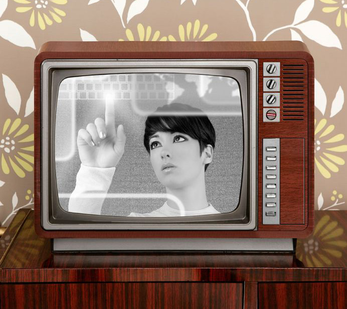
It’s been said that nothing is new, and everything old is new again. Never has that been more obvious than in today’s retro-infused consumer market. The trend towards aesthetics of the past are everywhere: fashion, art, music (the amount of remakes out there are enough to make your head spin), home decor, cars, architecture – you get the point.
So what is “retro” anyway?
According to Wikipedia, retro is “a culturally outdated or aged style, trend, mode, or fashion, from the overall postmodern past, that has since that time become functionally or superficially the norm once again.”
Basically, it’s a blast from the past. And we can’t seem to get enough of it. It’s part of human nature to gravitate towards the familiar. Psychologically, going retro gives the impression of standing the test of time. It has merit. Not to mention, it gives us that warm, fuzzy feeling that we so often crave.
Jumping on the Radio Flyer
Nostalgia seems to be something of a “new” commodity these days. Many are jumping onto the retro bandwagon, and not in an entirely elegant way. A lot of it is far too deliberate. There is no subtle throwback to a bygone era; it’s become outright blatant, down to the letter (or typeface if you will). Some may say it’s actually “retro reinvented,” meaning that it’s taken on a modern spin. But when that modern spin is just a whisper against the overall retro message, it can hardly be considered modern.
Okay, I’ll be the first to admit that I have a definite inclination towards thing of the past. But if Cyndi Lauper were to walk up to me today and ask me to design her new identity, it would not look like something from her earlier albums. Why? Because even she has moved forward. She’s not the same flamboyant performer of her past. She has evolved – not just reinvented, but changed.
Has retro design seen its day?
The primary goal of today’s retro revival seems simply to be to mimic a style instead of creating one. Actual art and design movements of the past were born in large part due to a cultural shift. And for the most part, they generally shifted forward. But there’s no shifting forward with retro design; it’s going back, because that’s what retro does.
Maybe we’ve run out of ideas, or we don’t know how to design for this nameless age. Or maybe we really do want to go back in time.
Graphic design will always have a strong link to its roots. That is, to those who came before and blazed a powerful trail to follow – great periods such as Art Nouveau, the Victorian era, the Industrial Revolution and, yes, even the latter half of the 20th century. But when we lean on the ideals of the past too much, we stop ourselves from moving forward.
Instead of going back, perhaps we should take a moment to think about where we’re going to be in the future. Maybe – just maybe – we’ll like it just as much. And if not, in 20 years it’ll become retro again anyway.
So, what do you think? What else have you’ve seen? Share your examples of the good, the bad and the downright embarrassing of retro graphic design…


