by Lindsay Sleightholm | Oct 16, 2013 | Branding, Design, Latest, Marketing
Though I’m a big music fan, I’m not going to pretend I know much about the actual music industry. But I do know a lot about graphic design and have my share of marketing know-how. And I recognize that there’s a lot more to creating an iconic band than great guitar riffs and a good-looking lead singer.
Is a band a brand?
Some bands are just bands. They’re not interested in creating an identity for themselves beyond what their music conveys. Although bands who want to get to the next level know that the business of music is not unlike any other business – it requires the use of marketing, advertising and design. Like anything else, good branding can help distinguish them among the competition. Bands have their own identities. Yet as musicians they’re not just creating music, they’re also shaping a brand persona – whether this was their intention or not.
Does a band need marketing and design?
Just like any other brand, a band needs to find its audience and connect with them. This happens of course through their music. However it is also created by the interactions they have with their audience, their public performances and appearances, their official and unofficial videos on YouTube, their presence on social media and their visual identities.
This is where the marketing and design comes in. Visual identities are created in order to market the music. These identities can end up on every facet of their visual branding – from T-shirts to websites. Some of the most successful bands of all time have made great use of this visual medium.
Band brands
So putting my music tastes aside, I’ll throw on my designer hat for my picks of some of the best in band branding.
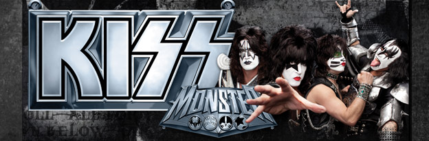
Kiss
If you google “kiss”, you’ll actually get the band Kiss – which in itself is pretty impressive. Originally known as Wicked Lester, headed by Gene Simmons and Paul Stanley in 1971. But it wasn’t until 1973 that the name change to Kiss came about and a new image was born. The Kiss logo was first developed by their original lead guitarist Ace Frehley, later to be polished by designer and illustrator Michael Doret.
Since then, they haven’t just put it on a few posters and T-shirts – they ran with it. Combined with their trademark make-up and costumes, the entire Kiss brand has been built into a music empire spanning over four decades.
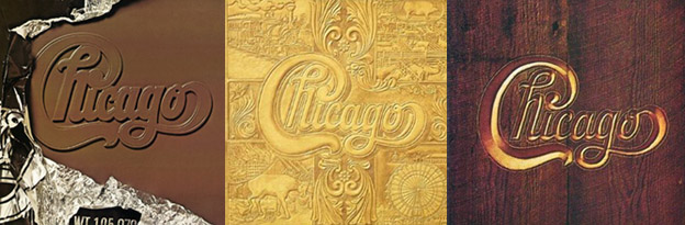
Chicago
Starting out as cover band The Big Thing in 1967, a name change to The Chicago Transit Authority in 1968 was short-lived due to the threat of legal action from the actual Chicago Transit Authority. By the 1970’s the band became simply Chicago. Their final name logotype was designed by art director John Berg.
That logo has since fronted nearly all of the band’s album covers – taking on a different illustrative style each time – yet remaining true to its original design. It has also earned its place in design history, with a nod from designer and author Philip B. Meggs, in Type and Image: The Language of Graphic Design.
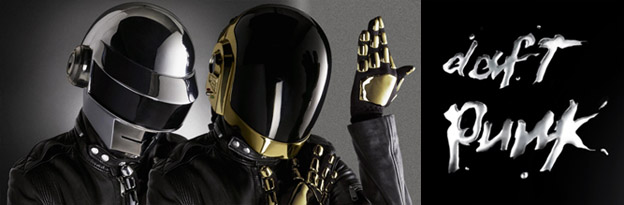
Daft Punk
The French duo that in 1992 was originally called Darlin’, after the Beach Boys song, quickly re-branded themselves as Daft Punk after receiving a negative review describing their music as “a daft punky thrash”.
By the latter half of the 90’s Daft Punk were beginning to not only carve out a place for their unique sound but their solid, albeit unconventional, visual brand. Known now for their look as much their music, the two robot-human hybrids have created an image for themselves without ever showing their faces.
These bands, although completely different in musical genre, have at least one thing in common, they have really taken advantage of branding to boost their identities – as have hundreds of other music greats. The music is their product, but they’ve also crafted a marketable image. And each is an example of how consistent branding can help propel any brand, or band, to the next level.
As most know, a good one-off will only give you your 15 minutes. But great branding, effective marketing and strong design can take what is already unique and give it the stage to really stand apart.
by Lindsay Sleightholm | Jun 28, 2012 | Business Success, Creative, Design
If an image is worth 1000 words, combine that image with text and the actual meaning behind the image becomes clearer. The variable of 1000 different words is reduced to only those that are necessary. This is not to say an image cannot speak on its own – many talented photographers, illustrators and artists can attest to that. Nonetheless, image and text together create a more focused message and is the root of great advertising. Further, the chosen typeface not only speaks with the image, it also speaks for itself.
Let’s start with typography
The origins of typography can include the first forms of written language and date back to about 3000 B.C. with Cuneiform by the Sumerians. However, it wasn’t until about 1440 A.D. when Johann Gutenberg created the printing press utilizing moveable type that typography as a craft really took off. This involved the process of printing by use of type blocks made of metal with raised letterforms that could be inked and pressed into a substrate.

What is the role of typography?
The roles of typography, typographic style and the typeface as parts of visual communication have evolved over the ages. Fast forward to today, within the information age (digital age) and there isn’t much we can’t do with type. We have many different tools and methods for working with typography. However, the principles behind it have not changed much since Gutenberg’s contribution. Ultimately, the role of typography should remain to honour content.
So, what’s in a typeface?
A typeface in itself is a visual. If you do not understand the language presented in type, you see it only as a visual. Although, a typeface is much more than it would appear at first glance. It is ruled by legibility, but also communicates through the form of it’s characters to provide meaning.
As designers and creatives know, we all have quite an attachment to the typefaces we work with. Unlike images, typefaces as elements are the ones that we refer back to on more than one occasion, so much so, we know most of them by name. Also, we know their “personalities” and which one of them would pair best with any given image.
A good typeface as part of a design can be compared to a good orchestra as part of a stage production. The music is heard and felt, but does not bring undue attention to itself. It aids the message. This happens not just through its personality and style, but also the mesh it makes with its image counterpart. It is the partnership of these elements that create a complete spectacle. If one overshadows the other, the message may suffer.
Respect for the typeface
If typefaces are ruled by legibility, we also need to consider their readability. As designers we aim to strengthen the meaning conveyed by a typeface through proper setting, size and placement. After all, any good “face” deserves that much. Without respect for the typeface, and its letterforms, many beautifully designed and legible typefaces can lack readability.

Where is typography now?
Well, through its many evolutions, typography has been handcrafted, mechanized and digitized. With these advancements in technology our relationship with typography has become strained. The speed, ease and flexibility that we have been afforded also means the time consuming task of attention to type can sometimes suffer.
Generally speaking, typefaces have been battered and bruised, scaled, pushed, prodded, stretched, outlined and sometimes just ignored entirely. However, as with any good element, the well intentioned and humble typeface continues to hold strong to it’s rightful place in graphic design.
Once upon a time (and not that long ago), there was an entire industry dedicated to typesetting. The specialized role of the typesetter was to govern the accuracy of the text component in conjunction with the designer’s visuals. Now, the role of designer includes typesetting. Graphic designers hold sole responsibility towards the success of typography within visual communication.
“By all means break the rules, and break them beautifully, deliberately and well.”
– Robert Bringhurst: The elements of typographic style
A good typeface should be embraced for its succinct presence, rather than written-off to optical software. So, let’s all just remember for a moment how much our typefaces mean to us, and how we can best show off their strengths.
What role does typography take in your design and more importantly, how much attention do you give it?
Further reading:
The Elements of Typographic Style
Typographic Design: Form and Communication
Type and Image: The Language of Graphic Design
Stop Stealing Sheep & figure out how type works
by Lindsay Sleightholm | Jun 1, 2012 | Business Success, Design
To spec, or not to spec: that is the question
As a graphic designer, I understand the need to build your portfolio, expand your client base and stretch your creative muscles as much as possible. But from one creative professional to another, I feel compelled to urge you not to participate in spec (speculative) work – including design contests and crowdsourcing.
What is spec work? It’s submitting creative or graphic design to a potential client who hasn’t yet agreed to pay you for that work. As a result, that potential client can offer up any type of possible compensation, or, I should say, the possibility of compensation – without legally promising anything. And you may never see a dime.
Need an example?
All right, let’s say Company X launches a promotion calling for entries for the design of their new logo. In return, they’re offering a $250 prize to the winner – plus, the bragging rights that go along with having published work. What’s more, no experience is necessary. If you win, there is also the possibility to include that piece in your portfolio, opening the doors to many more opportunities in the future. Sounds great, right?
Well, there are a few more questions you need to ask yourself before proceeding with your contribution. First of all, why is Company X using a contest to develop their new logo? Why not just hire a designer? Do they not have the funds to actually pay for graphic design? Is this actually what my time and skills are worth? Will this really lead to more opportunities from bigger clients in the future?
Amateur or professional?
There are certain groups of individuals that are within the rank of amateur. Amateurs often are going through the process of participating in competitions in order to hone their skills and improve their rank. There is a judging panel that decides final rank and ultimately a winner. Typically, this also means no payment is received. Some of these include Olympic athletes, voice, dance or acting talent hopefuls.
On the other side of the spectrum, there are professionals. These individuals are paid to perform specialized tasks. Graphic designers are within this category. Unfortunately, as is common practice within the industry, there is a process called “pitching” to a potential client. This is generally understood, as mandated by clients, as being spec. To any agency, this means their creative potential is cut short by having only the limited information given within the brief. In addition, the agency may or may not be informed that they have competition. Ultimately, it is the time, concepts and designs of the creative team that are presented; yet, these individuals are the only ones around the boardroom table who will not be paid to be there.
Why is it that creative professionals should have to take on gratis work, that in effect, puts them in the category of an amateur?
Is spec work bad?
When it comes to spec work, “bad” may not be the right word to choose. “Unethical” would be more appropriate. “Risky” might be even better.
By not having a solid agreement in place between the designer and client, there’s greater risk for the designer. The designs offered up could potentially be used without the designer’s knowledge, and he or she is by no means guaranteed compensation. Even the prize initially promised could end up being less than advertised. What at first seemed like a nice, shiny carrot could later resemble little more than scraps.
As a designer, you’re not the only one who may lose out from being part of a design contest. Spec work devalues the entire graphic design industry. It drives down the going rate for design work, while driving up the misconception that graphic design can and should be acquired as cheaply as possible. Put simply, it makes it difficult for everyone else in the industry to be respected for their worth.
We all make mistakes
Okay, so now you know a little more about spec work. Think back to that contest you entered a few months ago. You put a lot of hard work into that design, and sent it off with high hopes of being chosen as the winner, right? I’m guessing not much resulted from that entry. If you were lucky, maybe you got a “thank you” for a job well done. Does this sound familiar to you?
Everyone makes mistakes. What’s important is learning from them and passing on those lessons to others. Instead of entering contests, there are much more effective ways to build up your experience and credibility. If you haven’t already, get yourself on LinkedIn, visit your local design council, or talk to that friend-of-a-friend who knows someone in the industry. Fostering good relationships with your peers is a much more reliable way to further your career.
While we’re on the subject, here are some great resources for learning more about spec work:
• AIGA, the professional association for design (AIGA – USA)
• Society of Graphic Designers of Canada (GDC – Canada)
• No!Spec (international)
There are always different sides to the same story. This is my view. I’d like to know your view on spec work.
by Lindsay Sleightholm | Aug 31, 2011 | Creative
Creativity. Where does it come from? How does it happen? Some may think that an idea simply pops into your head. When you’re lucky, sometimes it does. Most of the time it needs to be coaxed. In a world of steady deadlines and day to day expectations, it is easy for the creative mind to get lost behind the left brain obligations. So, how can you inspire creativity when it is needed – when the idea doesn’t just ‘pop’ into your head?
There are various techniques and exercises that many creative people, be it designers, creative directors, marketers even artists use to summon the right brain when they need it. Everyone has a different process that inspires creativity. It is unique to the individual. What works for one person, may not work for the next. The only real mystery is finding the right combination of techniques that work for you.
Here are a few techniques to help inspire your creative thinking. Who knew listening to the left brain could help us develop the right brain?
- Sketching
- Free Writing
- Mind Mapping
- Problem Reversal
- Group Brainstorming