by Christine Marr | Apr 12, 2012 | Branding, Creative, Design
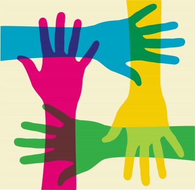
Our reaction to colour is subliminal. As consumers, we are generally unaware of the persuasive effects of colour. Psychological effect is instantaneous, stimulating the senses and power of suggestion. We see it in every level of communication: in corporate identification and logos, signage, advertising on tv, billboards, in print media and packaging, on the computer and in-store. As we zip down isles in our favourite stores, our eyes rest on a package for approximately .03 seconds. In that blinking-of-an-eyelash timing, the packaging/sign/logo must rivet the observers’ eyes, inform them of the product, and, more importantly, appeal to their psyches.
I doubt I am saying anything new here. However, last week, we went to visit a client at their office and what happened there, prompted me to take note about colour and how we identify with it. We hadn’t been to Dentsply Canada’s office in a little over six months. As we walked through the door, the receptionist glanced up and said “…from 3H?”. Wow, that completely floored me. We make a point of always wearing purple when we see clients, because purple is the dominent 3H brand colour. This was enough for the receptionist to remember our visit from 6 months ago. We, at 3H, are strong believers in Brand Recognition!
We practice what we preach. While we clearly know and acknowledge that it takes much more than colour to build a brand… what you do with a “brand” colour clearly enables and facilitates brand recognition. Colours are so intimately associated with a brand that just the suggestion of a colour is enough to bring a brand to mind. That’s isn’t simply amazing… it’s awesome in building equity.
Think about this…
When you think of Home Depot, what colour comes to mind?
Which bank is “blue”, which one is “orange”, and which one is ‘green”? Close your eyes and picture the Google logo. The McDonald’s logo? And for my Canadian readers… what is meant by the “Windsor” blue.
Our reaction to color is instantaneous and this lens is a quick look at general responses based on research, historical significance of color and word association studies. Let’s take this one step further… picture the Home Depot logo, but with different words in the same font in the orange box… would you still recognize it? Would you see the logo as a whole, as one image, and recognize it instantly, associating it with Home Depot.
So when developing a brand and beginning with the basics of creating a logo… choose a colour that would represent your brand identity effectively for now and the future…And repeat after me….
Repetition, repetition, repetition… consistency… everywhere… all the time. Exposure over time ensures success….. but that’s a different point of discussion! Colour makes a brand stand out and command attention and make sure that the Logo colour matches your brand mission and message to create the brand identity you want.
So what do colours mean anyway? Here’s a brief overview.
Green occupies more space in the spectrum visible to the human eye than most colours. Green is the pervasive color in the natural world, making it an ideal backdrop in interior design because we are so used to seeing it everywhere. Green is considered the colour of peace and ecology.
Purple embodies the balance of red’s stimulation and blue’s calm. This dichotomy can cause unrest or uneasiness unless the undertone is clearly defined, at which point the purple takes on the characteristics of its undertone.
Blue is seen as trustworthy, dependable, and committed. As the collective colour of the spirit, it invokes rest and is calming.
Yellow shines with optimism, enlightenment, and happiness. Shades of golden yellow carry the promise of a positive future. Yellow will advance from surrounding colors and instill optimism and energy, as well as spark creative thoughts.
Pinks are youthful, fun, and exciting, while vibrant pinks have the same high energy as red; they are sensual and passionate without being too aggressive. Pink is the color of happiness and is sometimes seen as lighthearted.
Orange sparks more controversy than any other hue. There is usually strong positive or negative association to orange and true orange generally elicits a stronger “love it” or “hate it” response than other colours. Fun and flamboyant orange radiates warmth and energy.
Understanding colour and what they represent is important in establishing a brand persona. In today’s world of fast communication and overload of visual stimuli, it is more than vital that brand expresses its identity at the blink of an eye.
If you had to define your personality as a brand colour, what would it be?


by Lindsay Sleightholm | Mar 8, 2012 | Business Success, Creative, Design
Okay, so as designers, we all loved “You know you’re a graphic designer when…”. For those of you who weren’t around or don’t remember, this was a viral list of some of the many oddities and unique characteristics that describe graphic designers. It was a little tongue-in-cheek, and for the most part, it really rang true.
When it first hit the web a number of years ago, it was extremely well received. I remember being huddled around a single computer in the studio with the rest of the designers. We all shrieked in delight about how much we related to it and about how much we really had in common with each other. Many similar lists spawned from the same idea. You can Google pretty much anything on the end of “You know you’re a” and come up with a list.
But, why did we like it so much? Perhaps because we felt someone took the time to get to know us. Well, they may not have really known us, but they touched upon aspects of ourselves that we could relate to. Someone articulated things about who we were that we may not have even realized. And, they not only made sense, they made us laugh and think about ourselves in a different way. That connection is what we gravitated to and why we shared it with everyone.
It is that same connection we as creative professionals still strive to achieve with our design and communications. We want our audience to know that we took the time to get to know them. We want them to think about something differently. We want to appeal to who they are as individuals and provide them with a message they can relate to.
In a world that’s getting a lot smaller, where we’re constantly inundated with messages – a lot of which are just noise – we want to have a clear voice that can speak to our audience and achieve that desired connection. So, how do we do that? We ask questions, we listen, we share and we learn. We then take what we know and apply it to our work. Hopefully, at the end of the day, that attention to detail has made a difference – not only in what we say, but how we say it.
On that note, how about reviving the list for today’s designer, just for fun? And this time, let’s make it a quiz… are you a graphic designer?
- When selecting a greeting card, do you opt for the better design over the perfect sentiment?
- Do you ever wonder how it’s legal to have the names of street signs horizontally scaled to fit the allotted space?
- Have you ever tried to command/control ‘S’ while reading a web page that you weren’t finished with?
- Do you feel that if someone touches your monitor it’s an intrusion upon your personal space?
- When you discover the list of web safe fonts has been added to, do you feel the need to high-five someone?
So, how did you do? Or, better yet, what questions would you rather ask?
by Miriam Hara | Feb 16, 2011 | Advertising
Smartphones are getting smarter, all thanks to advertising. With more people accessing the internet through their mobile phones, ad upgrading offers a huge niche for ad revenue. Mobile advertising is where creative juices (and funding) will be flowing hard. The thought of putting progressive advertising into the palm of every smartphone user’s hand couldn’t’ be more exciting!

Image provided courtesy of the Annie Mole (flickr), under the creative commons license.
With Google’s acquisition of Android Operating Systems and with the purchase of AdMob, the largest mobile advertising network out there, Google has put their stake in the sand for the fight in mobile advertising dominance.
A hair behind is Apple, with a $275 million dollar acquisition of Quattro Wireless after losing out to AdMob. The launch of the iPhone 4G which allows users to browse multiple programs simultaneously, has invariably improved the possibility for greater advertising space.
This means a great change for agencies, as it builds a brand new facet to our already lively interactive sector, and a viable tool for branding and monetizing the mobile web. Mobile advertising in the recent past was relatively archaic and chunky, but with big media players investing in functionality, the result is our playground.
mph
by Miriam Hara | Aug 5, 2010 | Interactive
I don’t like to think of the web as a numbers game – but when you are ranked in the Google top 3, it is a thing of beauty and joy. Being SEO minded when developing your web site is as key as promoting your unique selling position (USP). To achieve optimized search ranking and optimizing this medium, small, medium and large-sized companies alike are speaking about on-line marking strategies and looking at the increasingly popular and trendy tactics – Linkedin, Twitter and Facebook . Yet many are still unaware of how those tactics can be further leveraged using these free networking resources with more SEO know-how.
(more…)


