by Lindsay Sleightholm | Oct 16, 2013 | Branding, Design, Latest, Marketing
Though I’m a big music fan, I’m not going to pretend I know much about the actual music industry. But I do know a lot about graphic design and have my share of marketing know-how. And I recognize that there’s a lot more to creating an iconic band than great guitar riffs and a good-looking lead singer.
Is a band a brand?
Some bands are just bands. They’re not interested in creating an identity for themselves beyond what their music conveys. Although bands who want to get to the next level know that the business of music is not unlike any other business – it requires the use of marketing, advertising and design. Like anything else, good branding can help distinguish them among the competition. Bands have their own identities. Yet as musicians they’re not just creating music, they’re also shaping a brand persona – whether this was their intention or not.
Does a band need marketing and design?
Just like any other brand, a band needs to find its audience and connect with them. This happens of course through their music. However it is also created by the interactions they have with their audience, their public performances and appearances, their official and unofficial videos on YouTube, their presence on social media and their visual identities.
This is where the marketing and design comes in. Visual identities are created in order to market the music. These identities can end up on every facet of their visual branding – from T-shirts to websites. Some of the most successful bands of all time have made great use of this visual medium.
Band brands
So putting my music tastes aside, I’ll throw on my designer hat for my picks of some of the best in band branding.
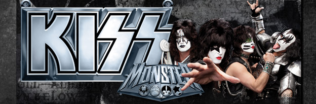
Kiss
If you google “kiss”, you’ll actually get the band Kiss – which in itself is pretty impressive. Originally known as Wicked Lester, headed by Gene Simmons and Paul Stanley in 1971. But it wasn’t until 1973 that the name change to Kiss came about and a new image was born. The Kiss logo was first developed by their original lead guitarist Ace Frehley, later to be polished by designer and illustrator Michael Doret.
Since then, they haven’t just put it on a few posters and T-shirts – they ran with it. Combined with their trademark make-up and costumes, the entire Kiss brand has been built into a music empire spanning over four decades.
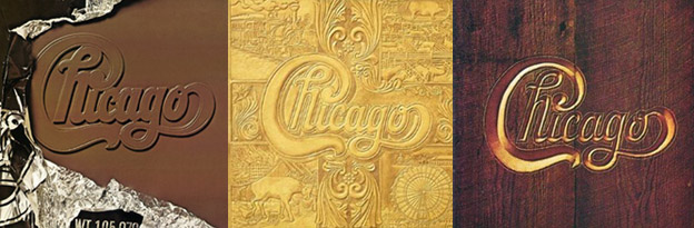
Chicago
Starting out as cover band The Big Thing in 1967, a name change to The Chicago Transit Authority in 1968 was short-lived due to the threat of legal action from the actual Chicago Transit Authority. By the 1970’s the band became simply Chicago. Their final name logotype was designed by art director John Berg.
That logo has since fronted nearly all of the band’s album covers – taking on a different illustrative style each time – yet remaining true to its original design. It has also earned its place in design history, with a nod from designer and author Philip B. Meggs, in Type and Image: The Language of Graphic Design.

Daft Punk
The French duo that in 1992 was originally called Darlin’, after the Beach Boys song, quickly re-branded themselves as Daft Punk after receiving a negative review describing their music as “a daft punky thrash”.
By the latter half of the 90’s Daft Punk were beginning to not only carve out a place for their unique sound but their solid, albeit unconventional, visual brand. Known now for their look as much their music, the two robot-human hybrids have created an image for themselves without ever showing their faces.
These bands, although completely different in musical genre, have at least one thing in common, they have really taken advantage of branding to boost their identities – as have hundreds of other music greats. The music is their product, but they’ve also crafted a marketable image. And each is an example of how consistent branding can help propel any brand, or band, to the next level.
As most know, a good one-off will only give you your 15 minutes. But great branding, effective marketing and strong design can take what is already unique and give it the stage to really stand apart.
by Miriam Hara | Sep 7, 2013 | Business Success, Design, Interactive, Latest
Gone are the days when having a static website was good enough – essentially showcasing an online brochure of a business. The introduction of flash animation and all the other bells and whistles have also run their course, (thankfully going by the wayside) now becoming passé. The evolution of websites and their role in the business arena has changed substantially; first playing a superficial role to one that is key in the success of any business. Business websites need to work harder to achieve differentiation and assist Marketing and PR initiatives.
A website’s relevancy in today’s business environment has become a necessity. It is no longer a nice to have to but a need to have. Here are a few elements that websites should have.
Social Media Icons: The integration of social media is key. It says a lot when you go to a site and there are no social media buttons… and at the same time that business site speaks of being innovative and cutting edge! I am not saying that businesses should include social media icons if they aren’t really doing anything on social media. But then, you must ask yourself, is this a company you want to start a relationship with?
Fresh Information: Minimally a website home page should have fresh content. That’s the only way Google will come over and visit the site.. helping the website ranking within the world-wide web. A feed from the business blog would be ideal… or a feed from a recognized industry newsletter or publication. The rotation information is also a good way to keep a site fresh, but that too needs to be updated and refreshed.
Page Naming: Website design, website navigation and website user experience are all important. However, how a site identifies and names each one of its pages is an easy way to maximize the performance of the website’s SEO (search engine optimization). Each page url on a business website should be unique and should be formulated with relevant keywords.
Build Relationships: The business website is the first step in developing some very important relationships. Websites should create valuable information for its visitors. Requesting visitors’ information through special offering such as ebooks, surveys or giveaway offers is a good way to start those relationships. Events should also be promoted, such a business milestones and contests, integrating the total digital experience for that business.
Websites are the first impression businesses make and they speak volumes about the culture and persona. As we enter the last quarter of 2013… (Bob Dylan stated so eloquently) “Times they are a-changing”. It’s time to take a good look at your business website to assess if it measures up.
by Miriam Hara | Aug 6, 2013 | Business Success, Design, Latest, Marketing, Social Media
In today’s corporate environment the vertical integration of all marketing facets is fast becoming the norm. The adage of “wearing many hats” that was once synonymous only with entrepreneurship, is no longer. Corporate marketing is increasingly becoming, in their own corporate space, a marketing hub for their brands, services or products.
If you’ve been following our blog 3H hoopla, you know that I have posted many times about the changes in technology and what that has meant to the advertising and creative field. Today I’m going to focus my perspective on what those changes have meant to corporations. Technological advancements, in terms of today’s computer and software systems, have allowed corporations to get “a handle” on their creative. Desktop publishing has given way to more sophisticated marketing and creative departments. Many corporate businesses have full internal marketing and creative departments, staffed with art directors, creative directors and graphic designers. Needless to say, this also means there is a greater need for full internet connectivity and monitoring of the way the corporation presents themselves to their target audience online, requiring a merging of the IT department with the evolved marketing department.
Over two decades after the launch of desktop publishing and the worldwide web, the business world is “a buzz” with social media.
Today’s corporate marketing departments are now finding themselves having to contend with all the social media platforms: Facebook, LinkedIn, Twitter, Pinterest and Instagram, to name just a few! Although the social media channel is nothing new, its platforms are relatively unchartered territory for corporate marketing. Many don’t know how to use them effectively, or evaluate and monitor their use.
As a result, many corporate marketing departments are becoming entrepreneurial adding yet another hat, social media to the number of hats they are currently wearing. Unlike entrepreneurs however, budgets are the not the motivating factor in initially taking on social media as a DIY (“do it yourself”) initiative. What ever the motivation is, it isn’t too long before corporate marketing is faced with the fact that to really run and maintain any social media property effectively, it takes a lot of time, focus, energy and knowledge.
Corporations are vertically integrating their creative needs and now, their social media needs.
On a theoretical level it all makes sense. At the surface, staffing for social media simply involves a good command of the English language with a strong understanding of social media properties. Right? Corporate businesses can now “own” all the layers of marketing, from product development, brand management, creative development, design and execution and now social media. The motivation of control and “owning” the brand voice is a real concern, but there are creative professionals and agencies that can be outsourced to provide this service seamlessly.
All this to say, social media isn’t a layer of marketing to be taken lightly. Social media entails strategy, investigation, monitoring, writing and engagement on a continuous (24-7) basis. At this point of the life cycle of Social Media, does it make sense for corporations to spread their resources too thin by including social media into their marketing layers? What are your thoughts on this, I’d like to hear about them.
by Lisa Wedmann | Jul 17, 2013 | Business Success, Communications, Creative, Design, Latest, Miriamisms
More Killer Tips on PowerPoint Templates and Backgrounds
This is the second time you are making a presentation to the same group. The guy yawning in the back of the room has perked up. The woman gazing at her nails looks up once or twice. At least this is an improvement. Last time she only looked at you in the beginning, after three minutes she was back to her nails.
But you notice another person that keeps looking at your slides. He looks at the slides, then he looks at his notes, then he looks at the slides again. You’re not sure what he’s doing but there is one thing you’re sure, he’s not listening to you.
What gives? You did what was important. You designed your PowerPoint presentation and you followed the formula correctly. (A recent blog I wrote Two Killer Tips for PowerPoint Presentations outlines this recommended formula.)
Is there anything else you can do to make your PowerPoint presentation more effective? Is there a way to design your PowerPoint slides to create greater interest in your presentation? Is there a way to make them look more professional? Absolutely. In addition to your personal presentation style there are many visual factors that contribute to the effectiveness of your PowerPoint presentation.
Keep Them Listening to You
No matter how animated you are and how much you engage your audience at some point during your presentation they will look at your slides. And when they look at your slides you need to make them as clear as possible so they can look quickly and get back to listening to you. How do you make your slides clear and quickly comprehensible.
Don’t let PowerPoint Templates Drive Your Content
Many businesses have a corporate PowerPoint template which you must use. In this case you don’t have any choice
But if you have flexibility to choose your own design, you may feel you should use PowerPoint templates to look professional. You are not the only who feels this way. Many people scan through the designs in PowerPoint templates to find the one they like best or if they want to be different they search on the web for that perfect PowerPoint design.
The danger with PowerPoint templates is the template starts to drive the content. It may be the size of the font, it may be the colours, it may be the format on the page. You may not be able to include charts the way you would like, insert a table or even add photos.
As you start working through the template you find you have to modify your content to fit the template. It doesn’t make sense to sacrifice the content of your presentation to fit the format of the design template.
You can change the format of the template to fit your requirements. But when you make changes to the template format the template loses its integrity since it is a departure from its design. Once the template loses integrity it degrades each time you deviate from its boundaries. Every time it is degraded you lose the cohesiveness of your presentation and the clarity of your slide.
Don’t get me wrong, I’m not saying you should never use PowerPoint templates.
When used properly, PowerPoint templates make it easy to format your material. They are consiste nt in look and feeland provide a theme to your presentation.
Three Words on PowerPoint Backgrounds
Here’s my thought on backgrounds. Don’t use them.
You might be surprised that I am taking such a hard line stance. The truth is you look like an amateur when your PowerPoint background colour is dark and your text is a colour. It is difficult to read yellow on a black background, yellow on a blue background or even worse red on a black background and your presentation is a toner hog to print.
When you think of your PowerPoint background colour think of Google or any of the search engines. The majority of the text is black on a white background. That’s what people see every day. Any other colour is a departure from the norm.
And in this case you want to be the norm. Don’t fight it. Keep your text black on a white background. Use colour sparingly.
Use PowerPoint Templates and Backgrounds with Care
PowerPoint templates and backgrounds can work for you but choose carefully. Don’t let them drive the content of your presentation. Form follows function (Louis Sullivan) function doesn’t follow form.
Remember you want that guy who keeps glancing up and down at your slides to absorb the material quickly so he can get back to focus on you.
by Justin James | Jul 9, 2013 | Advertising, Business Success, Creative, Design, Latest, Social Media
As I mentioned in my last blog, I want to be an entrepreneur. I have come to realize that the key to success is letting people know about your business since you need customers to earn money. Marketing is crucial for any business, and is important for me to understand if I want to run a successful business. To market effectively, I need a good marketing process.
At 3H, a lot of hard work goes into marketing. There are countless hours spent on the creative process, content and design, and linking all of the elements together effectively. For that reason, I believe one could call 3H’s marketing process 3D.
The “Three Dimensions” of the Marketing Process
The first dimension is the creative process. In only a couple of days, I’ve learned that a lot of time, inside and outside of the office, is spent on conceptualizing ideas. In this process, their team conjures the foundations for websites, advertisements, and strategic targeting of demographics and what appeals to them. This creative edge is what makes 3H stand above other marketing and branding agencies, since creativity is an essential part of connecting with an audience and capturing their attention.
The second dimension is where creativity meets reality. In the content and design phase, the company’s talented artists, writers, and web developers capture their creative ideas in a tangible, unique way. While I find the creative dimension enjoyable, it is this second dimension that makes me feel most satisfied as ideas come to life in ads, promotions or websites.
The third dimension is turning well-conceived efforts into effective efforts. This third phase links the content and ideas to the desired audience through blogs, social media, and introductory promotions. It is in this phase that 3H reaches out to the clients’ targeted demographics to build familiarity and trust with their potential buyers through online and offline tactics.
On social media platforms, like Facebook and twitter, 3H effectively uses content to engage their readers and spark their interests. The third dimension is the difference between reading well-written content on a website and feeling a personal connection with the company as they build trust, good will and confidence.
During my internship, I hope to learn more about the processes 3H utilizes in order to create the effective content they produce. I’m excited to have an opportunity to work with several new programs, including Google tools, Photoshop, and possibly Dreamweaver!
Even if I don’t become a marketer, understanding the need for effective marketing and the process behind creating good content is critical. I know that if I can learn these three dimensions, any future business I have will be more successful. Understanding how intricate the marketing process is makes me realize that it can be done most effectively by specialists in marketing. As most successful entrepreneurs know, it is best to stick with your core competencies and have other experts handle the accounting, marketing, shipping or other tasks, so you can do what you do best – and get the customers you need.
by Miriam Hara | Jul 2, 2013 | Creative, Design, Latest
What is creativity? There’s a misconception on what or rather who can call himself or herself a “creative”. There are many types of creativity out there. You don’t necessarily need to draw and paint in order to be a creative being…. so if you don’t, don’t sell yourself short. I run a brand creative agency and I have found that being creative and owning the label of a ’Creative’ is much more than drawing or painting. Through the many years of running a creative agency with graphic designers, web developers, photographers and writers, there are many different creative personalities, but they often fall into a creative type. Here’s my informal list of creative types identifiers.
Which one (or two, or three) best defines your creative style?
The ‘Artiste’: True and tried, these creative types are what everyone naturally thinks of as “creative”. They can be artists, sculptures, glass blowers, graphic designers, animators, art directors, illustrators and painters. They use any medium from a paintbrush and easel to computers and software such as Indesign, Photoshop and Illustrator, to name a few.
The Physical Artist: Born to perform, these artists are actors, comedians and yes, even musicians. They are at the forefront of their creative expression…. seen on TV or in the movies and can be found in local bars and theatres.
The ‘Conceptual’: Give these people a brick of information, add to it restrictions and rules of what can be done and what can’t be done… and leave them alone. They’ll come up with ideas that speak volumes and words that rock your world. Their thinking is organized, concise and rational. They’ll be creative directors, writers and art directors.
The Stylists: These creative types are visual. They use material (from fabric to brick) and colour… and understand lines and space. They’ll be your Fashion designers, architects, interior designers and interior decorators.
The Imaginative: Creative thinkers they always ask the one important question: “what if”. This creative group loves problem solving and is often inventors and innovators… and they can be anything from urban planners to scientists and anything in-between.
The Linear: With the advent of technology, I would be amiss if I didn’t include this creative type. From understanding website navigation and user interaction to making sites look good and maintain functionality, this group of creative IT designers are as integral as conceptual thinkers and artists in the marketing field.
So what’s your creative type? Do you have one that I haven’t listed? I’d appreciate you defining your creative type here.
Look forward to hearing from you!