by Lindsay Sleightholm | Nov 21, 2014 | Advertising, Creative, Design, Latest
“Getting” creative
Let’s start at the beginning. Long before you decided to get into a creative industry, at some point you discovered that you were good at it. Something just clicked and it made sense to you. You enjoyed it. Sometimes you’d even get excited about it. And if you were lucky, the people around you would encourage you to keep at it. There was no doubt about it: you were headed into the business of being creative.
Doubt creeps in
Somewhere along the way from point A to point B you encountered something that made you doubt yourself. What that is varies from person to person. But most of us know what it feels like. We change from being happy and excited about what we’re working on, to thinking we’ve made a mistake. As creatives, we sometimes feel a little vulnerable about what we produce. Although we are working for our clients, our work speaks partly about who we are as people. And it can be hard not to take criticism personally.
Self-doubt is any creative’s worst enemy
What happens when you don’t have confidence in your ability? Well, it makes it very hard to be creative. A lack of confidence can actually be creatively crippling. Any idea you may have is inevitably thwarted before it can be realized because you don’t think it’s good enough. That’s only if you actually get any ideas. More often than not, if you don’t feel confident, ideas just don’t happen. Some refer to it as being “blocked”. Unfortunately for any creative, we really can’t afford be blocked.
It’s okay to question yourself
Let’s face it: the creative industry is a competitive one. So you’d be right to question your ability from time to time. I’m pretty sure that if you didn’t question it occasionally, you wouldn’t fully realize what you’re capable of. For instance, sometimes questioning what you can do leads to improving your skills or taking the time to learn about a new subject. It’s actually a good thing.
Don’t compare yourself to others
The problem comes when you question yourself in a detrimental way. One of the biggest ways to do that is by comparing your work to the work of others. This never ends well. It’s okay to be inspired by others and let that inspiration guide your work. But comparing the value of your ideas against the ideas of others is not only detrimental, it’s inaccurate. Everyone is different. Each of us experiences the world and thinks in a different way. That’s what makes being creative so exciting in the first place. By thinking that someone else’s idea is better than what you would have thought of, you’re actually making the assumption that everyone thinks the same way.
Validation builds confidence
Creativity needs to be nurtured. As creatives seeking confidence, we also require validation. Referring back to the beginning, we need acknowledgement from the people around us to encourage us to keep at it – no matter how long we’ve been doing it – whether it comes from those in our personal lives, our peers or our superiors. Ultimately, everyone needs a second nomination. Lastly, and the most important thing, is self-validation. Because no matter how anyone else views you, if you don’t believe it for yourself, it doesn’t matter what anyone else thinks.
by Belinda Lui | Feb 3, 2014 | Advertising, Branding, Business Success, Communications, Creative, Design, Latest, Marketing, Social Media
We’ve been noticing a trend recently that lends a hand to the celebrities and shows that a lot of us grew up watching. What is the purpose of using these particular stars or shows to appeal to viewers? We think it has something to do with nostalgic value. Retro advertising has been done before but ever since Oikos used the stars from Full House to market their products during the Super Bowl, we’ve seen other brands follow suit. Before we share some of these ads with you, let’s discuss why nostalgic value has any value when it comes to retro advertising:
Much like emotive advertising, retro advertising is successful because we associate certain memories and feelings with that time period in our lives. I don’t know about you, but I associate only good things with the TV shows that I grew up watching. I remember coming home from (what seemed like) a never-ending day at school, plopping myself down on the couch with a tall glass of milk, and watching after-school specials until my mother came home. That small window of alone time never went unappreciated. It was an adolescent’s time to reflect on the lessons being taught through these programs. So, when a legacy brand uses a legacy show to simulate certain emotive associations — it’s actually quite a brilliant strategy; especially if that brand is formerly associated with negative feelings.
Retro Advertising at its finest:
This is Delta’s ’80s-themed safety video: a fun and light-hearted take on a video that so many of us choose to ignore before taking off on a flight. Bet you won’t be able to ignore it now!
This is some of the cast from Full House appearing on Jimmy Fallon — this may not be directly advertising a product or service, but it was the top trending viral video on Facebook on January 20, 2014.
What examples of retro advertising can you share with us?
by Kristina Parker | Jan 20, 2014 | Design, Latest
If you’ve been on the internet long enough, for something a lot more sensible than cat videos and pointless Facebook updates (say for instance, for making some real money) then you’ve also- on multiple occasions- come to that moment where you’ve had to get a website for yourself. Now, getting a website that actually works wonders for your business AND manages to survive the regular spate of Google updates is no cakewalk. You need a pro to do the best for your website. Luckily, it’s easy for you to find a good web developer, but how do you get the one you can trust?
One simple test is by making him discuss things that no other web developer would want to, like these four things…
You can’t go ahead without a plan
If you’re going for anything major, you need a plan. Many business owners think of their website as a whole different entity, as opposed to considering it a major aspect of the marketing strategy. Therefore, it doesn’t really make sense for you to just put random or no content up for users to see. Web design actually varies based on its purpose. So, obviously marketing plan counts. After all, it is the one thing that gives you solid direction. A good web developer understands this, and expects you to let him in on the plan too. This will help him come up with a more relevant design, which is perfectly in line with your goals and objectives.Talk to him about your target audience and the kind of growth you expect from the website. Don’t shy away from deep discussions about your plans with the developer.
Bad content
While the whole ‘Content is King’ thing may be over-hyped, there is a reason it has become the hype. Unique, relevant and original content is what lends your site the credibility that keeps people coming back to it. If the content is bad, no masterstroke of web design is going to save it. And if your web designer/developer isn’t telling you that already, you’re pretty much being taken for a ride. Agreed that the web developer isn’t really a big expert on the subject firsthand, however, he’s seen enough of web content to be able to distinguish the good ones from the bad. Moreover, publishing the content on a website is a major part of the web design. So, the bad content will eventually translate into bad design.
You will want to change
Nothing on the internet is stable or constant. Trends are changing on a daily basis and people are constantly on the lookout for something new and fresh. As a business, you have to constantly stay on your toes, so that you’re not lost in the crowd and clutter out there. This will require you to make some changes in the future. You wouldn’t want to stay out of tune with your audience. You need to maintain your appeal. Plus, somewhere down the line, your objectives and goals will change, so will your needs. Imprisoning your website in the last century with technology that cannot be altered or changed is one of the first things a good web developer will prevent you from doing.
Demand feedback
You’re not going anywhere without this. Yes, you may have a specific vision in mind. And yes, it’s for YOUR business, but don’t forget that you are putting it out for the world to see. It’s about the users- your target audience. And it is important that your website doesn’t fall flat on its face due to lack of appeal. This is why feedback helps; it lets you know what the other side is thinking. No developer is going to let you go live with a website without getting adequate feedback first.
The secret behind the success of any collaboration is clear and open communication, and of course, great attention to detail. Stick to these, and you should be sorted. Good luck!
by Belinda Lui | Dec 27, 2013 | Design, Latest
Innovation can be defined in many ways. You can deliver innovative design or an innovative user experience. In any scenario, innovation stems from the desire to either create something unique and original that has never existed before, or to take an existing product or service and make it even better. Here at 3H, we thrive on the being innovative and thus, put together a list of some of the companies we thought were the most innovative companies of 2013:
2013’s Most Innovative Companies:
1. Burberry: The company’s cutting-edge vision of creating a new user experience brought the runway to the physical stores — through the mirrors. Using RFID chips, which can be read by screens and mirrors, when a customer is trying on clothes, the mirrors can respond by showing images of how it was worn on the catwalk or details of the garment’s construction.
2. Sephora: It’s exceedingly frustrating to choose a foundation when your skin tone keeps changing with the seasons. Without an endless cycle of trial and error, finding the right colour can be a tedious task. Thankfully, Sephora has a handheld device, whose technology is based on that used in graphic design, which holds over 1,000 SKUs of colour to determine an exact match for customers.
3. Flipp App: This is an app that aggregates information from users and retailers to provide the ability to search flyers by interest and your location. Magazines have gone digital, why wouldn’t flyers? This is considered one of 2013’s most innovative companies because they identified a need: making a necessary part of everyday life more convenient, while being environmentally friendly.
4. Crate & Barrel: The retailer’s 3D Room Designer gives customers the ability to ‘try on’ a piece of furniture in their rooms before buying it. Users simply upload a photo of the room they would like to furnish to Crate and Barrel’s online platform and provide their room’s dimensions. The photo is the wiped clean of its furniture, enabling shoppers to substitute pieces from the retailer’s online catalog and visualize them as they would appear in the room. Shoppers can then email the modified photo of their room to the nearest Crate and Barrel and schedule a personal design appointment with an associate.
5. Uniqlo: The Japanese clothing giant has made “fast fashion actually fashionable” (a distinction that some other fast-fashion retailers might disagree with), citing its collaborations with such designers as Jil Sander and Rei Kawakubo.
What examples of innovative companies weren’t mentioned here? We’d love to hear your comments!
by Lyndsey Loiacono | Nov 4, 2013 | Design, Latest
Designing Restaurants: It’s the outside that counts.
If there is one thing you should know about me, its that I have a huge obsession with food. Cooking, eating, watching food network, I love it all. Growing up in an Italian family and spending hours sitting around a table might have something to do with it. So when thinking of a good topic to share, I thought it would be best to combine my love with food and my love for designing.
I spent 2 of my best years living in Toronto where there are restaurants every where you turn. What makes Toronto a world class city is the diversity in restaurants, but how do they stand out from one another? It seems now more than ever a restaurants brand is as important, if not more important than the food they serve you. It’s your first impression from the outside that brings people inside. Designing a restaurant logo is only one factor in designing a strong and unique restaurant identity.
Here are some great examples of restaurants that got designing appetite appeal right…. from the outside in!
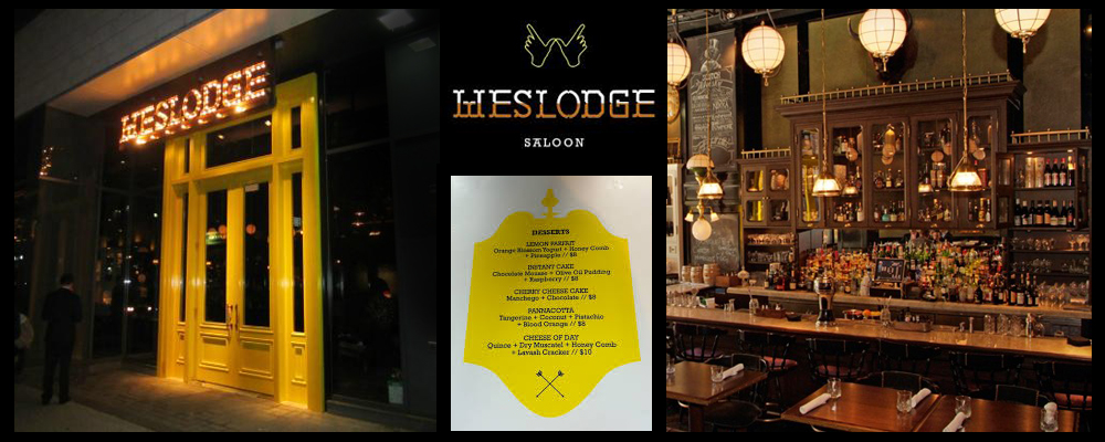
Weslodge, weslodge.com
This new on-the-scene restaurant in the popular king west area, has been branded as a “modern saloon”, with its impossible to miss canary yellow doors jumping right out at you. The interior is dark and feels like you have walked into a twisted pioneer hunting lodge with taxidermy filling the walls. Its logo has a modern back-woods feel to it and that canary yellow is shown very subtlety through menu design. What I love the most about this restaurant is how it celebrates it’s identity by the use of lights on the logo which separates this place from everything else on King west.
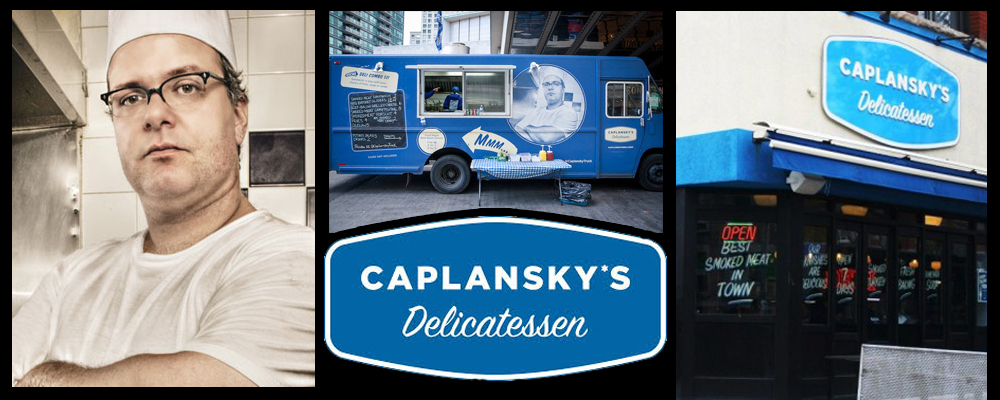
Caplansky’s Delicatessen, caplanskys.com
Oh so retro! Zane Caplansky is his brand as seen on the home page of his website dressed as a 60’s breakfast line cook, and good quality kosher food is his game. But before you go inside this eatery, it’s the outside that catches your attention. The retro throw back look is evident in the logo to the paint and design of the actual building. You feel like your looking back in time when your gazing at this place and in many ways you are. It’s simple yet forceful, establishing the Caplansky brand on the the corner of College and Brunswick for the past several years. To top it off, the Caplanksy food truck is a moving brand machine. Going to private events to food truck cook-offs, the proven look of the restaurant is arguably more powerful as a driving diner along the streets of the GTA.
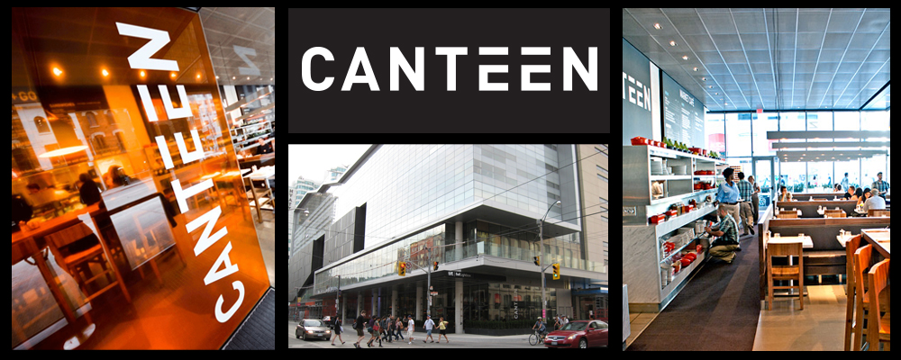
Canteen, oliverbonacini.com
Location, location, location! Ok so were not here to talk about the importance of location, were talking branding. But there is no denying that a superb location is only going to help any company, especially a restaurant, by solidifying it’s brand to the public. Canteen, located in the TIFF building on King street is front and centre in terms of a restaurant establishing it’s identity in the heart of Toronto. The logo itself is what you might call simple. Clean and cut, it makes you think of what a space station eatery might look like but than it’s location in the TIFF building reminds you that this is no ordinary place to eat. The brand is established really by it’s location more than anything. Hollywood meets Toronto for the perfect place to buy an over priced pizza while looking good doing it.
by Miriam Hara | Oct 19, 2013 | Design, Interactive, Latest
It’s no longer good enough for businesses and their brands to have brochure websites. Now websites have to work a lot harder – especially when it comes to establishing business creditability within the internet environment. An integral part of any solid website design is having navigation that’s easy to follow in order to access information and improve performance on the www.
Any solid website design should consider the following to perform well on the internet.
Allow for social media integration.
The evolution of website design has kept pace with the emergence of social media as well as the various blogging platforms that are now available. Opt for content to provide value rather than glitz and great flash animations, these tire quickly. Credible information not only promotes your expertise, it also increases your chances to get found.
Ensure you get found.
What’s the point of having a website if you can’t be found? SEO is as much a part of the development of a website design as the content. Keywords aren’t just for google ad words – they are the cornerstone of your website when it comes to getting found. Make sure you have your h1 tags enriched with keywords that will drive traffic to your site.
Be user-centric.
Make sure that viewers won’t be frustrated navigating your website. You need to keep that bounce rate % down and the enjoyment rate up!
Keep it fresh.
Google is known to change its algorithm quite often. However, good, fresh contest is the basic premise of google search engines. Make sure that your website provides fresh content, often and consistently. And it’s important that this content is relevant information. Add videos, whitepapers, develop ebooks or even publish how-to projects – anything to keep the integrity of the site strong and provide value to those who visit your site.
Build for tomorrow.
Just like urban planning, a website needs a good infrastructure to build upon. The front end of a website is what we in the marketing field describe as “fun”, but ultimately it’s the navigation and structure of the site that will enable your brand site to really perform.
Who goes there?
Having good solid traffic is great. But if you don’t know who visits your website, you’re only scratching the surface of what your website can do for your business. Make your website work for you – its part or your sales team. Have strategically placed calls to action where you can ask for a visitor’s information. Tie in your social media tactics by adding content like e-books, recipes, entertainment ideas, crafts or scientific white papers to download. But make sure you ask for the visitor’s information to create leads. There are a few good companies such as Hubspot that can assist you in data farming your traffic.
Be responsive!
In today’s competitive and fast paced world, where mobile is becoming the next best thing (if it isn’t already), your site must be responsive… in more ways than one!
Does your website measure up? Take a quick audit of your website against these basic suggestions and see how well your website really performs.