by Miriam Hara | Jun 9, 2023 | Advertising, Branding, Business Success
In the spirit of transparency, this is a rework of a brand building strategies blog with the same title I wrote close to a decade ago! This is one of my favourite sayings and the structure of article, I believe is still solid. My original article was written when brand building was primarily built on the pillars of packaging and advertising. This only involved one-way dialogues and communications. Even with this one way communication stream, some brands were launched…and were still left winking in the dark!
Today’s Complexities
When you market or launch a brand or corporation with little to no deployed communication plan, you will be essentially winking in the dark. No one can see you winking in the dark …no one can see your brand. You know your brand is available…but no one else does.
Today, brand building takes place in a much more complex landscape, where the digital environment and the variety of channels available offer endless possibilities. Platforms such as Google AdWords and YouTube campaigns, app advertising, and social media properties (Twitter, Facebook, Pinterest, LinkedIn, Instagram, TikTok, etc.) are essential for modern brand building. The rise of smartphones and on-the-go searches has opened up huge opportunities for brands to stay relevant and visible to consumers when they’re actively searching. And we won’t discuss omni-channel marketing here or the use of data collection for crafting personalized content…seamlessly, and yes effortlessly(that’s for another blog!).
The Same Yet Different
Amidst the ever-changing digital landscape, basic marketing protocols still hold true. Resonating with the target audience is only possible with a clear and emotive message which now needs to be identified beyond rigid demographic lines. Strategies must not only be focused but diverse.
Over a decade ago, brand building hinged on packaging and advertising. It was a one-way dialogue. No more! Times have dramatically changed. Brand building today taps into platforms like YouTube, social media, and influencers, which are key to a brand’s success.
Brand building strategies today requires integration and high exposure. Traditional (print and broadcast) media advertising, though still relevant, needs to complement digital and new streaming channels. Brands must strive for seamless communication across all platforms.
Community building and leveraging social influencers are an integral in brand building. A brand becomes a community hub, inviting consumers to share their stories. This paves the way for converting potential consumers into brand ambassadors.
Aligning with the right influencers can help brands reach new audiences and generate buzz. Understanding consumer expectations and leveraging the reasons why consumers can trust brands is paramount. Failing to engage and striking the right cord by aligning values with their target will increase the risk of brands being overlooked.
Brand building now thrives in a dynamic landscape that includes websites, social media, content marketing, search optimization, and mobile accessibility. It’s about creating a platform for discussion and consumer participation to build and achieve brand trust and love.
How is your brand building going? Are there any challenges needing help? Please share your thoughts and experiences below. I may need it to write another blog update for the next version of this blog in the next decade!
by Miriam Hara | May 26, 2023 | Agency, Branding, Communications, Marketing
In my 35-years at 3H, I’ve grown quite fond of an expression I use quite frequently in strategy sessions and yes, even in brainstorming sessions. The expression: – “we are talking to ourselves.” It’s an amusing acknowledgment of a trap we marketers often fall into. We’re so involved with our brand’s world that we sometimes forget our audience isn’t. This awareness has consistently guided my commitment to audience-centric marketing, reminding me to always consider the creative, communication, and positioning from the viewpoint of our target audience
The Impact of Self-Talk.
It creates an echo chamber, amplifying our own assumptions and drowning out the voice of our consumers. We believe that they’re as familiar with our brand as we are. The result? A communication gap. We’re talking, but not necessarily to our audience.
That’s what I refer to as the Self-Talk Syndrome. This self-talk results in a marketing echo chamber. We assume our consumers have the same brand intimacy as we do, creating a detrimental communication gap. We’re in conversation, but are our consumers truly part of it? Our clever taglines and plays on words or even how to express the need and use of our brand to consumers , so clear to us, may not resonate with those unfamiliar with our brand’s intimate details.
Remember this, our target markets, and by default, our consumers are not part of our internal dialogues. They see our brand quite differently from how we see it.
The Antidote to Self-Talk….Audience-centric Marketing!
So, what’s the solution? A perspective shift. We need to step outside our self-talk bubble and see through our consumers’ eyes. The goal isn’t brand familiarity, but effective, engaging communication.
Keep is simple. Keep it Clear.
The heart of audience-centric messaging is simplicity and clarity. It’s not about diluting our message, but making it more accessible – a counter to the complexity often bred in self-talk. Consumers care about benefits, value, and practicality – these should be the focus, not intricate product details.
Let’s Open Dialogue!
It’s also time to turn our self-talk into an open dialogue. Embrace feedback. Listening to our consumers lets us adapt our approach to align with their needs and expectations, ensuring that our self-talk doesn’t drown out their voices.
Bridge the gap.
Escaping the echo chamber of self-talk brings immense benefits. Clear, relatable messages. A bridge between brand and audience. An engaged consumer who appreciates our brand. By focusing on the audience, we foster stronger, deeper connections.
Break free from the cycle of self-talk and embrace audience-centric communication. Examine your marketing strategy. Is it a product of self-talk, or is it truly resonating with your audience?
Always keep in mind, the conversation we need to have isn’t with ourselves, but with our audience. It’s about making our brand not just known, but understood and valued. We don’t just want to talk – we want to engage, resonate, and build relationships. The most meaningful conversations are those we share with others, not the ones we have in our self-talk echo chamber. For that, let’s step out and tune into the frequency of our audience. Ready to sing along?
by Joyce Turner-Gionet | Dec 9, 2015 | Branding, Creative, Design, Latest, Marketing
The building of a brand icon
“When Andy Warhol wanted a shape to represent mass culture, he drew the [Coca Cola] bottle and when Volkswagen wanted to celebrate the shape of the Beatle, they compared the car to the bottle.” Excerpt from the Coca Cola Journey™: Celebrating 100 years of the Coca-Cola bottle.
How has the little glass Coke bottle transcended continents, cultures, languages and timelines to remain as firmly rooted in our experience today as when it first appeared 100 years ago? How did it get to be a brand icon? Which begs the question …
How does your packaging stack up to that kind of history? Are you a brand icon in the making?
When you check the retail shelf are you already blowing the dust off that packaging redesign you did last year? Every day we’re exposed to great brands with clever packaging. Some of it is truly inspired, but brand icon? That’s the kind of drawing power only a handful of brands command.
This blog was inspired by 3H Senior Designer Lindsay Sleightholm: “I love Coca-Cola branding. I was drawn to it even before I studied to become a graphic designer. Actually, it might have had a little bit to do with my career decision.”
That’s a big statement, but I’d hazard a guess that like Lindsay, each of us has been touched in some way by the allure of the little glass bottle.
Good Design Takes Things Personally
Lindsay: “For me, it started with a Coca-Cola pub mirror that my parents had hanging on a wall in our house when I was young. The copy read: “5¢, Delicious, Coca-Cola Relieves Fatigue, The Most Refreshing Drink in The World,” with a vintage photo of a young girl from the Edwardian era holding a glass of fountain Coke. No one could get away with those claims anymore (let alone the imagery). But back then I was sold. Not in the messaging so much, but in the feelings it evoked.
Today, I have a collection of Coca-Cola memorabilia: bottles, cans, signs, print ads, even an old cooler, and I still have that mirror. As far as antiques go, I don’t think the mirror holds much monetary value. For me, the value is sentimental.”
A brand moves from great to iconic by tapping into feelings and sentiments that are universal. Coca Cola’s advertising holds up a world mirror, reflecting the good times we’ve experienced with a bottle of Coke in hand, and it promises more good times to come, with a Coke in hand.
Good Design Shakes Things Up
Lindsay: “As with anything in branding and package design, it boils down to being unique. Coca-Cola learned this early on. It wasn’t enough to have a great tasting product because competitors could mimic the formula. What they needed was a way to stand apart from their competition. They accomplished this in 1915 with the contour bottle design — an abrupt departure from every other bottle design at the time. The mandate was for a bottle ‘that could be recognized when broken on the ground or by touch in the dark.‘ The design was originally patented and later trademarked. It’s a design that is ergonomic, iconic and as synonymous with the brand as the logo. You only need to see a silhouette of the bottle to know what the product is.”
Timeline: The Evolution of the Coca-Cola bottle.
See what the competition’s doing and then do it differently. Shake things up.
Good Design Walks the Talk Over Time
Lindsay: “The design of the Coke bottle is timeless because essentially it’s remained the same for 100 years and yet it’s still 100% relevant. There have been modifications over the years to allow the bottle to adapt to changing styles and trends in packaging – not so much the shape of the bottle, although that has evolved — but in the materials used to manufacture it. It was originally glass, then plastic, then aluminum, and now with certain skus there’s a return to glass. The bottle design is a perfect example of adapting to changing market demands while remaining true to a clear vision for the brand. Not to mention, ‘everything old is new again.’ Which in the case of the Coke bottle took 100 years.
Coca-Cola hasn’t drifted too far from the original design, so in essence we’ve all grown up with it. The bottle brings a sense of familiarity and nostalgia to people when they see it. Even if you don’t like the product you can’t help relating to it on some level.”
So what’s the message in the bottle?
So what’s the message in the bottle? Clarify your vision and remain true to it. When you find a design that works don’t mess (too much) with it. Coke says it best, recalling the universal backlash to a formula change in 1985: “The fabled secret formula for Coca-Cola was changed, adopting a formula preferred in taste tests of nearly 200,000 consumers. What these tests didn’t show, of course, was the bond consumers felt with their Coca-Cola — something they didn’t want anyone, including The Coca-Cola Company, tampering with.”
The coke bottle is a beautiful design and it remains relevant. But that’s not always the case. As Miriam, Chief Creative Officer at 3H, blogged, “you have to design within the framework of the culture. Even though it hurts to let a beautiful design go, if it doesn’t perform it will be let go eventually and the costs associated will be significant.”
Thank you Coca-Cola for 100 years of keeping it real and building a true brand icon. You’re an inspiration to all of us. If you haven’t seen Coca-Cola’s Celebrating 100 years of the Coca-Cola bottle, check it out, it’s a fascinating look at the life of a fascinating brand.
Want a few tips on how to get your brand’s message in a bottle, bag, box, or whatever shape you think your packaging will take? Download our free re:design e-book.
by Joyce Turner-Gionet | Nov 20, 2015 | Branding, Creative, Design, Latest
As Visual Identity ambassadors, we examine the marketing data we collect through every filter imaginable; we look at trends and we anticipate shifts. We sort and analyze the information to death and it’s important that we do. What we’re doing is looking for truths, looking for what’s real and what resonates with consumers. But as we’ve said before, if the end result — the product and the packaging — don’t reflect those truths, if our efforts don’t come across as real, then we’re wasting our time and our money.
[dt_sc_pullquote type=”pullquote6″ icon=”no” align=”center”]Good graphic designers know good design when they see it. And they know exactly why it’s good.[/dt_sc_pullquote]
I asked the graphic gurus at 3H to choose their favourite packaging design and speak to why they think it’s great. After all, they spend their days working on visual identity for clients and a big part of that is packaging design. We showcase our work on the 3H website, but sometimes it’s nice to step out and give credit to our colleagues in the great big marketing and advertising pond we’re all swimming in. My point? Good graphic designers know good design when they see it. And they know exactly why it’s good. The rest of us non-designers can learn from this…
Today’s blog is courtesy of Kyle McGuire, Senior Digital Designer at 3H.
[dt_sc_title type=”H3″ border=”Yes” align=”Left”]Kyle’s favourite packaging …[/dt_sc_title]
[dt_sc_two_third first]
Analyzing Visual Identity
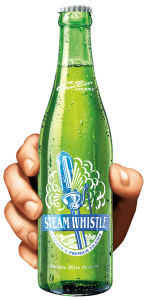
Featured Brand: Toronto’s Steam Whistle Pilsner
A Toronto microbrewery started by three “fired guys,” who upon being let go from another Canadian microbrewery opened their own because they wanted to “make a Pilsner that would compete with the best in the world.”
Why Kyle likes it?
Intelligently Simple Creative with a Retro Feel
“It’s a very retro, yet clean logo. It’s a visual identity that stands out from the crowd.
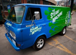
The creative is intelligently simple and always graphically on track with the other pieces in the product line via its clean lines, bold colours, and the consistent retro look. It’s a fun, light-hearted brand and the packaging reflects this, whether we’re talking about the company’s retro van, a 1967 Ford Econoline Heavy Duty that along with an entire fleet of vintage vehicles delivers beer and travels to events around the country, or the clean action of the steam trails in the company logo.
The retro look makes this brand easily identifiable on the shelf, in particular the bright green base colour that is used on everything, including the green bottle, rather than the industry-standard brown bottle. The green bottle is a great retro element, based on vintage bottles from the 1940s and ‘50s.
Smart Packaging
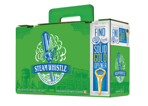
The company calls their packaging “overbuilt.” It is. Steam Whistle redesigned the 12-bottle carrying case; theirs is known as the “suitcase” 12 pack. It has a retractable handle and the top seals itself without the use of glue. It’s an ingenious innovation using die-cutting. The design is also forward thinking because for so long no one changed the format of the 12-pack of beer. It was always a 4 x 3 bottle arrangement with side holes for handles. The “suitcase” is a 2 x 6 pattern and the handle comes straight out of the center of the box so it’s an easy one-handed carry, not prone to tearing.
[/dt_sc_two_third]
[dt_sc_one_third last]
[/dt_sc_one_third]
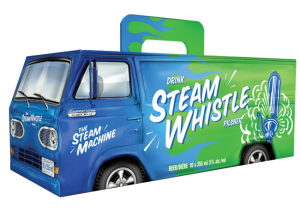
Packaging for the Can Van 10-pack box, inspired by the Steam Whistle Van, is fun, exciting and humorous; it instantly catches your eye on shelf, relying on that vintage look, but with modern packaging development. The perforated rear van doors on the Can Van box open just like the van doors on the back of the Steam Whistle van. This makes it easy to store in the fridge. The Can Van box also uses the same handle as the suitcase, so it’s also easy to carry with one hand without worrying about the handle breaking.
Forward Thinking
Steam Whistle has a very forward thinking approach to its visual identity, both in its package development and graphic design. In my eyes, this synergy makes them one of the most creative companies in package design and development. Their light-hearted, feel-good approach to design consistently comes over as real.
Want a few tips on design or redesign? Download our free re:design e-book.
by Miriam Hara | Sep 17, 2015 | Advertising, Branding, Creative, Design, Latest, Marketing
Powerful product packaging. It’s not just about the product experience anymore. Today, even the packaging needs to be an experience. Powerful packaging requires more than a basic understanding of packaging fundamentals. It’s not just about being pretty and persuasive with packaging, it’s also about being practical.
… powerful product packaging design can be likened to a powerful social media initiative
As you may have guessed from previous posts, packaging design is one of my favourite aspects of marketing. I’ve written about it often. In an earlier post, Package Design: Think of it as Social Media on a shelf I spoke about how a good package design compares to a good social media initiative: it’s inherently social, stands out from its neighbours, starts a conversation and gets people to connect with it. I promised a follow-up to that post with 7 quick tips for creating better package design. Here goes …
Product Packaging: 7 tips to get it right!
Want powerful product packaging? Here are 7 things you need to know before you even begin to design:
- Know your market. Who are you designing for? Research is the foundation for all successful marketing and advertising and that includes packaging design.
- Know your competition. Take a walk down those crowded store aisles and see what your competition is doing, then do it better! Be original.
- Know your story. Every brand has (or should have!) a story. Packaging tells your brand story but in a thoughtfully scaled down version that fits the physical format.
- Know your product. Packaging copy must tell your customers what you want them to know as well as what they need to know. These two things are not necessarily the same.
- Know your personality. Is your brand/product personality serious or fun? Your packaging design (i.e. shape, size, colours, textures, imagery and type fonts) must work together to reflect that personality. Don’t be afraid to use humour!
- Know your materials. Can the design be reproduced effectively in mass and is it cost effective to reproduce? Will your materials stand up well in the retail landscape … from initial transport to life on the shelf.
- Know your responsibilities. Brands have a responsibility to be environmentally conscious. Packaging should be eco-friendly.
Read more about the fundamentals behind powerful product packaging …
Packaging: More than a pretty on-shelf face
Delivering Great Packaging Design
10 Secrets to Eye-Popping Package Designs
by Miriam Hara | Sep 14, 2015 | Branding, Design, Latest, Marketing, Social Media
What does your product’s package design say about your brand’s personality? It should say (almost) everything.
If people haven’t seen any advertising for your product, then the first time they’re going to see it is in the store. Think of packaging as Social Media on a shelf – its role is the same: good package design is inherently social, it’s original in that it stands out from its neighbours, it starts a conversation and gets people to connect with it. Creating an engaging brand/product personality is the key to establishing these vital connections. The ultimate retail challenge is getting consumers attention.
… if your product’s package design doesn’t immediately establish a connection with consumers, it’s lost
Unlike the Social Media space, ‘real estate’ is physically limited on a store shelf, so if your product’s package design doesn’t immediately catch the consumer’s eye, it’s lost. This is particularly true if you’re launching a new product and you can’t rely on established brand equity or the halo effect.
The perfect analogy is a book cover
The cover is a book’s packaging. (Typically, authors don’t have much say about the covers of their books, it’s left to those marketing the book.) You’re at the library or in a book store. If you already enjoy the author, you’ll reach for their latest book — that’s brand equity in play. If you don’t know the author, it’s often the cover that attracts you. If it resonates with you, you reach for it. If it doesn’t, you pass over it. It’s the same with product packaging. And the process happens in seconds.
The look and feel of a product’s package design plays a definitive role in consumers’ purchasing choices
Never underestimate the power of package design and the influence it has on purchasing behaviour. Research shows that the look and feel of a product’s package design plays a definitive role in consumers’ purchasing choices.
An excerpt from The Consumer Factor’s website on consumer insights, market research, consumer behavior and neuromarketing …
“According to a recent study published by researchers from the University of Miami and California Institute of Technology in the scientific journal Proceedings of the National Academy of Sciences, the packaging of a food product would have a proven and important influence on the consumer purchase decision in-store. Researchers showed that the aesthetic aspects of products’ packaging (color, brightness, typography, etc.) will influence where the shopper’s eyes will land on the shelf – and thus the products he will look at and the time spent for each product.
The study showed that packaging influences consumers in a ratio of 1:3 or 2:3 compared to their personal preferences. Thus, even if consumer’s tastes have a bigger influence, a product’s visual attractiveness plays a significant part into the decision to buy.”
We make decisions based solely on a product’s package design
Before we even know if we enjoy the experience of the product, we make decisions based solely on its package design. It should go without saying that the inside has to deliver on what the outside promises. If the actual experience of the product is a letdown, the consumer won’t reach for that product again, no matter how smart and sexy the packaging. Packaging, particularly that for a new and as yet unknown product, gets only one chance with consumers, so it’s important to get it right.
Packaging is psychology in action
Packaging is psychology in action, particularly the psychology of design. It requires expertise and creativity to get right. Most important, it demands an understanding of the people who are going to buy your product and that’s where research comes in … who will buy your product? You can’t create personality for your packaging design without knowing your target market intimately.
Good package design tells a story
Good package design is good storytelling. You don’t skimp on the cost of packaging. As I’ve said before, packaging design shouldn’t even be viewed as a cost, good package design is an investment. My next blog will offer 7 quick tips to help you create better product package design.
Additional reading: