by Joyce Turner-Gionet | Dec 9, 2015 | Branding, Creative, Design, Latest, Marketing
The building of a brand icon
“When Andy Warhol wanted a shape to represent mass culture, he drew the [Coca Cola] bottle and when Volkswagen wanted to celebrate the shape of the Beatle, they compared the car to the bottle.” Excerpt from the Coca Cola Journey™: Celebrating 100 years of the Coca-Cola bottle.
How has the little glass Coke bottle transcended continents, cultures, languages and timelines to remain as firmly rooted in our experience today as when it first appeared 100 years ago? How did it get to be a brand icon? Which begs the question …
How does your packaging stack up to that kind of history? Are you a brand icon in the making?
When you check the retail shelf are you already blowing the dust off that packaging redesign you did last year? Every day we’re exposed to great brands with clever packaging. Some of it is truly inspired, but brand icon? That’s the kind of drawing power only a handful of brands command.
This blog was inspired by 3H Senior Designer Lindsay Sleightholm: “I love Coca-Cola branding. I was drawn to it even before I studied to become a graphic designer. Actually, it might have had a little bit to do with my career decision.”
That’s a big statement, but I’d hazard a guess that like Lindsay, each of us has been touched in some way by the allure of the little glass bottle.
Good Design Takes Things Personally
Lindsay: “For me, it started with a Coca-Cola pub mirror that my parents had hanging on a wall in our house when I was young. The copy read: “5¢, Delicious, Coca-Cola Relieves Fatigue, The Most Refreshing Drink in The World,” with a vintage photo of a young girl from the Edwardian era holding a glass of fountain Coke. No one could get away with those claims anymore (let alone the imagery). But back then I was sold. Not in the messaging so much, but in the feelings it evoked.
Today, I have a collection of Coca-Cola memorabilia: bottles, cans, signs, print ads, even an old cooler, and I still have that mirror. As far as antiques go, I don’t think the mirror holds much monetary value. For me, the value is sentimental.”
A brand moves from great to iconic by tapping into feelings and sentiments that are universal. Coca Cola’s advertising holds up a world mirror, reflecting the good times we’ve experienced with a bottle of Coke in hand, and it promises more good times to come, with a Coke in hand.
Good Design Shakes Things Up
Lindsay: “As with anything in branding and package design, it boils down to being unique. Coca-Cola learned this early on. It wasn’t enough to have a great tasting product because competitors could mimic the formula. What they needed was a way to stand apart from their competition. They accomplished this in 1915 with the contour bottle design — an abrupt departure from every other bottle design at the time. The mandate was for a bottle ‘that could be recognized when broken on the ground or by touch in the dark.‘ The design was originally patented and later trademarked. It’s a design that is ergonomic, iconic and as synonymous with the brand as the logo. You only need to see a silhouette of the bottle to know what the product is.”
Timeline: The Evolution of the Coca-Cola bottle.
See what the competition’s doing and then do it differently. Shake things up.
Good Design Walks the Talk Over Time
Lindsay: “The design of the Coke bottle is timeless because essentially it’s remained the same for 100 years and yet it’s still 100% relevant. There have been modifications over the years to allow the bottle to adapt to changing styles and trends in packaging – not so much the shape of the bottle, although that has evolved — but in the materials used to manufacture it. It was originally glass, then plastic, then aluminum, and now with certain skus there’s a return to glass. The bottle design is a perfect example of adapting to changing market demands while remaining true to a clear vision for the brand. Not to mention, ‘everything old is new again.’ Which in the case of the Coke bottle took 100 years.
Coca-Cola hasn’t drifted too far from the original design, so in essence we’ve all grown up with it. The bottle brings a sense of familiarity and nostalgia to people when they see it. Even if you don’t like the product you can’t help relating to it on some level.”
So what’s the message in the bottle?
So what’s the message in the bottle? Clarify your vision and remain true to it. When you find a design that works don’t mess (too much) with it. Coke says it best, recalling the universal backlash to a formula change in 1985: “The fabled secret formula for Coca-Cola was changed, adopting a formula preferred in taste tests of nearly 200,000 consumers. What these tests didn’t show, of course, was the bond consumers felt with their Coca-Cola — something they didn’t want anyone, including The Coca-Cola Company, tampering with.”
The coke bottle is a beautiful design and it remains relevant. But that’s not always the case. As Miriam, Chief Creative Officer at 3H, blogged, “you have to design within the framework of the culture. Even though it hurts to let a beautiful design go, if it doesn’t perform it will be let go eventually and the costs associated will be significant.”
Thank you Coca-Cola for 100 years of keeping it real and building a true brand icon. You’re an inspiration to all of us. If you haven’t seen Coca-Cola’s Celebrating 100 years of the Coca-Cola bottle, check it out, it’s a fascinating look at the life of a fascinating brand.
Want a few tips on how to get your brand’s message in a bottle, bag, box, or whatever shape you think your packaging will take? Download our free re:design e-book.
by Joyce Turner-Gionet | Nov 20, 2015 | Branding, Creative, Design, Latest
As Visual Identity ambassadors, we examine the marketing data we collect through every filter imaginable; we look at trends and we anticipate shifts. We sort and analyze the information to death and it’s important that we do. What we’re doing is looking for truths, looking for what’s real and what resonates with consumers. But as we’ve said before, if the end result — the product and the packaging — don’t reflect those truths, if our efforts don’t come across as real, then we’re wasting our time and our money.
[dt_sc_pullquote type=”pullquote6″ icon=”no” align=”center”]Good graphic designers know good design when they see it. And they know exactly why it’s good.[/dt_sc_pullquote]
I asked the graphic gurus at 3H to choose their favourite packaging design and speak to why they think it’s great. After all, they spend their days working on visual identity for clients and a big part of that is packaging design. We showcase our work on the 3H website, but sometimes it’s nice to step out and give credit to our colleagues in the great big marketing and advertising pond we’re all swimming in. My point? Good graphic designers know good design when they see it. And they know exactly why it’s good. The rest of us non-designers can learn from this…
Today’s blog is courtesy of Kyle McGuire, Senior Digital Designer at 3H.
[dt_sc_title type=”H3″ border=”Yes” align=”Left”]Kyle’s favourite packaging …[/dt_sc_title]
[dt_sc_two_third first]
Analyzing Visual Identity
Featured Brand: Toronto’s Steam Whistle Pilsner
A Toronto microbrewery started by three “fired guys,” who upon being let go from another Canadian microbrewery opened their own because they wanted to “make a Pilsner that would compete with the best in the world.”
Why Kyle likes it?
Intelligently Simple Creative with a Retro Feel
“It’s a very retro, yet clean logo. It’s a visual identity that stands out from the crowd.
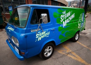
The creative is intelligently simple and always graphically on track with the other pieces in the product line via its clean lines, bold colours, and the consistent retro look. It’s a fun, light-hearted brand and the packaging reflects this, whether we’re talking about the company’s retro van, a 1967 Ford Econoline Heavy Duty that along with an entire fleet of vintage vehicles delivers beer and travels to events around the country, or the clean action of the steam trails in the company logo.
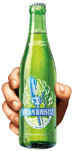
The retro look makes this brand easily identifiable on the shelf, in particular the bright green base colour that is used on everything, including the green bottle, rather than the industry-standard brown bottle. The green bottle is a great retro element, based on vintage bottles from the 1940s and ‘50s.
Smart Packaging
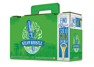
The company calls their packaging “overbuilt.” It is. Steam Whistle redesigned the 12-bottle carrying case; theirs is known as the “suitcase” 12 pack. It has a retractable handle and the top seals itself without the use of glue. It’s an ingenious innovation using die-cutting. The design is also forward thinking because for so long no one changed the format of the 12-pack of beer. It was always a 4 x 3 bottle arrangement with side holes for handles. The “suitcase” is a 2 x 6 pattern and the handle comes straight out of the center of the box so it’s an easy one-handed carry, not prone to tearing.
[/dt_sc_two_third]
[dt_sc_one_third last]
[/dt_sc_one_third]
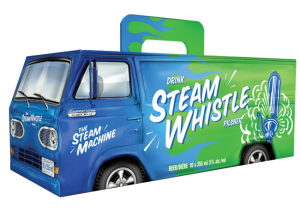
Packaging for the Can Van 10-pack box, inspired by the Steam Whistle Van, is fun, exciting and humorous; it instantly catches your eye on shelf, relying on that vintage look, but with modern packaging development. The perforated rear van doors on the Can Van box open just like the van doors on the back of the Steam Whistle van. This makes it easy to store in the fridge. The Can Van box also uses the same handle as the suitcase, so it’s also easy to carry with one hand without worrying about the handle breaking.
Forward Thinking
Steam Whistle has a very forward thinking approach to its visual identity, both in its package development and graphic design. In my eyes, this synergy makes them one of the most creative companies in package design and development. Their light-hearted, feel-good approach to design consistently comes over as real.
Want a few tips on design or redesign? Download our free re:design e-book.
by Miriam Hara | Nov 10, 2015 | Agency, Business Success, Creative, Latest
Clients who are involved in the client agency relationship do not realize that they have a direct impact on the creative their agency produces. We hear so much about agencies and their creative prowess and how ‘the creative’ talent establishes its reputation. But there’s hardly any mention of the trust factor and how that directly impacts the creative output. The creative process, whether it’s for personal endeavours or professional ones is always based on the ability of the creative mind to be at ease. To feel comfortable in the exploration of the obvious and not so obvious.
There are so many articles and blogs written on brainstorming practices… in group settings or solo ones, but very few tap into the premise of the brainstorming. In order to brainstorm you need a mandate – again, it could be a personal mandate or a professional one, brought forth from a client. If the client fosters the creative team with not only information, but with a sense of team and with a sense of knowledge that the outcome will be nothing short of awesome, then that is a setting for success, for all parties. I have the pleasure of working with clients whom have fostered that environment within our creative team. After the creative process, it’s a delight when we present and the client gets excited and says, “Wow, I wasn’t expecting that”.
Developing creative is an exciting and passionate business to be in. Fostering trust in a business relationship, is the cornerstone of creating creative that wins.
As with any relationship, creating and building on trust is a two-way street. Here’s a few points from both perspectives for the professional relationships:
The Creative Agency Built on Trust:
Know the brief. Ask questions. In order to evolve a brief into a sparkling, unique, rare but concise creative, you need to get involved… and that means that you need to admit that you don’t know. Clients will respect that and this will showcase the intelligence driving the creative outcome.
Empower your client. Never assume that the client doesn’t have a creative bone in their body. Clients know their business better than anyone else, including you. Within their brief, they will articulate gems of creative ideas… and they don’t even realize it. Take those gems and work them into creative that expresses their ideas. They will recognize them as such, and realize that, yes, you really do listen.
Always deliver and more. If a client has asked you to be at the table and provided you with a brief, it’s not only to fulfill the order, it’s to add value to the creative process in order to provide a creative outcome that sings. The damage of over promising and under delivering will break all trust and will start eroding the credibility that has been established. Just because you’re in the business of creating doesn’t mean it’s acceptable to be flighty and irresponsible.
The Client Built on Trust:
Share the knowledge. The more the creative agency knows, the better they are at creating and developing creative that is thought provoking and on target. Understanding the market and the intricate details of the industry is key to creating creative that will push the envelope.
Advocacy is key. Give credit where credit is due… and not to the creative agency, but to the management team. It’s important for the upper layer of management to know that the partner at the table is an instrumental element to the team.
Garner stability. There’s nothing more hurtful to a relationship based on trust than asking the creative agency to continuously fight for the business, especially if they have met 100% of your expectations. Asking a creative agency to continuously have to prove their right to be at the table, is a short term vision of what should be a long term relationship.
by Miriam Hara | Sep 25, 2015 | Creative, Design, Latest, Marketing
Are you on trend? In the creative field, being on trend or staying ahead of the trend curve is something that needs to be constantly monitored. As designers of packaging, creators of TV ads and developers of Social Media initiatives, being on trend is a must.
… being on trend really means being next to the minute or slightly ahead of the curve. That takes talent … or does it?
We hear a lot about trending these days … we can thank Twitter for that! However being on trend and trend setting are completely different things. Of course, the concept of trend is still the same. Ultimately, it’s about what people are adopting. In other words, what’s the next big thing? What are people tweeting about most right now?
Within the creative field, being on trend really means being next to the minute or slightly ahead of the curve. That takes talent … or does it?
It’s not about talent, it’s about taking the time.
There’s a subtle difference between what is popular and what is on trend or trend setting. The ability to identify what is already passé is necessary in order to understand what’s next. How do you do that? It’s actually easy. It’s about turning habits into skills. It’s not about talent, it’s about taking the time.
- Read: Read a variety of things from a variety of sources – the more unrelated the better. Of course not everything you read will take flight. But accumulating knowledge is the first step needed before assimilating the information you gather.
- Surf the Net: Look at shops, (both online and bricks and mortar) to see what it out there. When you travel, even when you’re just out for a walk, look around. See what’s happening. Look at people, cars, colours and styles.
- Be Aware: Associate similarities across different categories (i.e., fashion, food, automotive, consumer electronics, leisure, etc.). It’s important. It allows you to connect the dots in order to see what “trend” is about to explode onto the scene.
It’s been my experience that a trend usually happens in one context. If it really catches on, it’s adopted and applied to a variety of contexts across different categories. Bamboo is a great example. Think back eight years, bamboo was a real ‘on trend’ material. Think about bamboo today. It’s definitely popular, but is it still on trend? Is it next to the minute or has it become passé?
What’s your experience with identifying trends? Let me know.
Read more:
Search Insights: Spotting Category Trends and Opportunities
by Miriam Hara | Sep 17, 2015 | Advertising, Branding, Creative, Design, Latest, Marketing
Powerful product packaging. It’s not just about the product experience anymore. Today, even the packaging needs to be an experience. Powerful packaging requires more than a basic understanding of packaging fundamentals. It’s not just about being pretty and persuasive with packaging, it’s also about being practical.
… powerful product packaging design can be likened to a powerful social media initiative
As you may have guessed from previous posts, packaging design is one of my favourite aspects of marketing. I’ve written about it often. In an earlier post, Package Design: Think of it as Social Media on a shelf I spoke about how a good package design compares to a good social media initiative: it’s inherently social, stands out from its neighbours, starts a conversation and gets people to connect with it. I promised a follow-up to that post with 7 quick tips for creating better package design. Here goes …
Product Packaging: 7 tips to get it right!
Want powerful product packaging? Here are 7 things you need to know before you even begin to design:
- Know your market. Who are you designing for? Research is the foundation for all successful marketing and advertising and that includes packaging design.
- Know your competition. Take a walk down those crowded store aisles and see what your competition is doing, then do it better! Be original.
- Know your story. Every brand has (or should have!) a story. Packaging tells your brand story but in a thoughtfully scaled down version that fits the physical format.
- Know your product. Packaging copy must tell your customers what you want them to know as well as what they need to know. These two things are not necessarily the same.
- Know your personality. Is your brand/product personality serious or fun? Your packaging design (i.e. shape, size, colours, textures, imagery and type fonts) must work together to reflect that personality. Don’t be afraid to use humour!
- Know your materials. Can the design be reproduced effectively in mass and is it cost effective to reproduce? Will your materials stand up well in the retail landscape … from initial transport to life on the shelf.
- Know your responsibilities. Brands have a responsibility to be environmentally conscious. Packaging should be eco-friendly.
Read more about the fundamentals behind powerful product packaging …
Packaging: More than a pretty on-shelf face
Delivering Great Packaging Design
10 Secrets to Eye-Popping Package Designs
by Joyce Turner-Gionet | Sep 9, 2015 | Agency, Branding, Business Success, Communications, Creative, Design, Interactive, Latest, Marketing, Social Media
Rah-Rah, Google! Give us an ‘E’ (but make it crooked!).
Gotta LOVE that crooked ‘e’ in the new Google logo. It’s so Google! Irrepressible, playful. I hear it’s annoying people. They want to straighten it. Personally, I think it’s perfect. Think about it. Leaving the ‘e’ crooked speaks volumes about Google’s personality.
Not everyone agrees with me, Twitter Users Think Google Copied Heineken with its new logo’s crooked ‘e’ (Google kind of admits it.)
All done in house, the rebranding is a composite of three elements: the word mark, a four-colour ‘G’ monogram and animated dots that represent the Google search engine in ‘thinking’ mode. For those who’ve been under a rock, or enjoying the last days of summer up at the cottage, here it is:

New Google Logo

New Google Dots

New Google Monogram
Here’s a reminder of the old Google logo:

1999 – 2015
Here are some Google logo ideas that presumably didn’t make the cut
Here’s why Google did the rebranding …
Says Google … (from the official Google blog)
“So why are we doing this now? Once upon a time, Google was one destination that you reached from one device: a desktop PC. These days, people interact with Google products across many different platforms, apps and devices—sometimes all in a single day. You expect Google to help you whenever and wherever you need it, whether it’s on your mobile phone, TV, watch, the dashboard in your car, and yes, even a desktop!
Today we’re introducing a new logo and identity family that reflects this reality and shows you when the Google magic is working for you, even on the tiniest screens.
Read everything Google said …
Are we impressed?
I asked a few graphic gurus and marketing types across the industry for their opinion on the rebranding:

“Google, with an upper case G … it’s all grown up!”
“The lower case (previous) logo was approachable. With this new logo, Google has maintained its approachability, but made it more mature. More established. The colours and the playfulness with the dots has added to its “fun” nature … almost showcasing its “magic”. Turning questions into a found result. The use of an uncluttered, streamlined font adds to the contemporary nature … the G, unencumbered, is almost futuristic.
More importantly, I love the Alphabet name … the idea. It’s the basis of communications. With letters and building blocks, imaginations soar. What else can we develop? Where else can we go? It offers the ability of each letter to have its significant place in the sun!”
– Miriam H, Chief Creative Officer at 3H
“… suits their position as a search engine (wayfinding system)”
“Overall, it’s a thumbs up from me. The font they used is called Product Sans and was one they created specifically for the new logo and overall rebranding with the animated dots and icons. Similar to the new-ish Twitter icon, it was (mostly) created using only circles and semi-circles. I think it has a much more ‘current’ feel and suits their position as a search engine (wayfinding system).”
– Lindsay S, Senior Graphic Designer
“They’re still leading the way, now with their very own font.”
“It has retained its simple look and colour palette, while bringing a more accessible and contemporary feel. The font also has a uniqueness, a quirkiness, which demonstrates Google’s lighthearted, forward-thinking approach. They’re still leading the way, now with their very own font.”
– Jayne B, Integrated Marketing Manager
“fun and playful”
“I loved the way they presented it, the animation is fun and playful. I like the sans serif font more than the previous serif font. They’ve had the same logo for a long time. The previous logo was dated and the trend is towards sans serif fonts. Nice and chunky. It was a smart move since Google is now owned by Alphabet company. A new beginning for Google and the new logo is a great start.”
– Craig C, Senior Graphic Designer & Mixed Media Artist

“Just another logo”
“Just another logo. Cultural relevance? There’s a lot of talk about this, but I really don’t think it changes much.”
– Jason H, Photographer
“… reminiscent of the avant garde style of the TTC subway signs that came out in the 1950s”
“The new direction of the Google logo makes it easier to display on smaller devices, the switch from a serif to sans serif will make displaying on smaller screens much cleaner and simpler, it will also scale nicely. The thickness also lends itself to displaying more clearly on mobile screens. The change in the Google Icon, the New “G”, now reinforces the colour coding that Google has progressively moved towards, so now even the icon hints towards the growing suite of properties and product offerings. It seems to be a successful step in streamlining the branding of the complete picture of essential elements that Google is trying to put forward. I find it clean, modern and simple, reminiscent of the avant garde style of the TTC subway signs that came out in the 1950s and are still used for everything in the TTC Subway System. I like it.”
– Kyle M, Digital Designer
“Google’s big enough to be brave”
“Rebranding is never easy. You can’t please everyone and it always opens you up to negativity, particularly for a global giant like Google. Not everyone likes change but Google’s big enough to be brave. The clean, linear font ties in beautifully with the Alphabet name that came out of the overhaul of Google’s corporate structure. The company’s new url abc.xyz gave me a chuckle. Nice, clean, modern logo.”
– Mark A, Marketing, PR & Social Media Consultant
“It’s not a WOW logo, but …”
“It’s simple. The colours are very basic. It’s not a WOW logo, but I think that’s the way it should be for Google. Google is not just a company name, it’s a verb, it’s part of our culture. The logo doesn’t need to be beautiful, it needs to be recognizable and it still is. Just like ‘Google Doodles’, the logo gets changed in those but we always recognize it.”
– Yukari Y, Senior Designer
What do YOU think of the new Google logo? Does the crooked ‘e’ bug you? Let me know!
A HISTORY, FROM A TO … no Z, because Google is far from finished changing the world:
From Gizmodo … The Evolution of Google’s Iconic Logo
From Time Magazine … A History of Google Doodles