by Miriam Hara | Sep 25, 2015 | Creative, Design, Latest, Marketing
Are you on trend? In the creative field, being on trend or staying ahead of the trend curve is something that needs to be constantly monitored. As designers of packaging, creators of TV ads and developers of Social Media initiatives, being on trend is a must.
… being on trend really means being next to the minute or slightly ahead of the curve. That takes talent … or does it?
We hear a lot about trending these days … we can thank Twitter for that! However being on trend and trend setting are completely different things. Of course, the concept of trend is still the same. Ultimately, it’s about what people are adopting. In other words, what’s the next big thing? What are people tweeting about most right now?
Within the creative field, being on trend really means being next to the minute or slightly ahead of the curve. That takes talent … or does it?
It’s not about talent, it’s about taking the time.
There’s a subtle difference between what is popular and what is on trend or trend setting. The ability to identify what is already passé is necessary in order to understand what’s next. How do you do that? It’s actually easy. It’s about turning habits into skills. It’s not about talent, it’s about taking the time.
- Read: Read a variety of things from a variety of sources – the more unrelated the better. Of course not everything you read will take flight. But accumulating knowledge is the first step needed before assimilating the information you gather.
- Surf the Net: Look at shops, (both online and bricks and mortar) to see what it out there. When you travel, even when you’re just out for a walk, look around. See what’s happening. Look at people, cars, colours and styles.
- Be Aware: Associate similarities across different categories (i.e., fashion, food, automotive, consumer electronics, leisure, etc.). It’s important. It allows you to connect the dots in order to see what “trend” is about to explode onto the scene.
It’s been my experience that a trend usually happens in one context. If it really catches on, it’s adopted and applied to a variety of contexts across different categories. Bamboo is a great example. Think back eight years, bamboo was a real ‘on trend’ material. Think about bamboo today. It’s definitely popular, but is it still on trend? Is it next to the minute or has it become passé?
What’s your experience with identifying trends? Let me know.
Read more:
Search Insights: Spotting Category Trends and Opportunities
by Miriam Hara | Sep 17, 2015 | Advertising, Branding, Creative, Design, Latest, Marketing
Powerful product packaging. It’s not just about the product experience anymore. Today, even the packaging needs to be an experience. Powerful packaging requires more than a basic understanding of packaging fundamentals. It’s not just about being pretty and persuasive with packaging, it’s also about being practical.
… powerful product packaging design can be likened to a powerful social media initiative
As you may have guessed from previous posts, packaging design is one of my favourite aspects of marketing. I’ve written about it often. In an earlier post, Package Design: Think of it as Social Media on a shelf I spoke about how a good package design compares to a good social media initiative: it’s inherently social, stands out from its neighbours, starts a conversation and gets people to connect with it. I promised a follow-up to that post with 7 quick tips for creating better package design. Here goes …
Product Packaging: 7 tips to get it right!
Want powerful product packaging? Here are 7 things you need to know before you even begin to design:
- Know your market. Who are you designing for? Research is the foundation for all successful marketing and advertising and that includes packaging design.
- Know your competition. Take a walk down those crowded store aisles and see what your competition is doing, then do it better! Be original.
- Know your story. Every brand has (or should have!) a story. Packaging tells your brand story but in a thoughtfully scaled down version that fits the physical format.
- Know your product. Packaging copy must tell your customers what you want them to know as well as what they need to know. These two things are not necessarily the same.
- Know your personality. Is your brand/product personality serious or fun? Your packaging design (i.e. shape, size, colours, textures, imagery and type fonts) must work together to reflect that personality. Don’t be afraid to use humour!
- Know your materials. Can the design be reproduced effectively in mass and is it cost effective to reproduce? Will your materials stand up well in the retail landscape … from initial transport to life on the shelf.
- Know your responsibilities. Brands have a responsibility to be environmentally conscious. Packaging should be eco-friendly.
Read more about the fundamentals behind powerful product packaging …
Packaging: More than a pretty on-shelf face
Delivering Great Packaging Design
10 Secrets to Eye-Popping Package Designs
by Miriam Hara | Sep 14, 2015 | Branding, Design, Latest, Marketing, Social Media
What does your product’s package design say about your brand’s personality? It should say (almost) everything.
If people haven’t seen any advertising for your product, then the first time they’re going to see it is in the store. Think of packaging as Social Media on a shelf – its role is the same: good package design is inherently social, it’s original in that it stands out from its neighbours, it starts a conversation and gets people to connect with it. Creating an engaging brand/product personality is the key to establishing these vital connections. The ultimate retail challenge is getting consumers attention.
… if your product’s package design doesn’t immediately establish a connection with consumers, it’s lost
Unlike the Social Media space, ‘real estate’ is physically limited on a store shelf, so if your product’s package design doesn’t immediately catch the consumer’s eye, it’s lost. This is particularly true if you’re launching a new product and you can’t rely on established brand equity or the halo effect.
The perfect analogy is a book cover
The cover is a book’s packaging. (Typically, authors don’t have much say about the covers of their books, it’s left to those marketing the book.) You’re at the library or in a book store. If you already enjoy the author, you’ll reach for their latest book — that’s brand equity in play. If you don’t know the author, it’s often the cover that attracts you. If it resonates with you, you reach for it. If it doesn’t, you pass over it. It’s the same with product packaging. And the process happens in seconds.
The look and feel of a product’s package design plays a definitive role in consumers’ purchasing choices
Never underestimate the power of package design and the influence it has on purchasing behaviour. Research shows that the look and feel of a product’s package design plays a definitive role in consumers’ purchasing choices.
An excerpt from The Consumer Factor’s website on consumer insights, market research, consumer behavior and neuromarketing …
“According to a recent study published by researchers from the University of Miami and California Institute of Technology in the scientific journal Proceedings of the National Academy of Sciences, the packaging of a food product would have a proven and important influence on the consumer purchase decision in-store. Researchers showed that the aesthetic aspects of products’ packaging (color, brightness, typography, etc.) will influence where the shopper’s eyes will land on the shelf – and thus the products he will look at and the time spent for each product.
The study showed that packaging influences consumers in a ratio of 1:3 or 2:3 compared to their personal preferences. Thus, even if consumer’s tastes have a bigger influence, a product’s visual attractiveness plays a significant part into the decision to buy.”
We make decisions based solely on a product’s package design
Before we even know if we enjoy the experience of the product, we make decisions based solely on its package design. It should go without saying that the inside has to deliver on what the outside promises. If the actual experience of the product is a letdown, the consumer won’t reach for that product again, no matter how smart and sexy the packaging. Packaging, particularly that for a new and as yet unknown product, gets only one chance with consumers, so it’s important to get it right.
Packaging is psychology in action
Packaging is psychology in action, particularly the psychology of design. It requires expertise and creativity to get right. Most important, it demands an understanding of the people who are going to buy your product and that’s where research comes in … who will buy your product? You can’t create personality for your packaging design without knowing your target market intimately.
Good package design tells a story
Good package design is good storytelling. You don’t skimp on the cost of packaging. As I’ve said before, packaging design shouldn’t even be viewed as a cost, good package design is an investment. My next blog will offer 7 quick tips to help you create better product package design.
Additional reading:
by Joyce Turner-Gionet | Sep 9, 2015 | Agency, Branding, Business Success, Communications, Creative, Design, Interactive, Latest, Marketing, Social Media
Rah-Rah, Google! Give us an ‘E’ (but make it crooked!).
Gotta LOVE that crooked ‘e’ in the new Google logo. It’s so Google! Irrepressible, playful. I hear it’s annoying people. They want to straighten it. Personally, I think it’s perfect. Think about it. Leaving the ‘e’ crooked speaks volumes about Google’s personality.
Not everyone agrees with me, Twitter Users Think Google Copied Heineken with its new logo’s crooked ‘e’ (Google kind of admits it.)
All done in house, the rebranding is a composite of three elements: the word mark, a four-colour ‘G’ monogram and animated dots that represent the Google search engine in ‘thinking’ mode. For those who’ve been under a rock, or enjoying the last days of summer up at the cottage, here it is:
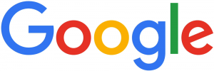
New Google Logo

New Google Dots

New Google Monogram
Here’s a reminder of the old Google logo:
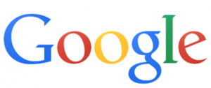
1999 – 2015
Here are some Google logo ideas that presumably didn’t make the cut
Here’s why Google did the rebranding …
Says Google … (from the official Google blog)
“So why are we doing this now? Once upon a time, Google was one destination that you reached from one device: a desktop PC. These days, people interact with Google products across many different platforms, apps and devices—sometimes all in a single day. You expect Google to help you whenever and wherever you need it, whether it’s on your mobile phone, TV, watch, the dashboard in your car, and yes, even a desktop!
Today we’re introducing a new logo and identity family that reflects this reality and shows you when the Google magic is working for you, even on the tiniest screens.
Read everything Google said …
Are we impressed?
I asked a few graphic gurus and marketing types across the industry for their opinion on the rebranding:

“Google, with an upper case G … it’s all grown up!”
“The lower case (previous) logo was approachable. With this new logo, Google has maintained its approachability, but made it more mature. More established. The colours and the playfulness with the dots has added to its “fun” nature … almost showcasing its “magic”. Turning questions into a found result. The use of an uncluttered, streamlined font adds to the contemporary nature … the G, unencumbered, is almost futuristic.
More importantly, I love the Alphabet name … the idea. It’s the basis of communications. With letters and building blocks, imaginations soar. What else can we develop? Where else can we go? It offers the ability of each letter to have its significant place in the sun!”
– Miriam H, Chief Creative Officer at 3H
“… suits their position as a search engine (wayfinding system)”
“Overall, it’s a thumbs up from me. The font they used is called Product Sans and was one they created specifically for the new logo and overall rebranding with the animated dots and icons. Similar to the new-ish Twitter icon, it was (mostly) created using only circles and semi-circles. I think it has a much more ‘current’ feel and suits their position as a search engine (wayfinding system).”
– Lindsay S, Senior Graphic Designer
“They’re still leading the way, now with their very own font.”
“It has retained its simple look and colour palette, while bringing a more accessible and contemporary feel. The font also has a uniqueness, a quirkiness, which demonstrates Google’s lighthearted, forward-thinking approach. They’re still leading the way, now with their very own font.”
– Jayne B, Integrated Marketing Manager
“fun and playful”
“I loved the way they presented it, the animation is fun and playful. I like the sans serif font more than the previous serif font. They’ve had the same logo for a long time. The previous logo was dated and the trend is towards sans serif fonts. Nice and chunky. It was a smart move since Google is now owned by Alphabet company. A new beginning for Google and the new logo is a great start.”
– Craig C, Senior Graphic Designer & Mixed Media Artist

“Just another logo”
“Just another logo. Cultural relevance? There’s a lot of talk about this, but I really don’t think it changes much.”
– Jason H, Photographer
“… reminiscent of the avant garde style of the TTC subway signs that came out in the 1950s”
“The new direction of the Google logo makes it easier to display on smaller devices, the switch from a serif to sans serif will make displaying on smaller screens much cleaner and simpler, it will also scale nicely. The thickness also lends itself to displaying more clearly on mobile screens. The change in the Google Icon, the New “G”, now reinforces the colour coding that Google has progressively moved towards, so now even the icon hints towards the growing suite of properties and product offerings. It seems to be a successful step in streamlining the branding of the complete picture of essential elements that Google is trying to put forward. I find it clean, modern and simple, reminiscent of the avant garde style of the TTC subway signs that came out in the 1950s and are still used for everything in the TTC Subway System. I like it.”
– Kyle M, Digital Designer
“Google’s big enough to be brave”
“Rebranding is never easy. You can’t please everyone and it always opens you up to negativity, particularly for a global giant like Google. Not everyone likes change but Google’s big enough to be brave. The clean, linear font ties in beautifully with the Alphabet name that came out of the overhaul of Google’s corporate structure. The company’s new url abc.xyz gave me a chuckle. Nice, clean, modern logo.”
– Mark A, Marketing, PR & Social Media Consultant
“It’s not a WOW logo, but …”
“It’s simple. The colours are very basic. It’s not a WOW logo, but I think that’s the way it should be for Google. Google is not just a company name, it’s a verb, it’s part of our culture. The logo doesn’t need to be beautiful, it needs to be recognizable and it still is. Just like ‘Google Doodles’, the logo gets changed in those but we always recognize it.”
– Yukari Y, Senior Designer
What do YOU think of the new Google logo? Does the crooked ‘e’ bug you? Let me know!
A HISTORY, FROM A TO … no Z, because Google is far from finished changing the world:
From Gizmodo … The Evolution of Google’s Iconic Logo
From Time Magazine … A History of Google Doodles
by Miriam Hara | Sep 1, 2015 | Agency, Business Success, Communications, Latest, Management, Marketing, Problem Solving
What is common sense? How important is it in business?
In business, I believe knowledge and experience make for common sense. If you don’t have both, you’re working from opinion. Common sense is a way of thinking, based on what you know for sure.
You might have heard your grandmother say: “that girl is full of common sense.” She meant it as a compliment. The “she” grandma was referring to was a highly practical gal, or in today’s speak, someone who exercised good sense and sound judgement that consistently led to sound outcomes. Chances are this gal was working from what she knew for sure.
It’s called common sense because, supposedly, it’s common to all of us.
It’s called common sense because, supposedly, it’s common to all of us. That’s debatable, since we all do things that don’t make any sense. We spend too much, text while driving, drive over the speed limit, eat a second piece of cheesecake even though we’re on a diet, procrastinate on a project, delay backing up our phone or PC and ignore our doctor’s advice. More than likely, as most of us are doing these things, we know they don’t make sense, but we throw caution to the wind and do them anyway. (Just for fun, take the quiz at the end of this blog if you want to to test your common sense.)
Despite what we might think, common sense is not necessarily linked to a high IQ.
Every day we hear something, read something or see something, that doesn’t make common sense. Politics can be a minefield of questionable sense. Government decisions on how our money should be spent are no different. (For an eye opener, on common sense gone MIA (Missing in Action), check out the 2015 17th Annual Teddy Government waste award winners) It’s the same in business. Business leaders regularly exercise good judgement as well as poor judgement; decisions rooted in common sense or resulting from the lack of it. Despite what we might think, common sense is not necessarily linked to a high IQ.
Not all people with common sense are forward thinkers.
In business we use common sense daily, to prioritize. It’s our way of connecting the dots to business preservation. Business thinkers who connect the dots can be forward thinkers, the surest route to business success. That doesn’t mean all forward thinkers have common sense. And not all people with common sense are forward thinkers.
In business you must constantly assess situations. Common sense helps out here too. It allows us to avoid stressful situations. When we are in an unavoidable situation, we can use common sense to negotiate a way out. The more experience I have, the more common sense I accumulate. Was I born with the inclination for common sense? I repeat: I think it’s learned.
Remember Einstein’s sage advice?
A person with common sense also learns from mistakes. Remember Einstein’s sage advice? “Insanity is doing the same thing over and over again and expecting different results.” In business, as in life, if we don’t learn from our mistakes we’re liable to make them again. Common sense encourages us to look around and see what’s happening beyond our own business world. We can also learn from the mistakes as well as the successes of others, a common sense learning approach that works well.
Most common sense people have learned the art of removing themselves from a situation in order to look at it objectively.
Common sense allows us to assess the value of moving forward and double check the move with our intuition — a gut feeling that is based on our past business knowledge and experience — before we act. We’re able to see both the big picture and the details and assess how the details could help or hinder the outcome. Yes, we value and take into account the (knowledgeable) opinions of business others, but we don’t allow your own sound judgement to be clouded by their perceptions. Most common sense people have learned the art of removing themselves from a situation in order to look at it objectively.
You’ve heard of street smarts. There are business smarts too. They’re centered on developing a plan, understanding the weaknesses of the plan and setting up contingencies. Business common sense, based on knowledge and experience (and that dose of intuition), allows us to clearly and objectively assess every business course of action.
There’s a downside to common sense
There’s a downside to common sense in business and we need to guard against it. We must never become too pragmatic. Good business benefits from a healthy dose of intuition and once in a while, a leap of faith. Both might seem at odds with common sense, but they’re really not. Case in point; we started 3H in the middle of a recession!
Got a comical example of common sense missing in action, send it to me?
Grandma would roll her eyes at this one! But in today’s world, there’s an internet answer for everything: How to Develop Common Sense: 8 Steps (with pictures)
Just for fun, see if you have common sense and take the quiz on Quiznatic
A little more serious from Forbes:
10 Uncommon, Common Sense Commandments for Life and Business
by Miriam Hara | Aug 28, 2015 | Advertising, Agency, Business Success, Communications, Content, Interactive, Latest, Management, Marketing, Social Media
In life, we need a plan. To create rich content, we need a plan.
There’s a lot of buzz around content and content creation. For those new to content and content creation, it can get confusing. What is content? In a nutshell: content = information. Rich content = great information.
I’ll give you an example of what’s meant by content (information). As an ad agency, there is:
- The content (information) our clients hire us to create using a variety of vehicles: billboard ads, print campaigns, outdoor advertising, videos (including YouTube videos), TV spots, radio spots, advertorials, brochures, packaging, websites, Social Media, etc. … you get the idea.
- Then, there’s the content (information) we create for the agency: our internal marketing and advertising. This could be news and views delivered via our website, blogs, tweets, Facebook posts, pins on Pinterest, Instagram, posts on LinkedIn and on business-to-business sites, etc.
Rich Content – What’s its job?
Content’s job is to add value and provide insight. To do this, it must be engaging. To be engaging, it must be informative and interesting (i.e. ‘rich’). To be effective, it must be targeted. This is important. 3H’s content reach is wide-ranging and eclectic. We speak to our clients, to large corporations, small businesses, executives and non-executives, the business-to-business market, people in the creative field and students (particularly those in the arts and communication). A content piece may not (and likely, will not) resonate with all of these people, all of the time. So at 3H, we vary the content regularly, to make sure there’s something for everyone. And we’re strategic with our content. We put it in places where the people we want to see it, will see it.
Who? What? When? Where? Why? And How?
A helpful way to plan for engaging content creation is to think the way a news editor or journalist thinks when developing a piece. Answer the four “W” questions: Who? What? When? Where? Why? And answer the ‘H’ question: How?
Who?
Define your target market(s) — the people you want to speak to, the ones you want to engage with your content.
What?
What do we want to say to our audience? This will also help establish a tone for your content and a voice for your organization. Your business is unique; tone and voice help get that across.
When?
When will we reach our audience? Plan to reach out regularly, in the same places, so that not only do they expect you, they search you out. Appear sporadically and you’ll lose your audience. Be flexible and adaptable: if you notice your audience gravitating to new places (and with the pace of technology, this happens regularly) — be there for them.
Take advantage of established media events, things such as Earth Day, Labour Day, Heart Month, Diabetes Month, Valentine’s Day, etc. If your business is geared toward any of these things, piggy back your content on the media excitement.
Every business experiences an ebb and flow. Make the most of slower times to come up with new ideas for content.
Create events, unique ones that belong only to you. Then wrap content around these events. Content is about engaging your audience. Give them a reason to get excited, to celebrate and to connect with you.
Where?
Where will we reach our audience? Where do they hang out? If you’re not sure, do a little research.
Why?
Why do we want to create rich content? Sounds pretty basic, I know, but it’s important. Why do you?
As you plan moves along, the “why” should stick around. You’ve implemented a plan, but don’t set it and forget it. Review. Regularly. How is your content being received? This leads to important answers to questions, such as: “Why is this type of content working well for us, but this other type isn’t?” The success of your content is measurable. For example, you can measure the progress of your Social Media efforts with metrics (The 5 Easy Steps to Measure Your Social Media Campaign). You can measure response to your website Five Keys to Success for Measuring Your Website.
You can measure it by the comments and feedback you’re getting. If you’re never getting any feedback, start asking why?
A good plan has legs
A good plan has legs, it evolves; it can take you to new places with new insights so that your content consistently delivers value. Gives your audience a reason to keep coming back.
A good plan needs a good team
Content creation should not be the sole job of the content creator(s). I’ve said this before: Everyone in a company can and should have input. It makes for a much richer, collaborative and enjoyable experience and ultimately, content will benefit, in quality and quantity.
HOW?
How will you do it? It’s all about fiber …
- Meaty and rich content.
- Make it regular.
Add value! Provide Insight!
If you don’t feel comfortable or confident enough to create your own content, hire a content creator. It really is that important!
STICK TO THE PLAN!
(If it’s a good plan.) If the plan’s not working, find out why and fix it. Then … STICK TO THE PLAN!
Want to delve deeper into Content Creation? Download our free eBook: Content Creation Understood. 21 short snappy insights (we call them biz-isms) that will help you wrap your head around creating great content.